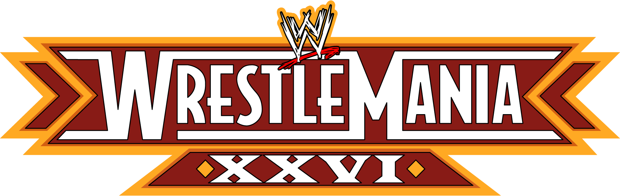
🏟️ WrestleMania 26 – Brand & Logo Overview
WrestleMania 26 (sometimes styled WrestleMania XXVI) was the 26th annual WrestleMania, the flagship professional wrestling pay‑per‑view (PPV) event produced by World Wrestling Entertainment (WWE). It took place on March 28, 2010 at the University of Phoenix Stadium in Glendale, Arizona, attracting more than 72,000 fans and generating record‑level interest around the world.
WrestleMania itself isn’t just a single show — it’s a cultural phenomenon that WWE markets as “The Grandest Stage of Them All,” representing the culmination of ongoing storylines, championship battles, and some of the company’s most memorable matches. Each year’s WrestleMania logo is crafted to reflect both the event’s number and its unique theme or location.
📜 Logo History
Unlike many corporate marks that remain static, WrestleMania uses a yearly evolving logo system. Each WrestleMania event has its own visual identity tied to that year’s branding and promotion. These logos are used in TV broadcasts, promotional material, merchandise, digital assets, and stadium signage.
For WrestleMania 26, WWE designed a distinct logo that:
- Displays the WWE brand wordmark prominently, signifying official WWE production.
- Features the number 26 (or XXVI) integrated into the design in a bold, athletic type style that matches the energy and spectacle of the event.
- Incorporates stylistic elements consistent with war‑like, triumphant, and Americana imagery often used in wrestling promotions — with strong lines and impactful typography. (The exact stylistic motifs vary depending on source and fan‑made variants since WWE doesn’t publicly detail logo symbolism each year.)
The WrestleMania logos overall evolved over decades — from classic designs in the 1980s to modern vector‑based graphics — reflecting changing design trends and WWE production values.
🔍 Design Meaning
While WWE doesn’t publicly publish official interpretation of logo symbolism, the WrestleMania 26 logo visually communicates several key concepts:
🎯 Legacy and Continuity
- The use of the number “26” (or XXVI) underscores WrestleMania’s long history as the biggest annual wrestling event. Each iteration’s numeral is a badge of legacy.
🪩 Strength and Spectacle
- The angular, strong typography and bold letter shapes evoke physical intensity, competition, and larger‑than‑life athleticism — all hallmarks of WWE’s entertainment style.
🏛️ Brand Cohesion
- Featuring the WWE logo ties WrestleMania 26 to WWE’s corporate brand, reminding fans that this is WWE’s pinnacle event of the year. This consistency reinforces brand recognition globally.
📍 Localized Theme (Indirect)
- While not always reflected in the logo itself, WrestleMania 26’s promotional campaign often referenced the event’s Phoenix/Arizona setting — sometimes using color palettes or motifs (e.g., maroon, gold, desert imagery) tied to host‑city identity in posters and marketing. (Some fan and editorial commentary suggests influences from local culture on design choices, though WWE doesn’t officially codify these details.)
🎨 Color Philosophy
The WrestleMania 26 logo typically featured:
- Bold Black and White (Primary): Strong contrast makes the logo instantly legible in TV, print, and live stage environments.
- Accent Tones: Some promotional variants or merchandise added red, gold, or metallic hues to evoke excitement, prestige, and a premium sporting event feel.
The choices reflect WWE’s broader graphic design philosophy of ensuring maximum visibility and emotional impact across platforms — from entrance screens to posters to t‑shirts.
📌 Event Context & Brand Impact
WrestleMania 26 was notable not just for its logo but as a cultural event:
- It featured the retirement match of Shawn Michaels against The Undertaker — one of wrestling’s most emotionally charged storylines.
- John Cena captured the WWE Championship in a marquee match.
- The event continued WrestleMania’s tradition as WWE’s biggest annual spectacle, drawing global media coverage and deep fan engagement.
Because WrestleMania is both a sports entertainment showcase and a brand experience, each year’s visual identity (including the logo) plays a role in storytelling and fan anticipation.
❓ Frequently Asked Questions (FAQs)
Q: What does the WrestleMania 26 logo represent?
A: It represents WWE’s 26th WrestleMania event, combining the WWE corporate mark with a bold, athletic numeral to convey legacy, spectacle, and annual continuity.
Q: Why change the logo each year?
A: Each WrestleMania logo is tailored to that year’s marketing theme and helps make that edition visually unique — similar to how major global sporting events (like the Olympics or Super Bowl) refresh branding annually.
Q: Is the logo officially trademarked?
A: Yes. Like all WWE event logos, it is intellectual property owned by WWE and trademark protected.
Q: Where is this logo used?
A: The WrestleMania 26 logo appeared in TV broadcasts, merchandise, posters, digital marketing, pay‑per‑view graphics, and in‑arena signage during the March 28, 2010 event.
📌 Summary
The WWE WrestleMania 26 logo serves as both a numeric identifier and a visual anchor for WWE’s biggest annual event. Strong typography, bold contrasts, and consistent WWE branding tie it into The Showcase of the Immortals’ larger identity — celebrating over a quarter‑century of annual wrestling spectacles and global fan engagement.