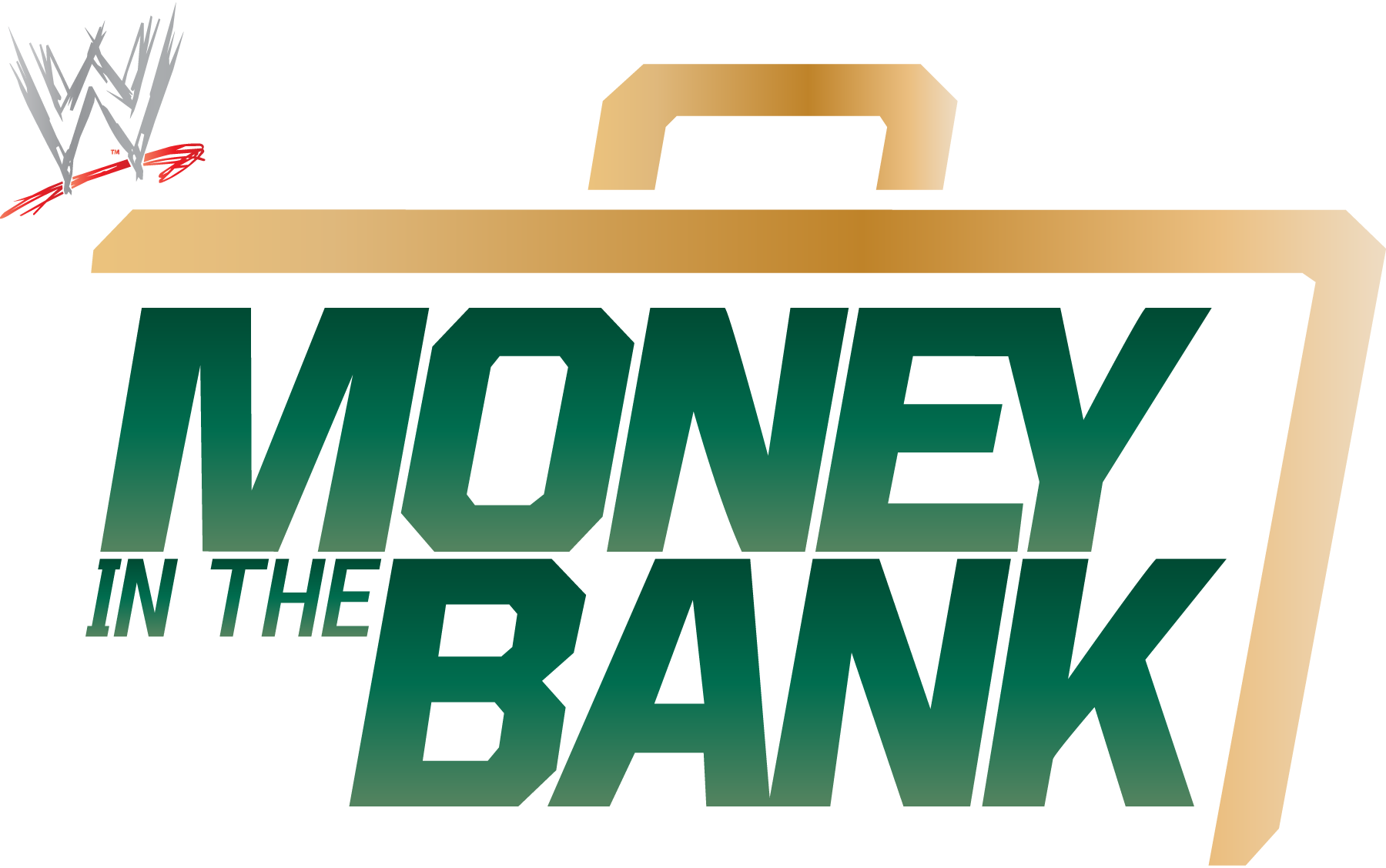
WWE Money in the Bank Logo — Brand Overview
The WWE Money in the Bank logo represents one of the most thrilling and unpredictable events on the WWE calendar. Since its introduction in 2010, this logo has become synonymous with high‑stakes drama, athleticism, and a unique blend of sports and entertainment.
Unlike a simple promotional title, the Money in the Bank logo carries emotional weight for wrestling fans: it signals excitement, the promise of a dramatic cash‑in moment, and the unforgettable ladder matches that define the premium live event.
Logo History
The Money in the Bank concept didn’t start as its own show — it began as a match at WrestleMania in 2005.
- 2005–2010: WrestleMania Roots
Before there was a dedicated event, the Money in the Bank ladder match existed at WWE’s marquee event WrestleMania, capturing fans’ imaginations with its intense action and the tantalizing briefcase prize. - 2010: A Standalone Event Is Born
WWE spun the concept into its own annual premium live event, giving it a brand identity complete with its own logo, promotional posters, and theme music. - 2010–Present: Evolving but Consistent
Over the years, the core design of the Money in the Bank logo has stayed recognizable — bold lettering paired with graphic elements that hint at its central symbol: the briefcase. Variations have appeared, including 2D and 3D versions as well as color changes (such as yellow or black options used in recent years).
While the event’s visual presentation evolves with WWE’s creative direction, the logo’s essence — bold and unmistakable — remains a constant across different annual editions.
Design Meaning
The Money in the Bank logo is built to convey energy, opportunity, and tension — all central to what the event represents:
- The Font & Lettering
The sharp, confident typography reflects strength and urgency, mirroring the competitive intensity of the ladder match itself. - Graphic Motifs
While versions vary, many include visual nods to the briefcase — the central object of desire in the titular match — and use blocky, powerful shapes to evoke tension and impact. - Hierarchy of Text
Words like “Money” and “Bank” are often emphasized with bold weight or stronger contrast, underscoring the theme of stakes and reward. The name isn’t just a label — it’s a promise of drama.
Together, these elements create a visual identity that’s louder and more electric than a standard sports logo — perfectly suited to WWE’s theatrical storytelling and spectacle.
Color Philosophy
While the WWE Money in the Bank logo has appeared in various palettes, a few principles guide its use:
- Strong Contrast
The design often employs high‑contrast colors (like bold yellow, black, or metallic tones) to create impact and make the logo stand out on posters, digital screens, and merchandise. - Metallic & Gold Hints
Because the event revolves around a contract briefcase symbolizing future championship opportunity, the logo’s palette often leans toward metallic or gold tones in promotions — visually echoing the preciousness of that prize. - Brand Consistency
While WWE experiments with color themes each year, the logo still harmonizes with the broader WWE branding system — tying it into familiar WWE colors and production aesthetics.
These design choices make the logo feel premium, urgent, and exciting — fitting for an event where careers can change in a single moment.
Cultural & Wrestling Significance
The Money in the Bank logo isn’t just a static mark — it’s a distillation of an event that has shaped modern WWE storytelling:
- A Symbol of Opportunity
Winning the Money in the Bank briefcase means a guaranteed world title match — any time and any place within a year of winning. That unpredictability is central to why fans react so passionately to the logo and event. - Global Recognizability
Since Money in the Bank became its own event, it has grown alongside WWE’s global reach, being held across North America and even in venues overseas, like London in recent years. - Merch & Identity
The logo appears on a wide range of WWE merchandise — from T‑shirts and hats to posters and digital media — helping it stick in the minds of fans as a momentous occasion on the WWE calendar.
Every year, when that logo appears on announcements and screens, fans know they’re in for moments that could define careers — whether it’s an unexpected cash‑in or a breakout performance.
Frequently Asked Questions (FAQs)
Q1: What is the Money in the Bank logo used for?
It’s the official graphic identity for WWE’s annual Money in the Bank event — one of the company’s marquee premium live shows.
Q2: Why does Money in the Bank have its own logo?
Because it’s a standalone event with a unique concept and legacy, distinct from other WWE shows like WrestleMania or SummerSlam.
Q3: What does the logo represent?
It represents competition, opportunity, and the coveted briefcase that holds a future championship match contract — a powerful symbol in WWE storytelling.
Q4: Has the logo changed over time?
Yes — the core design is maintained each year, but WWE updates color schemes and visual effects to match that year’s promotional themes.
Q5: Where can you see the logo?
In official WWE marketing — including promotional posters, event video packages, merchandise, and broadcast graphics.