Brand Overview
Wild ’N Out is a popular American sketch comedy and improv hip‑hop television show known for its high‑energy games, freestyles, and celebrity guest appearances. Created and hosted by Nick Cannon, the show premiered in 2005 and has become a mainstay of youth comedy and urban pop culture, blending rap battles, comedy sketches, and audience‑interactive segments.
The show airs in seasons on television and streaming platforms and has developed a dedicated global fanbase. Much of Wild ’N Out’s appeal lies in its spontaneous humor, musical creativity, and competitive vibe, where cast members face off in comedic battles that revolve around witty rhymes, punchlines, and crowd reactions.
Over the years, Wild ’N Out expanded beyond just television into live tours, merchandise, music collaborations, and digital content, creating a cultural brand that resonates deeply with younger audiences and fans of comedy and hip‑hop.
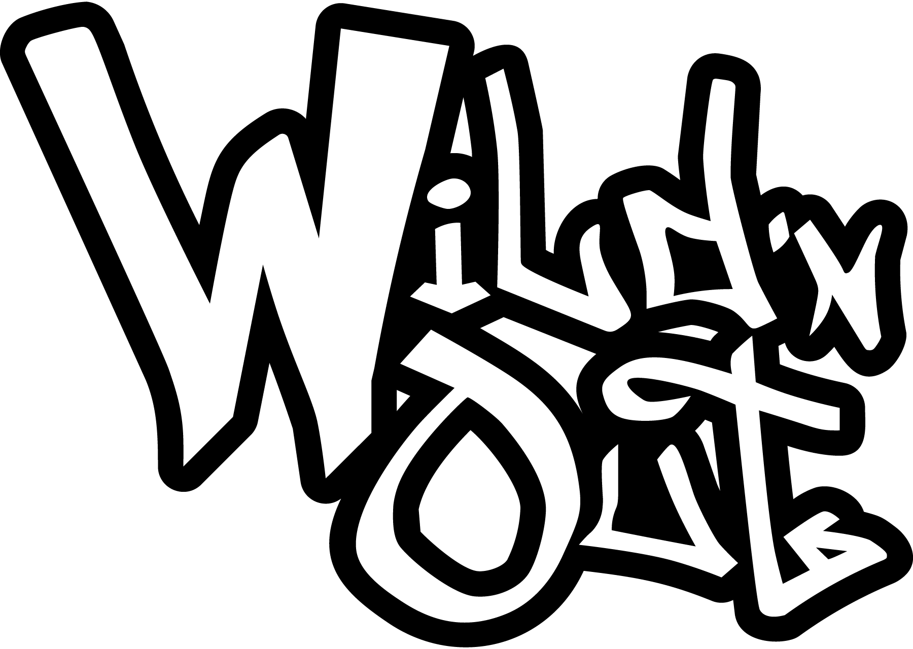
The Wild ’N Out logo is a major part of the show’s visual identity, appearing on promotions, apparel, album covers, posters, and digital media. It visually communicates the show’s attitude: bold, unpredictable, and unmistakably urban.
Logo History
The Wild ’N Out logo has evolved with the show, reflecting shifts in cultural energy and visual trends while maintaining key elements that keep it instantly recognizable.
Early Seasons
When Wild ’N Out first launched, the branding and logo were designed to evoke street vibe, raw energy, and forged competitiveness — much like the atmosphere of freestyle hip‑hop battles. The early logo combined bold typography with dynamic graphics suggesting motion and impact.
It often associated the words “Wild” and “Out” with a rugged, graffiti‑like style, emphasizing spontaneity and urban flavor.
Modern Adaptations
As the show grew in popularity, the logo underwent refinement. The modern Wild ’N Out logo retains its energetic style but uses cleaner lines, more consistent typography, and stylized graphic cues that work well on television, social media, merchandise, live events, and promotional materials.
Despite updates in style over the years, the Wild ’N Out logo keeps its core attitude: bold contrasts, youthful energy, and visual intensity that mirrors the show’s fast‑paced vibe.
Design Meaning
The Wild ’N Out logo contains visual cues that reflect the show’s identity, tone, and cultural positioning.
Dynamic Typography
The most notable element of the Wild ’N Out logo is its bold, modern lettering. The wordmark is usually composed of:
- Blocky, sans‑serif font
- Strong contrasts between thick and thin strokes
- Energetic spacing that suggests movement
This style conveys:
- Confidence and boldness
- Youthful energy and attitude
- A sense of rhythm and beat
Because Wild ’N Out is deeply tied to hip‑hop culture, the logo’s typography mirrors the rhythm and flow of rap — bold, punchy, and impactful.
Visual Emphasis on “Wild”
Often the logo visually emphasizes the word “Wild” through size, boldness, or color contrast. This reinforces the show’s unpredictable and spontaneous nature — after all, the show is built around ‘wild’ freestyles and improvisation.
Urban Style Elements
Depending on the version, the logo may incorporate stylistic details that evoke:
- Street culture
- Graffiti aesthetics
- Performance stages and spotlights
These graphic cues tie the logo into hip‑hop visual traditions and street sensibility, making it relatable to the show’s audience.
Color Philosophy
The Wild ’N Out logo uses a high‑contrast, energetic color palette that helps it stand out in promotional material and entertainment branding.
Black
Black is frequently used as the primary base color or outline. It conveys:
- Authority and boldness
- Contrast against bright highlights
- An urban, grounded aesthetic
Black provides a dramatic backdrop that makes other colors pop while anchoring the visual weight of the logo.
Red
Red is one of the most common accent colors used in the Wild ’N Out logo and associated branding. It represents:
- Energy and excitement
- Intensity and competition
- Passion and bold expression
Red’s vibrant tone instantly draws attention and reflects the competitive nature of freestyle battles and games within the show.
White
White is often used for lettering or background — offering:
- Clarity and contrast
- Readability in dynamic media
- Clean design balance
White helps offset darker elements and ensures the logo is visible across multiple platforms and merchandise.
Yellow / Gold Accents
Occasionally, yellow or gold highlights are used to add:
- Visual warmth
- Attention‑grabbing highlights
- Stylized flair for event posters or limited‑edition graphics
These accents add brightness and excitement while maintaining the Wild ’N Out brand energy.
The overall palette of black, red, and white with optional warm accents helps create a ship‑shape, high‑impact visual identity that reflects the show’s bold, fast‑paced personality and real‑time creativity.
FAQs
What is Wild ’N Out?
Wild ’N Out is a sketch comedy and improv hip‑hop show created and hosted by Nick Cannon, known for its rap battles, humor, and celebrity appearances.
What does the Wild ’N Out logo represent?
The logo represents the show’s bold, energetic, unpredictable, and competitive identity — mirroring the tone of the entertainment it delivers.
Why is the logo designed with bold typography?
Bold and dynamic typography conveys confidence, intensity, and youthful attitude — key aspects of Wild ’N Out’s brand and performance style.
What colors are prominent in the Wild ’N Out logo?
Black, red, and white dominate the visual palette, reflecting strength, energy, contrast, and visibility.
Can I use the Wild ’N Out logo freely?
No. The Wild ’N Out logo is a protected intellectual property of the show’s rights holders and cannot be used for commercial purposes without authorization.
Conclusion
The Wild ’N Out logo is more than just a graphic — it’s a visual signature of a dynamic entertainment brand rooted in contemporary comedy, hip‑hop culture, and competitive freestyle creativity. Its bold typography, striking palette, and energetic design elements make it instantly recognizable and reflective of the show’s wild, unfiltered style.