Brand Overview
Who Wants to Be a Millionaire is one of the most successful and widely recognized television game show formats in broadcasting history. The show originated in the United Kingdom and first aired on September 4, 1998 on ITV. Created by David Briggs, Mike Whitehill, and Steven Knight, the program quickly became a global hit, spawning international adaptations in dozens of countries.
The format centers on a single contestant attempting to win large sums of money by answering multiple‑choice questions of increasing difficulty. The game’s key mechanics—lifelines like 50:50, Phone a Friend, and Ask the Audience—became cultural touchstones and helped make the show an international phenomenon.
Over more than two decades, the show has aired in more than 160 territories worldwide, reaching millions of viewers and becoming one of the best‑known quiz shows on television.
The iconic Who Wants to Be a Millionaire logo plays an important role in the show’s branding, appearing across television broadcasts, marketing materials, promotional merchandise, and digital platforms.
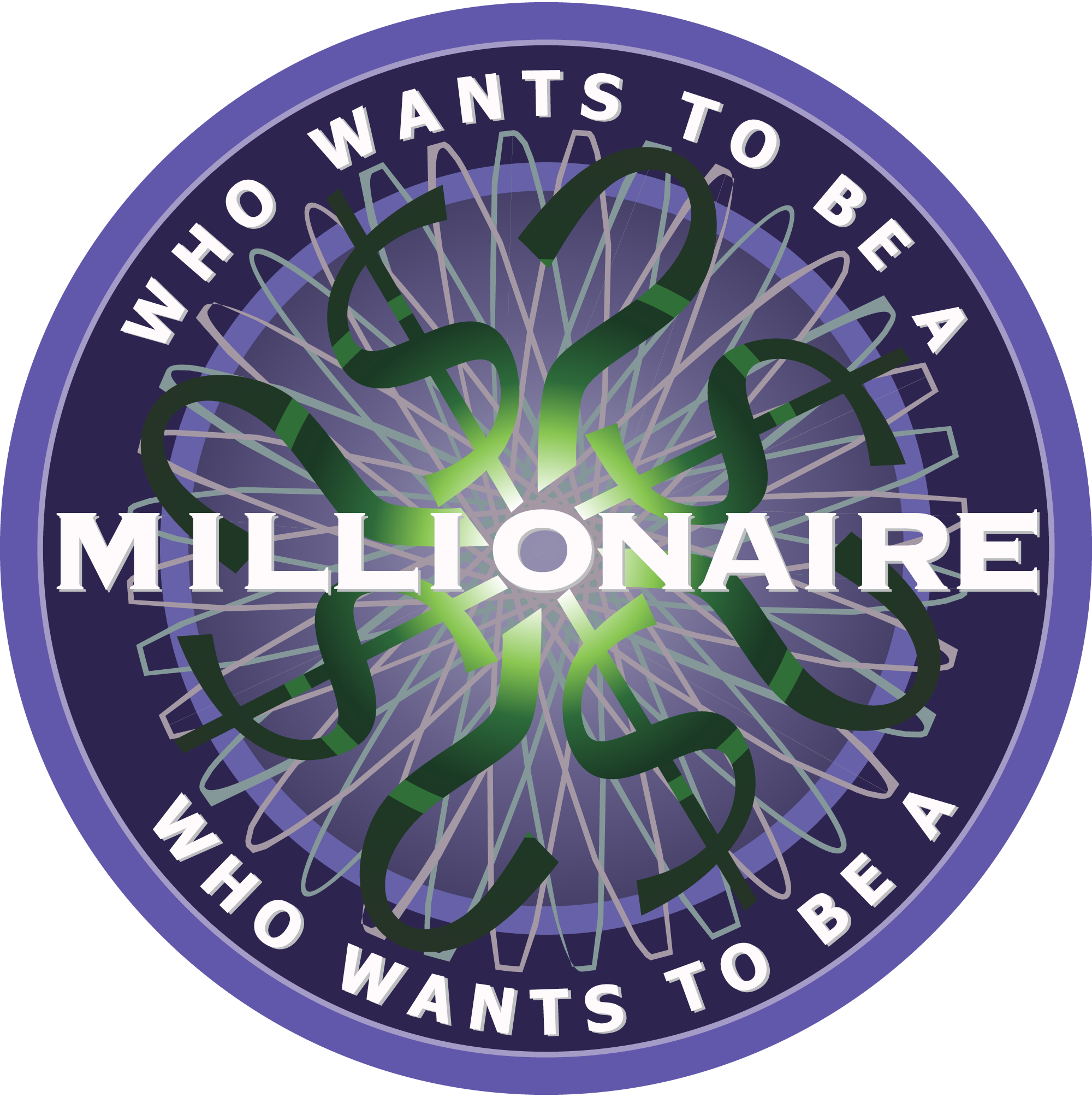
Logo History
The Who Wants to Be a Millionaire logo has evolved in style and presentation over the years, but its core visual identity has remained highly consistent.
Original UK Logo (1998)
When the show debuted in the United Kingdom, the logo featured a distinctive circular emblem with concentric rings and bold typography spelling out the show’s name. The circular motif and intricate line work reflected the idea of complexity and challenge—matching the escalating difficulty of the quiz format.
The typography was typically presented in all caps, giving a sense of seriousness and importance to the show’s title.
International Variations
As the format was licensed worldwide, versions of the logo were adapted for different languages and markets. However, the essential design elements—circular badges and bold, geometric text—remained consistent to maintain global brand recognition.
Some international versions introduced color variations or localized accents, but the core circular emblem became a universal symbol associated with the Millionaire franchise.
Modern Revisions
In later years, especially with updated studio designs and digital platforms, the logo has been modernized with smoother gradients, glowing effects, and refined finishes. Despite these graphical enhancements, the logo’s core circular motif and strong typography endure, maintaining continuity from the original design.
Overall, the Who Wants to Be a Millionaire logo is one of the most consistent and enduring visual identities in global television.
Design Meaning
The Who Wants to Be a Millionaire logo was designed to reflect the show’s core themes: knowledge, challenge, and progression.
The Circular Emblem
The circular design represents:
- Continuity and completeness – echoing the full journey from easy to difficult questions
- Cycles of progress and achievement – matching the contestant’s path through questions
- Connection and inclusivity – the circle suggests unity and brings all elements together visually
The multiple concentric rings give the logo depth and a sense of complexity, mirroring the layered difficulty of the questions contestants face during the game.
Typography and Lettering
The bold typeface used for the words Who Wants to Be a Millionaire conveys:
- Authority and seriousness – appropriate for a high‑stakes quiz show
- Clarity and readability – important for television screens and promotional materials
- Forward momentum – the geometric shapes give a sense of purpose and motion
The name itself is a question, and the logo’s linear arrangement of text emphasizes clarity and focus, reinforcing the show’s format.
Color Philosophy
The Who Wants to Be a Millionaire logo uses a distinctive color palette that reinforces the show’s identity and tone.
Green
Green is one of the most prominent colors associated with the logo.
It represents:
- Wealth and money – appropriate given the show’s focus on winning a million
- Growth and ambition – reflecting the contestant’s journey upward
- Balance and stability – suggesting logic and calm decision‑making
In many versions of the logo, a rich emerald green is used for text or accent lines to emphasize the financial theme.
Gold
Gold accents often appear in promotional versions of the logo, especially in marketing materials focused on the top prize.
Gold represents:
- Prestige and achievement – winning a million dollars
- Success and excellence – the ultimate goal of contestants
- Luxury and celebration
Gold highlights create visual appeal and draw attention to the aspirational nature of the show.
Black and White
Black is commonly used for contrast and grounding, while white is used for clarity and readability.
Together these neutral colors help:
- Anchor the logo visually
- Ensure legibility on broadcast screens
- Create a timeless, professional appearance
The combination of green, gold, black, and white gives the logo a balanced yet impactful presence that fits the show’s high‑stakes quiz identity.
FAQs
Q: What is Who Wants to Be a Millionaire?
A: Who Wants to Be a Millionaire is a global television game show where contestants answer increasingly difficult questions to win cash prizes, with the ultimate goal of reaching the top prize of one million (in local currency).
Q: When did the show first air?
A: The original version of the show premiered in the United Kingdom on September 4, 1998.
Q: Why is the logo circular?
A: The circular design represents progression, unity, and challenge—echoing the game‑show’s structure and the contestant’s journey through the questions.
Q: What colors are primarily used in the Millionaire logo?
A: Common colors include green, gold, black, and white—chosen to communicate wealth, achievement, clarity, and professionalism.
Q: Are there different versions of the logo worldwide?
A: Yes. While the basic design principles remain the same, different international versions may feature localized text or color tweaks to match regional editions.