1. Brand Overview
Wests Tigers is a unique joint venture club that blends the heritage of two foundation rugby league outfits:
- Balmain Tigers, a club with eleven premierships and a long heritage in Sydney’s inner‑west; and
- Western Suburbs Magpies, a foundation club known for its black and white colours and tough playing style.
The combined club adopted its name to honour both identities — “Wests” from Western Suburbs and “Tigers” from Balmain — and established a distinct brand built on unity, strength, ferocity, and community pride. Playing home games at both Leichhardt Oval (traditional Balmain home ground) and Campbelltown Stadium (Western Suburbs base) reinforces this shared heritage while connecting with a broader fan base across Sydney.
The club’s official colours — orange, black, and white — symbolise the blending of the two foundation clubs’ colours: black and white from the Western Suburbs Magpies and black and gold/orange from the Balmain Tigers.
2. Logo History
2000 – Early Logo (Founding Era)
At the club’s inception in 2000, the Wests Tigers logo combined key visual elements from both founding clubs. The emblem featured a dynamic, stylised tiger poised as if lunging forward, signalling strength, aggression, and determination on the field. It incorporated the club name prominently above or around the tiger motif, and a stylised “V” shape beneath — a nod to the Western Suburbs’ traditional jersey design.
This initial logo captured the essence of the joint venture:
- A tiger with Balmain lineage,
- A V‑shape and styling cues referencing Western Suburbs,
- Bold typography reflecting the fierce identity of the unified club.
2005 – Minor Update (Wordmark Tweaks)
In 2005, a subtle refresh was made where the tiger icon remained broadly the same, but the club wordmark was adjusted so that “Wests” and “Tigers” appeared balanced in size — a design choice that symbolically positioned both foundation clubs equally within the visual identity.
2018 – 20th Anniversary Logo
In 2018, the club introduced a 20th anniversary logo to commemorate two decades as a unified NRL team. This special logo was used on jerseys and merchandise throughout the 2019 season, honouring the club’s history while looking ahead to future achievements.
2021 – Modern Simplified Logo
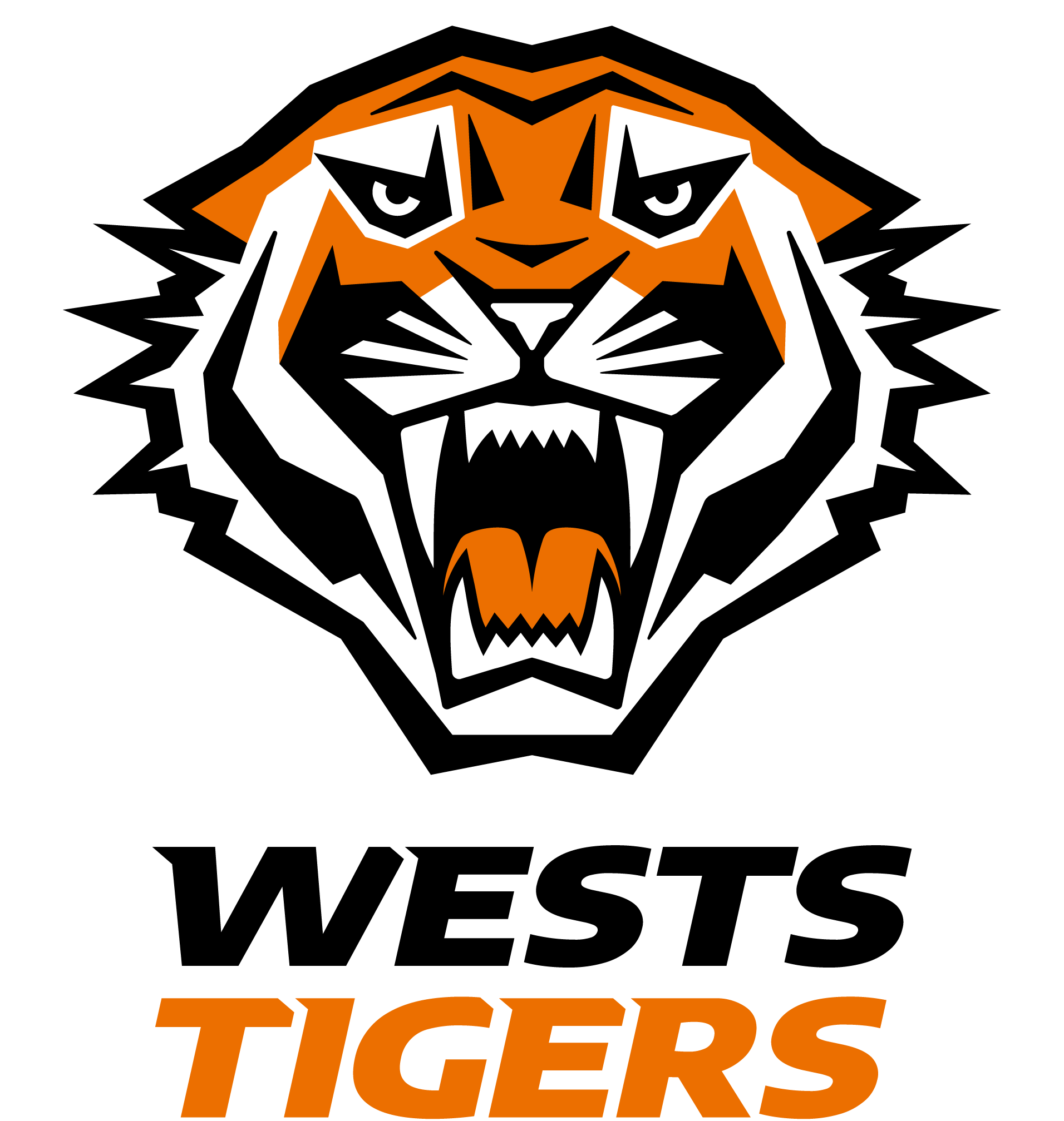
Ahead of the 2022 NRL season, Wests Tigers unveiled a refreshed logo that modernised the original design for contemporary branding needs. The update kept the tiger head as the central element but simplified details to enhance clarity and digital readability. The colours were streamlined to the club’s core palette — orange, black, and white — and finer lines were reduced to ensure better visibility across digital platforms, jerseys, and merchandise.
This redesign was part of a broader brand revitalisation aligned with the club’s new Centre of Excellence and future‑facing goals.
2023 – 25th Anniversary Identity
In late 2023, Wests Tigers unveiled a 25‑year anniversary logo to celebrate the coming 2024 NRL season. This commemorative mark acknowledges the club’s quarter‑century journey while providing a fresh visual marker for milestone celebrations on jerseys and merchandise.
3. Design Meaning
The Wests Tigers logo is rich in symbolism that reflects both the club’s merged heritage and its competitive ethos:
- Tiger Motif:
The tiger’s head — bold, fierce, and full of motion — represents strength, energy, and aggression. This captures the sporting spirit the club embodies, while also preserving a key link to the Balmain Tigers’ historic identity. - Stance and Expression:
The stylised tiger often appears ready to pounce or roar, symbolising competitive intensity and a hunger for success. Its aggressive expression and forward tilt communicate motion and ambition. - Typography & Shield Elements:
The club name, typically bold and angular, complements the tiger motif and reinforces the brand’s sporting presence. In earlier logos, a shield or “V” shape alluded to Western Suburbs’ traditional uniform design and the rugged, no‑nonsense character of their legacy. - Anniversary Variants:
Special edition logos like those for the 20th and 25th anniversaries incorporate milestone elements — such as ribbons, years, or alternate stylisation — acknowledging history while connecting with fans and membership celebrations.
4. Color Philosophy
The Wests Tigers’ colour palette — orange, black, and white — reflects the identity and heritage of both legacy clubs:
- Black and White: Taken from the Western Suburbs Magpies’ traditional colours; black often denotes strength, resilience, and formality.
- Orange/Gold: Originating from Balmain Tigers’ colours, orange (often referred to as gold in historical contexts) adds energy, warmth, and visual contrast.
- White: Used to balance and define shapes, enhancing clarity and visibility across jerseys, print, and digital media.
This combination ensures a striking visual identity that is instantly recognisable and strongly associated with the Tigers brand in rugby league.
5. Cultural and Community Identity
Wests Tigers represent a broad community footprint across Sydney’s inner‑west and south‑west regions. By honouring both foundation clubs’ names, colours, and traditions, the brand connects with fans from diverse backgrounds. The dual home ground arrangement between Leichhardt Oval and Campbelltown Stadium further strengthens this community identity, allowing supporters from both heritage clubs to feel equally represented.
The club also participates in initiatives like the Indigenous Round jerseys, which weave local Indigenous culture and heritage into special kits that respect Traditional Custodians of the lands where Wests Tigers play and train. These designs symbolise community connection, continuity, and respect for cultural history.
6. FAQs
Q: What does the Wests Tigers logo represent?
A: It symbolises the combined heritage of the Balmain Tigers and Western Suburbs Magpies — uniting the sporting legacy and colours of both clubs into a contemporary, fierce rugby league brand.
Q: When was the club formed?
A: The Wests Tigers began competition in the 2000 NRL season as a joint‑venture club.
Q: Why are the club colours orange, black, and white?
A: These colours are derived from the legacy teams: black and white from the Magpies; black and orange (sometimes described as gold) from the Tigers, creating a unified visual identity.
Q: Has the logo changed over time?
A: Yes — the original early‑2000s logo evolved with minor wordmark tweaks in 2005, a modernised logo unveiled ahead of the 2022 season, and special anniversary variants introduced for milestone years.