1. Brand Overview
Wesfarmers is one of the largest and most influential corporations in Australia. Founded in 1914 in Western Australia, the company originally began as a cooperative formed to provide services and merchandise to local farmers. Over time, it transformed into a major publicly traded conglomerate with operations across retail, chemicals, energy, industrial products, and healthcare.
Headquartered in Perth, Western Australia, Wesfarmers operates a wide range of businesses across Australia and New Zealand. The group owns several well-known retail and industrial brands, including:
- Bunnings Group
- Kmart Group
- Officeworks
- Australian Pharmaceutical Industries
With tens of billions of dollars in annual revenue and more than 100,000 employees, the company is considered one of Australia’s largest private employers and a major component of the Australian economy.
Wesfarmers’ mission focuses on sustainable growth, long-term shareholder value, and responsible corporate leadership, while continuing to expand across multiple industries.
2. Logo History
The Wesfarmers logo has evolved gradually alongside the company’s transformation from a regional agricultural cooperative to a global-scale conglomerate.
Early Cooperative Era (1914–1980s)
In its earliest years, Wesfarmers used simple branding associated with agricultural cooperatives and rural services. Logos and marks during this period were primarily functional rather than strongly design-driven.
Public Company Transition (1984)
When the company listed on the Australian Securities Exchange (ASX) in 1984, its branding became more corporate and recognizable. The name “Wesfarmers”, derived from “Westralian Farmers,” reflected the organization’s origins in Western Australia’s agricultural sector.
Modern Corporate Identity
As the company expanded into retail, industrial manufacturing, and consumer services, its visual identity was redesigned to match its broader corporate profile.
The modern logo features:
- A stylized green emblem above the wordmark
- A clean sans-serif typeface
- A single strong corporate color palette
This minimal design allows the logo to work effectively across digital media, signage, corporate documents, and investor communications.
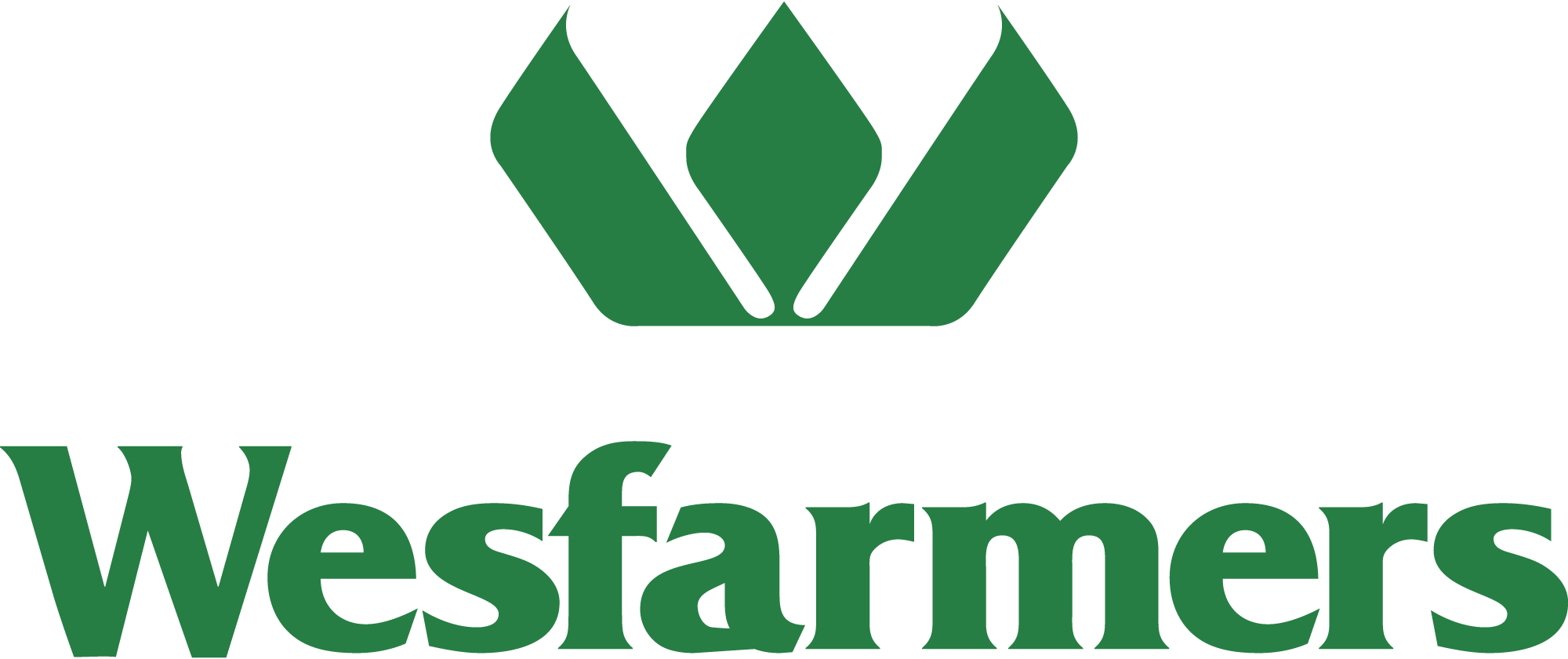
3. Logo Design Meaning
The Wesfarmers logo is simple yet symbolic, reflecting the company’s history and long-term growth strategy.
Leaf-Inspired Symbol
One of the most recognizable features of the logo is the three abstract shapes above the company name.
These shapes resemble:
- Leaves
- Plant shoots
- Upward arrows
The leaf-like design reflects the company’s agricultural roots and early mission of supporting farmers and rural communities. At the same time, the upward orientation symbolizes growth, progress, and forward momentum.
Modern Typography
The wordmark uses a clean, modern typeface that communicates professionalism and stability.
Key characteristics include:
- Balanced letter spacing
- Strong readability
- A corporate tone suitable for large multinational companies
This typographic simplicity reinforces the brand’s credibility and leadership in multiple industries.
Symbol of Expansion
The arrangement of the three shapes also suggests diversification, representing the company’s multiple business divisions.
Over the decades, Wesfarmers expanded beyond agriculture into retail, chemicals, industrial products, and consumer services—making the logo a subtle reflection of this diversified structure.
4. Color Philosophy
Color plays a crucial role in the Wesfarmers brand identity.
Green
Green is the primary color of the Wesfarmers logo.
Symbolically, green represents:
- Growth and prosperity
- Agriculture and nature
- Sustainability and environmental responsibility
This color choice directly connects to the company’s origins in farming and agricultural supply while also representing long-term sustainable growth.
White Background
White backgrounds are commonly used with the logo to provide:
- Visual clarity
- High contrast
- A modern corporate appearance
This combination ensures the logo remains clean and recognizable across both digital and print media.
5. Symbolism and Brand Identity
The Wesfarmers logo represents several key ideas central to the company’s identity.
Heritage
The plant-inspired design pays tribute to the company’s agricultural beginnings as a cooperative serving farmers in Western Australia.
Growth
The upward shapes reflect expansion and long-term progress, aligning with the company’s strategy of sustainable development and diversified investments.
Corporate Strength
The bold wordmark and minimalist design create a professional identity suitable for one of Australia’s largest publicly listed companies.
6. Brand Usage and Applications
The Wesfarmers logo appears across many different business contexts, including:
- Corporate reports and investor presentations
- Company headquarters and office signage
- Subsidiary company communications
- Digital platforms and official websites
- Media announcements and sustainability reports
Because Wesfarmers oversees multiple brands and divisions, the logo typically represents the parent corporation, while individual subsidiaries maintain their own brand identities.
7. FAQs (Frequently Asked Questions)
What does the Wesfarmers logo represent?
The logo represents growth, sustainability, and the company’s agricultural heritage. The leaf-like shapes symbolize prosperity and forward progress.
What color is the Wesfarmers logo?
The primary color is green, representing nature, growth, and sustainability.
When was Wesfarmers founded?
The company was founded in 1914 as a cooperative serving farmers in Western Australia.
What companies does Wesfarmers own?
Wesfarmers owns several major businesses including Bunnings, Kmart Group, Officeworks, and Australian Pharmaceutical Industries.
Where is Wesfarmers headquartered?
The company’s headquarters are located in Perth, Western Australia.