1. Brand Overview
Viktor&Rolf is a Paris‑based haute couture and ready‑to‑wear fashion house founded in 1993 by Dutch designers Viktor Horsting and Rolf Snoeren. The duo met in 1989 at the Arnhem Academy of Art & Design in the Netherlands and quickly established a reputation for conceptual, avant‑garde fashion that blends artistic storytelling with technical precision.
Known for pushing the boundaries of traditional fashion design, Viktor&Rolf work across categories including:
- Haute couture (formerly part of the official Paris couture calendar)
- Prêt‑à‑porter (ready‑to‑wear)
- Perfumes and fragrances
- Collaborative and conceptual collections
Their work is characterised by theatricality, irony, irony‑laden wit, and sculptural tailoring — often blending fashion with performance art and conceptual exploration.
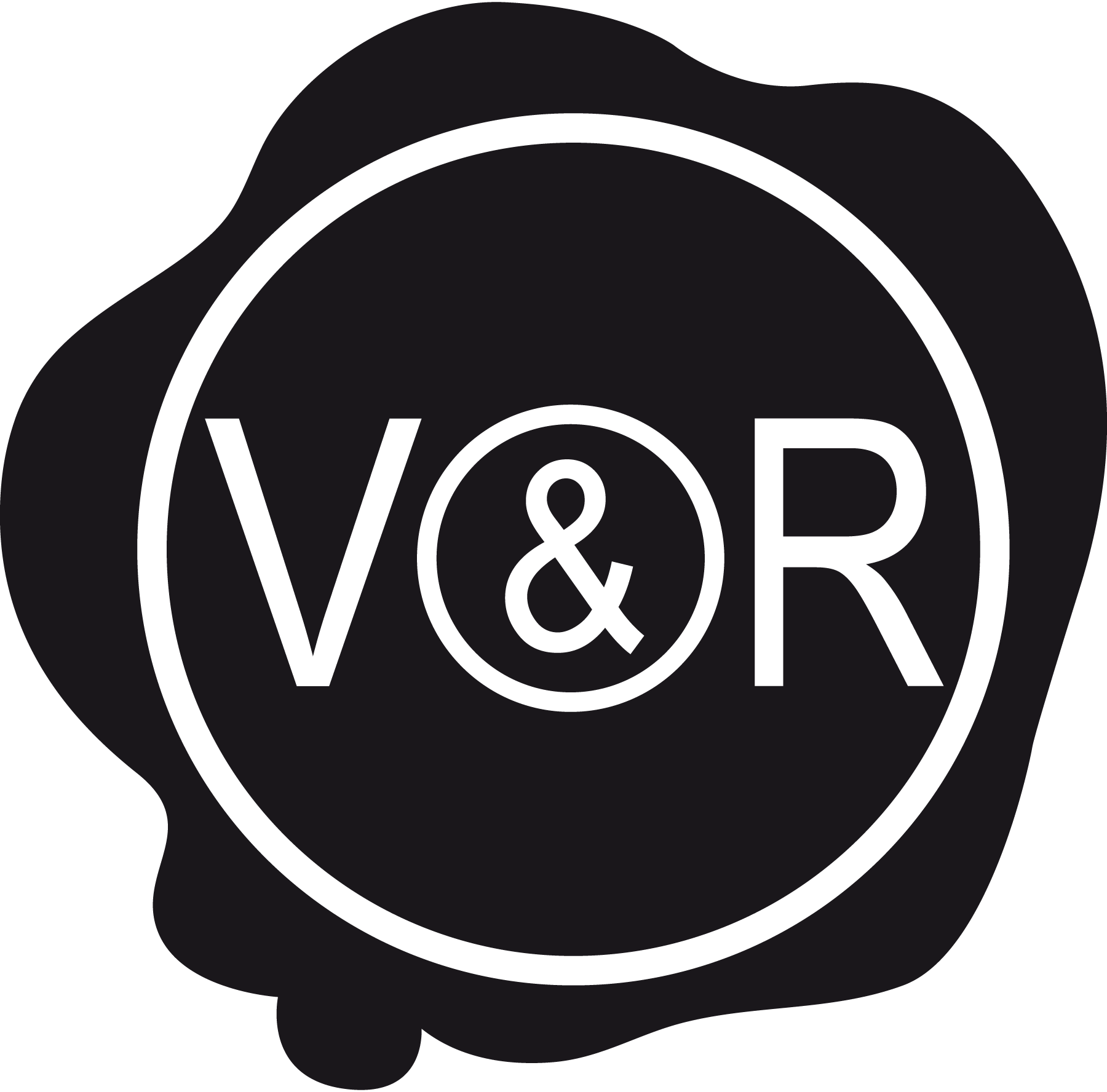
2. Logo History and Identity
The Viktor&Rolf logo is simple, elegant, and typographically refined — much like the design philosophy of the fashion house itself. While the fashion duo’s pieces are often bold or experimental, their logo opts for understated precision and clarity, embodying a timeless approach to brand identity.
Evolution Over Time
Unlike some corporate brands with multiple logo iterations, Viktor&Rolf’s visual identity has remained relatively consistent since the brand’s inception:
- A minimal wordmark built around a refined and balanced typeface
- Clean, uppercase lettering that conveys professionalism and artistic seriousness
- The ampersand (&) as a central visual connector between the designers’ names
This restrained brand mark allows the focus to remain on the designs themselves, while the logo functions as a marker of authenticity and quality across runway shows, retail, packaging, and digital platforms.
3. Logo Design Meaning
The Viktor&Rolf logo’s design is deeply intertwined with the brand’s philosophy:
Typography and Precision
The logo uses a clean, serif‑inspired wordmark that is both modern and classic. Serif typefaces are often associated with:
- Heritage and elegance
- High fashion and editorial polish
- Attention to craft and structure
This choice communicates Viktor&Rolf’s position within the fashion world as a design‑driven, intellectually engaged label rather than merely a commercial brand.
The Ampersand (&) as Identity Core
The ampersand is more than just punctuation in the logo — it visually and conceptually joins two individual designers into a single creative entity. It symbolises:
- Collaboration and partnership
- Dual creative voices working in harmony
- The intersection of Viktor Horsting’s and Rolf Snoeren’s perspectives
That central “&” gives the logo a sense of balance and partnership, emphasising their joint authorship.
Minimalist Aesthetic
By keeping the logo minimal and typographically focused, Viktor&Rolf reinforces:
- A luxury appeal
- Artistic seriousness
- A modern yet timeless identity that isn’t driven by fads
This restraint mirrors the way luxury fashion brands often use simple wordmarks to let their work — not the brand logo — take centre stage.
4. Colour Philosophy
While the PNG/SVG version you saw may be presented in black or monochrome, the typical colour philosophy for the Viktor&Rolf logo includes:
Black
- Represents luxury, authority, and timelessness
- Provides maximum contrast on packed runway imagery, product tags, and lookbooks
White
- Used for negative space and editorial imagery
- Conveys purity and sophistication
The duo’s brand identity leans on monochrome elegance because it works across a wide range of applications — from printed lookbooks and couture show invitations to minimalist website layouts and retail signage.
This palette ensures that the logo never competes with its own designs; instead, it provides a harmonious visual anchor.
5. Brand Identity & Cultural Significance
The Viktor&Rolf logo plays an important role in how the brand is perceived culturally — both in and beyond the fashion industry:
Conceptual and Artistic Influence
Viktor&Rolf are known for blurring the line between fashion and art — their runway shows often take the form of performance pieces or conceptual exhibitions that challenge norms. The logo’s minimal design provides a stable framework for their creative expression.
Recognition in Global Fashion
Although not as loudly branded as commercial fashion labels, Viktor&Rolf’s logo features prominently in:
- Fashion week visuals
- Luxury retail boutiques
- Perfume bottles and packaging
- Editorial fashion spreads
This wordmark functions as a badge of artistic credibility within fashion narratives that prioritise innovation and critique.
Fragrance and Lifestyle Extensions
Viktor&Rolf has extended its brand into fragrances — notably Flowerbomb, Spicebomb, and Bonbon — where the logo appears as a sign of design excellence and luxury perfume craftsmanship.
6. FAQs (Frequently Asked Questions)
Q: What does the Viktor&Rolf logo represent?
A: The logo represents the collaborative creative identity of designers Viktor Horsting and Rolf Snoeren. Its clean, minimal wordmark conveys elegance and artistic seriousness.
Q: Why is the ampersand (&) significant in the logo?
A: The ampersand symbolises partnership and collaborative creativity, highlighting that Viktor&Rolf is a dual‑designer brand built on the equal creative contributions of both founders.
Q: Who founded Viktor&Rolf?
A: The brand was founded by Viktor Horsting and Rolf Snoeren in 1993 after they met at the Arnhem Academy of Art & Design.
Q: What types of products use the Viktor&Rolf logo?
A: The logo appears on haute couture and ready‑to‑wear labels, perfume and fragrance packaging, lookbooks and campaigns, and in luxury retail stores.
Q: What does the logo’s minimal design say about the brand?
A: Its minimalist, refined wordmark reflects the brand’s identity as a conceptual, design‑driven fashion house — prioritising creative expression over loud branding.