University of Waterloo Brand Overview
The University of Waterloo is one of Canada’s leading public research universities, recognized globally for innovation, academic excellence, and its pioneering cooperative education programs. Founded in 1957 in Waterloo, Ontario, the institution has developed a strong reputation in engineering, technology, business, and scientific research.
The University of Waterloo brand represents forward-thinking education, experiential learning, and research-driven solutions. It stands for innovation, leadership, and a commitment to preparing students for real-world challenges. The visual identity of the university reflects both its academic heritage and its modern, progressive outlook.
Logo History
The University of Waterloo logo is rooted in traditional academic heraldry while evolving to meet modern branding standards.
Early Foundation (1957–1960s)
Shortly after its establishment, the university adopted an official coat of arms to symbolize institutional authority and academic tradition. The shield became the core symbol of the university’s identity.
Heraldic Recognition
The coat of arms was formally granted and incorporated into official materials. It reflected European academic traditions commonly seen in established universities worldwide.
Modern Refinements
Over the years, the logo was refined to improve clarity, scalability, and digital adaptability. While the shield design remained consistent to preserve tradition, typography and layout were modernized for better readability and brand consistency across print and digital platforms.
Today’s logo maintains its historic shield while presenting a clean, professional wordmark suitable for global recognition.
Design Meaning
The University of Waterloo logo carries strong symbolic meaning through its elements:
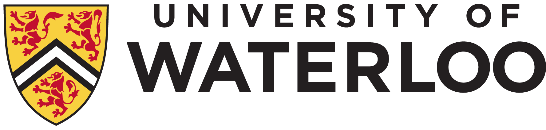
Shield
The shield represents protection, strength, honor, and academic integrity. It reinforces the university’s stability and long-standing educational values.
Three Lions
The red lions within the shield symbolize courage, leadership, and excellence. In heraldic tradition, lions represent authority and strength—qualities aligned with academic achievement.
Chevron
The chevron shape within the shield represents protection and support. In an educational context, it symbolizes guidance and the university’s role in nurturing student development.
Typography
The clean and formal wordmark reflects professionalism, credibility, and clarity. It ensures the brand appears modern while respecting tradition.
Together, these elements communicate a balance between heritage and innovation.
Color Philosophy
The University of Waterloo logo uses a distinctive and meaningful color palette:
Black
Represents authority, sophistication, and academic seriousness.
Gold
Symbolizes excellence, prestige, and high achievement.
Red
Conveys strength, determination, and leadership.
White
Suggests clarity, transparency, and simplicity.
This combination creates a powerful and respected academic identity that aligns with global university branding standards.
FAQs
1. What does the University of Waterloo logo represent?
It represents academic excellence, institutional strength, and leadership through its heraldic shield and symbolic elements.
2. Why does the logo feature lions?
The lions symbolize courage, authority, and strength—traditional qualities associated with academic institutions.
3. When was the logo first introduced?
The coat of arms was established shortly after the university’s founding in the late 1950s and has been refined for modern use.
4. What are the official colors of the logo?
The logo uses black, gold, red, and white to reflect prestige, excellence, and clarity.
5. Is the University of Waterloo logo free to use?
No. The logo is a protected trademark, and commercial or promotional use typically requires official permission from the university.