Brand Overview
Founded in 2004 by American designer Tory Burch, the Tory Burch brand blends classic American sportswear with bohemian and eclectic influences. From its first boutique in Manhattan’s Nolita district, the label quickly gained a devoted following for its refined yet accessible aesthetic, merging:
- Timeless tailoring
- Easy‑to‑wear silhouettes
- Global patterns and textures
- Refined accessories
Tory Burch’s product range includes women’s ready‑to‑wear, handbags, shoes, accessories, watches, beauty products, and a lifestyle cosmetics line. The brand is also known for its commitment to women’s empowerment, notably through the Tory Burch Foundation, which supports female entrepreneurs.
The Tory Burch logo plays a central role in expressing this identity — appearing on handbags, footwear, apparel, packaging, boutiques, digital media, and global advertising campaigns.
Logo History
The Tory Burch logo did not emerge fully formed overnight — it evolved as the brand expanded and defined its visual voice.
Early Identity (2004–2007)
In its earliest days, the brand employed simple, elegant wordmarks to anchor its name in the fashion landscape. These early marks often emphasized classic serif or clean sans‑serif letterforms reflective of the polished yet approachable style the label stood for.
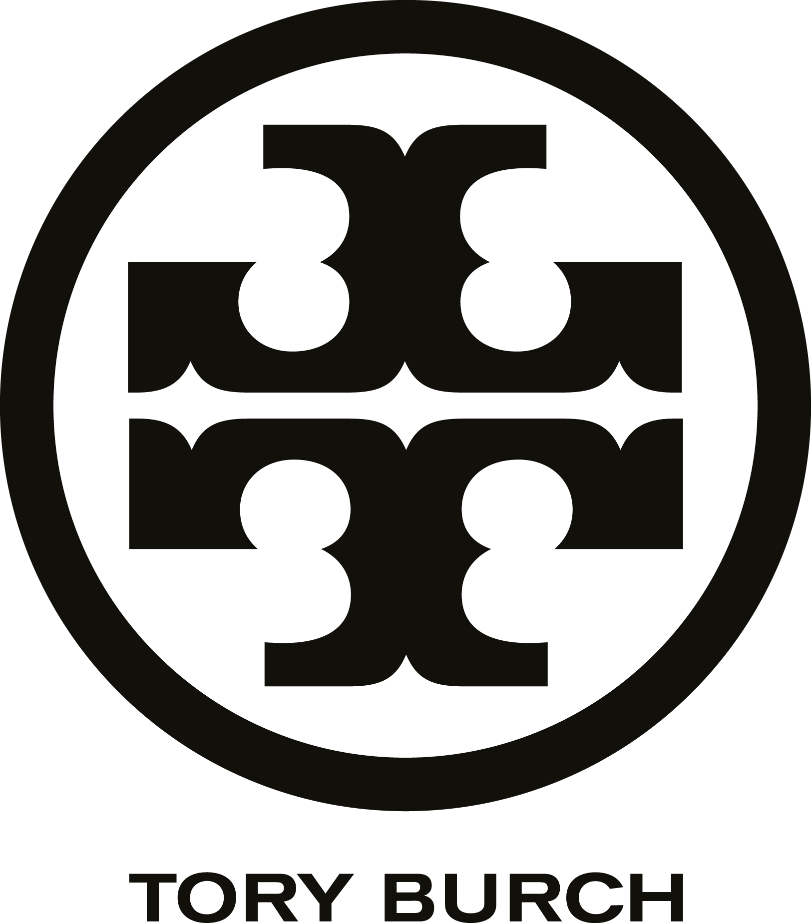
Introduction of the Iconic “Double‑T” (2008)
As Tory Burch matured and expanded globally, the brand adopted its now‑signature emblem: the “Double‑T” medallion logo. This geometric, symmetrical symbol became the visual centerpiece of the brand’s identity, serving as a recognizable motif across a broad range of products and marketing.
Global Standardization (2010s – Present)
By the early 2010s, the logo had been fully standardized across all touchpoints. Rather than periodically redesigning the identity, the brand chose consistency and refinement — ensuring that the emblem remained instantly identifiable whether embossed on leather, stitched to fabric, printed on packaging, or displayed digitally.
Today’s logo maintains continuity with its early presentation while benefiting from visual subtleties optimized for clarity, legibility, and refinement.
Design Meaning
The Tory Burch logo stands out not because it’s overly complex, but because it is meaningful, balanced, and symbolic. Its design communicates a nuanced mix of heritage, accessibility, and modern elegance.
1. The “Double‑T” Emblem
At the heart of the logo is the double T — a mirrored, interlocking, symmetrical monogram that serves as the brand’s signature mark. This emblem carries layered meaning:
Heritage and Monogram Tradition
Monograms have long been associated with:
- High fashion houses
- Personal signatures
- Ownership and craftsmanship
The mirrored T recalls classic historical emblems where personal initials were stylized into circular, symmetrical forms. In Tory Burch’s case, it functions both as a personal signature and a brand signature.
Symmetry and Balance
Symmetry in logo design is often associated with:
- Visual stability
- Harmony and proportion
- Aesthetic completeness
The mirrored T emblem exudes a measured elegance while remaining playful — a visual equivalent of Tory Burch’s design philosophy.
Circular Containment
Encasing the mirrored T within a circular or rounded square space:
- Enhances recognizability
- Frames the symbol like a medallion
- Echoes motifs found in jewelry, metalwork, and luxury accessories
This framing turns the logo into a graphic medallion — one that works beautifully as a hardware piece on handbags and shoes, as well as a printed emblem on garments and tags.
Color Philosophy
Color plays a crucial role in how the Tory Burch logo is perceived — it shifts subtly depending on context while always reinforcing the brand’s aesthetic of refined confidence.
Classic Neutrals
The logo most commonly appears in neutral tones such as:
- Black
- Gold or metallic tones
- White or off‑white
- Deep brown or espresso
These colors convey:
- Timeless elegance: Neutral palettes endure across seasons and trends.
- Sophistication: Metallic golds emphasize luxury without ostentation.
- Contrast and legibility: Black and white combinations ensure clarity across media.
Warm Accent Palettes
In some product lines, the logo appears with subtle accent colors sourced from the brand’s seasonal palettes:
- Warm reds and terracottas
- Deep greens and navies
- Soft pastels and earth tones
These colors complement the neutral logo while adding emotional warmth and seasonal variation — reinforcing the fashion collection’s mood without altering the core identity.
Materials‑Driven Appearance
The logo frequently appears as:
- Embossed leather
- Gold or silver hardware
- Debossed rubber
- Printed metallic foil
In each case, the material choice interacts with color to elevate the logo’s presence — reinforcing both quality and craftsmanship.
Why the Logo Works
The enduring success of the Tory Burch logo is rooted in several key design strengths:
1. Memorability
The mirrored T emblem is distinct and instantly recognizable. It functions as a stand‑alone symbol that doesn’t require the full brand name to convey identity — much like the double C of another luxury brand.
2. Versatility
The logo works beautifully across contexts:
- Small jewelry and hardware
- Large boutique signage
- Digital interfaces and social media
- Seasonal marketing materials
Its balanced geometry brings clarity at every scale.
3. Emotional Resonance
Through symmetry and classic monogram cues, the logo evokes:
- Luxury heritage
- Personal signature identity
- Craftsmanship and detail
This aligns perfectly with a brand built on modern classics and elevated everyday style.
4. Visual Harmony
The geometry of the logo — the mirrored T and its containment — creates a pleasing sense of balance that’s not only aesthetically strong but also versatile for patterning, surface design, and graphic application.
5. Alignment with Product Philosophy
Tory Burch’s aesthetic emphasizes:
- Effortless sophistication
- Wearable luxury
- Refined but playful design
The logo encapsulates these qualities visually — a geometric mark that is formal yet fresh, grounded yet expressive.
Frequently Asked Questions (FAQs)
What does the Tory Burch logo represent?
It represents refined, accessible luxury. The mirrored T emblem functions as both a monogram and a graphic symbol of balance, sophistication, and heritage.
Has the Tory Burch logo changed over time?
The logo has been refined but not radically redesigned. Its core identity — the mirrored T emblem — has remained consistent, evolving subtly to improve clarity and adaptability.
Why is the logo often paired with neutral or metallic tones?
Neutral tones ensure timelessness and versatility, while metallics (like gold) evoke luxury and premium quality. Together, they reinforce the brand’s fashion identity.
Can the logo be used at very small sizes?
Yes. Because of its balanced geometry, the logo works at small scales (e.g., handbag hardware, jewelry, tags) as well as large formats (boutique signage and digital banners).
Is the Tory Burch logo trademarked?
Yes. The Tory Burch logo is a registered trademark and an essential part of the brand’s intellectual property and identity guidelines.
Final Thoughts
The Tory Burch logo is a sophisticated visual embodiment of a modern fashion brand with deep roots in classic styling and contemporary elegance. Its mirrored T emblem is simple yet powerful — a mark that communicates balance, heritage, and versatility.
Through carefully chosen color treatments, refined typography, and thoughtful geometric design, the logo bridges fashion tradition and modern identity — making it both instantly recognizable and enduringly stylish.