Thyssen Group / ThyssenKrupp Logo — Brand Overview
The Thyssen Group logo (most commonly seen today as the ThyssenKrupp logo) represents one of the largest and most storied industrial conglomerates in the world — a company deeply rooted in German engineering, materials innovation, and global industrial solutions. While “Thyssen Group” can refer to brand assets associated with the historical Thyssen AG, today’s recognizable corporate identity belongs to ThyssenKrupp AG, the multinational industrial powerhouse born from one of history’s most significant mergers.
This logo isn’t just a visual mark — it’s a symbol of industrial heritage, technological evolution, and transgenerational innovation. Across decades and hundreds of business units from steel to elevators to engineering services, the logo has come to signify reliability, modernity, and German industrial prowess.
Logo History
The roots of the Thyssen logo go back long before today’s corporate branding:
- Origins in Thyssen AG:
The original Thyssen AG was founded in 1891 as a major German steel manufacturer by the Thyssen family, based in Hamborn, Germany. Over time, Thyssen became one of the dominant players in European steel production. - The Thyssen “Arch” (1976):
In the mid‑20th century, the company began using an iconic logo version that featured an “arch” element — a stylized graphic representing the Thyssen identity and symbolizing its overarching reach across varied industrial activities. This symbol originated when August Thyssen‑Hütte AG acquired Rheinstahl AG in the 1970s and adopted the Rheinstahl arch, merging it with Thyssen’s own trademark, making it a visual bridge over its expanding operations. - Merger to Form ThyssenKrupp (1999):
The modern chapter began when Thyssen AG merged with Krupp, another German industrial titan, in 1999 to form ThyssenKrupp AG, integrating decades of history, expertise, and product legacy into one unified entity. - Unified Brand Identity (2015):
In 2015, ThyssenKrupp introduced a refreshed and unified logo that merged historical elements from both the Thyssen arch and the Krupp rings, accompanied by an updated wordmark using clean, modern typography. This design reflects the company’s evolution from a traditional steelmaker to a diversified, globally integrated industrial and engineering group.
Design Meaning & Symbolism
The ThyssenKrupp logo is rich in symbolic components that blend legacy with forward‑thinking vision:
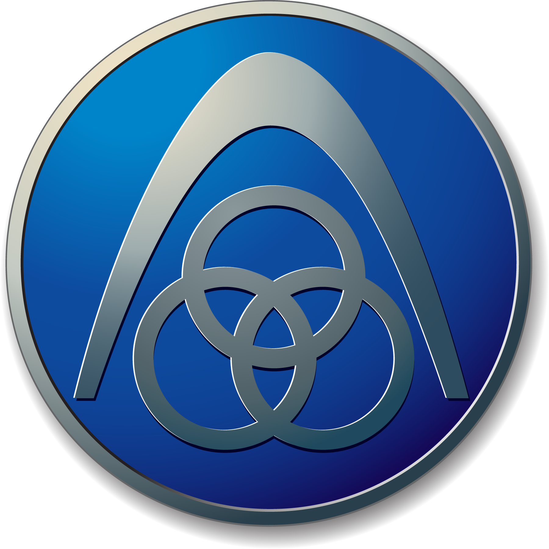
The Interlocking Rings
At the heart of the logo, three interlocking rings are derived from the historic Krupp symbol used since the 19th century. Originally, these rings referenced Krupp’s patented seamless railway tires — a major industrial innovation at the time — and over the years became a visual metaphor for strength, interconnection, and industrial unity.
The Arch Element
Above or woven into the rings is an arch‑like curve, a visual legacy from the original Thyssen “open T” or “arch” symbol. It represents continuity, protection, and an overarching reach — capturing how the company’s activities span across sectors and markets worldwide.
Typography & Wordmark
The modern logo pairs these graphic forms with a custom, lowercase wordmark, spelled as thyssenkrupp in a clean and stable sans‑serif typeface. The lowercase style signals humility, collaboration, and accessibility, while the simplicity conveys clarity, modernity, and precision in engineering — values that define the brand’s ethos today.
Color Philosophy
The color palette of the ThyssenKrupp logo reinforces its visual identity and emotional impact:
- Industrial Blue:
The primary shade of blue used reflects trust, technical excellence, and strength, resonating with the company’s engineering heritage and global reliability. Blue is also associated with clear skies, stability, and confidence — qualities customers and partners expect from industrial solutions. - Monochrome / Neutral Options:
In some applications, the logo appears in neutral tones like black or white, especially in formal contexts such as corporate communications or documentation, emphasizing clarity and professionalism.
Color in the ThyssenKrupp logo doesn’t just appeal aesthetically — it underscores a deep, unified identity rooted in performance and dependability.
Logo Evolution — A Visual Journey
The Thyssen brand evolved significantly over time:
- Pre‑Merger Logos: Separate identities existed for Thyssen and Krupp, with their own visual marks. The Thyssen arch and Krupp rings stood independently, each reflecting a distinct industrial legacy.
- Post‑Merger Integration: After the 1999 merger, the challenge was to forge a single visual identity that celebrated both heritages. This was gradually refined over years of design work, culminating in a unified logo that visually synthesizes both histories.
- Modern Refresh (2015 Onwards): The current identity signals not just unity but also a shift toward diversified technological excellence, where engineering spans from materials to elevators, automotive parts, and advanced services across continents.
Brand Significance & Global Identity
The ThyssenKrupp logo carries meaning beyond corporate branding:
- Industrial Legacy: It visually ties together two centuries of German industrial evolution — from steel production and metallurgical innovation to global mechanical engineering.
- Unified Global Presence: By combining elements from both legacy companies, the logo symbolizes how the group operates as one cohesive entity across markets in Europe, Asia, America, and beyond.
- Innovation & Collaboration: The graphic motif of intertwining rings and arch reflects not just historical roots but also partnerships, cooperation, and connectivity — core drivers of modern industry.
Frequently Asked Questions (FAQs)
Q1: What does the ThyssenKrupp logo represent?
It unifies two historic industrial brands — Thyssen and Krupp — and symbolizes strength, innovation, and interconnected engineering solutions in a modern global industrial group.
Q2: Why are there three rings in the logo?
The three rings originate from the Krupp emblem, historically linked to Krupp’s inventions such as seamless railway tires, and now symbolize unity, cooperation, and combined industrial capabilities.
Q3: What does the arch symbolize?
The arch element comes from the Thyssen logo lineage and visually represents an overarching reach, continuity, and structural integrity across sectors.
Q4: Why is the name written in lowercase?
Using all lowercase letters conveys modernity, accessibility, and unity — reflecting a brand that is innovative yet approachable.
Q5: Is ThyssenKrupp the same as the original Thyssen Group?
The original Thyssen AG became part of ThyssenKrupp AG after the merger with Krupp in 1999. Today’s logo is tied to the merged entity and its global industrial identity.