1. Brand Overview
The Sydney Roosters are a professional rugby league club based in Sydney, New South Wales, Australia, competing in the top‑tier National Rugby League (NRL). Founded in 1908 as the Eastern Suburbs District Rugby League Football Club, the Roosters are one of the oldest and most successful clubs in Australian rugby league history, boasting multiple premierships and a strong reputation on and off the field.
The club’s brand identity is steeped in tradition and pride, with the iconic rooster emblem playing a central role in its visual representation. The red, white, and blue colours have been a fixture of the Roosters’ identity since the beginning, reflecting both sporting heritage and a connection to Sydney’s Eastern Suburbs.
2. Logo History
The Sydney Roosters logo has evolved over decades in line with the club’s development, while always maintaining its core imagery of a rooster—a symbol of strength, courage, and identity.
Early Era (1908–1966)
During the early decades of the club, jerseys typically did not feature an emblem as part of the official uniform. Instead, the team was colloquially referred to as the “Tricolours” due to their distinctive red, white, and blue striped jerseys.
First Official Logo (1967–1977)
After a winless season in 1966, the club adopted its first official logo in 1967, featuring a rooster and the slogan “Easts to Win,” marking the first time a formal crest was worn.
Eastern Suburbs Logo (1978–1994)
In 1978, the club rebranded the crest, dropping the original motto and instead using a bold rooster design within a shield marked with the name Eastern Suburbs. This version stayed with the club for nearly two decades and became iconic among supporters.
Sydney City Roosters (1995–1999)
As the game expanded and club identities modernised, the team updated its name to Sydney City Roosters and modified the logo for broader appeal and commercial presence.
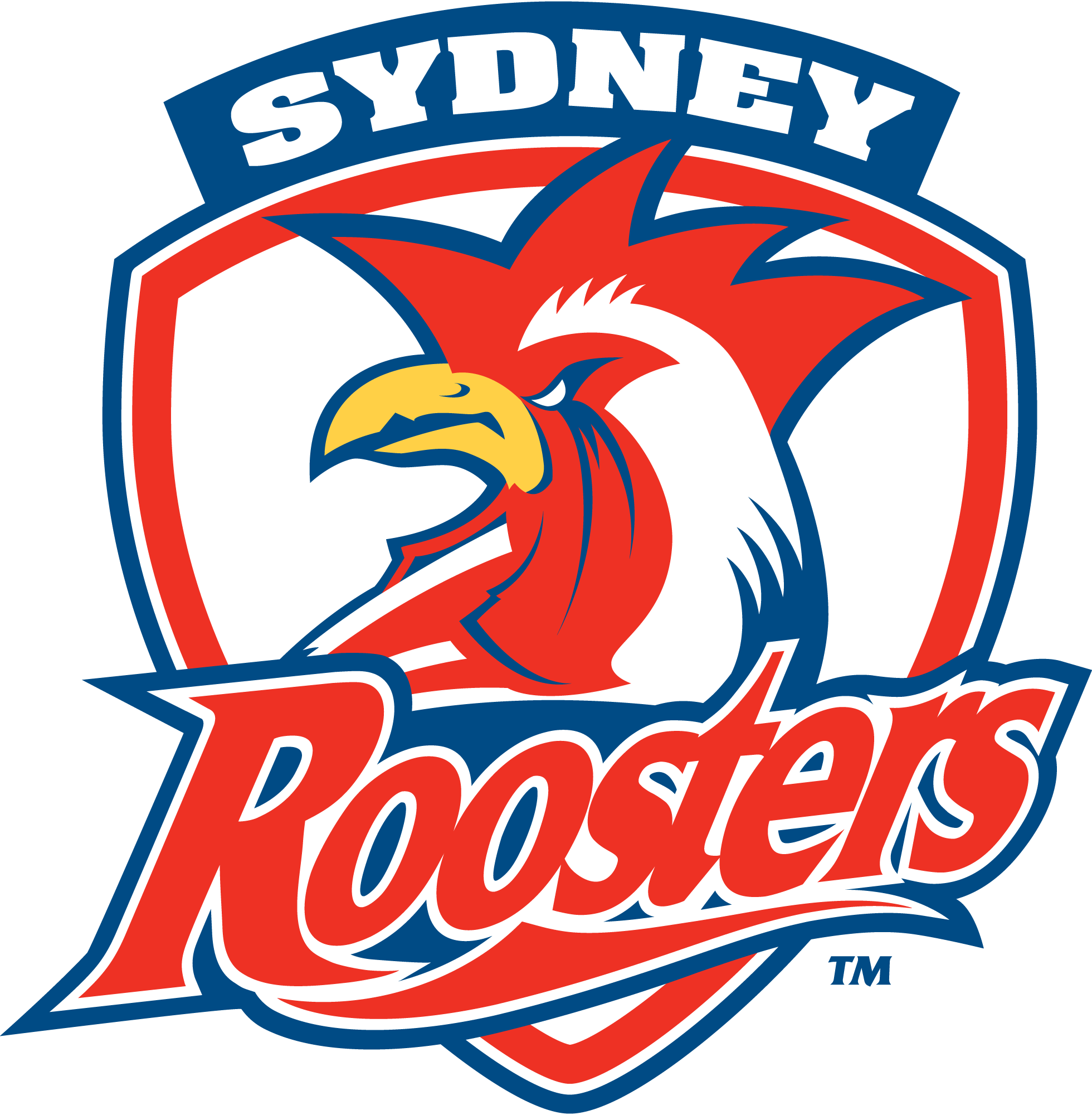
Modern Logo (2000–Present)
In the year 2000, the club officially shortened its name to Sydney Roosters and debuted the current logo that features a stylised, more aggressive rooster head within a shield, reinforcing its strong competitive image. This version has remained in use for more than two decades and is recognised by fans worldwide.
3. Logo Design Meaning
The Sydney Roosters logo carries deep meaning tied to the club’s values and history:
Rooster Imagery
The rooster symbol represents pride, courage, and competitive spirit—attributes that align with the team’s approach to rugby league. The choice of a rooster was influenced by early mascot associations and is believed to have derived from inspiration tied to the French national team’s emblem, which was known as “le coq.”
Shield Shape
The shield silhouette surrounding the rooster communicates strength, defence, and tradition. Sporting teams often use shield forms to emphasise unity and resilience on the field.
Typography
The words “Sydney” and “Roosters” are typically included above and below the central image. The bold lettering reinforces identity and geographic pride, emphasising the club’s connection to Australia’s largest city.
4. Colour Philosophy
The Sydney Roosters logo’s colours are iconic and integral to the club’s identity:
Red
Red conveys energy, aggression, passion, and drive, reflecting the team’s fiery competitive nature on the field.
White
White balances the design, symbolising clarity, unity, and tradition. It also complements the vibrant red to maintain visual contrast across uniforms and merchandise.
Blue
Blue signifies loyalty, stability, and professionalism—a nod to the club’s long heritage in rugby league and its standing as a foundational team in the sport. These colours have formed part of the club’s identity since its earliest days.
Together, these colours create a bold and dynamic identity that is instantly recognisable to fans and rivals alike.
5. Cultural and Sporting Importance
Beyond its visual impact, the Sydney Roosters logo serves as a symbol of community identity and sporting legacy:
- It appears on jerseys, merchandise, and memorabilia, making it familiar to generations of fans.
- The emblem represents club heritage, having evolved alongside major eras in rugby league history.
- It’s used across official media, digital platforms, and promotional content to unify fans and strengthen brand presence.
- Special editions of jerseys, such as Indigenous Round designs, incorporate cultural art alongside the traditional logo to celebrate diversity and community engagement.
6. FAQs (Frequently Asked Questions)
Q: What does the Sydney Roosters logo represent?
A: The logo represents the Sydney Roosters rugby league club, with the rooster symbolising pride, courage, and competitive spirit.
Q: When was the Sydney Roosters club founded?
A: The club was established in 1908 as the Eastern Suburbs District Rugby League Football Club.
Q: Why is the rooster used in the logo?
A: The rooster was inspired by early mascot associations and likely influenced by the French national team emblem, representing strength and fighting spirit.
Q: What are the official colours of the Sydney Roosters logo?
A: Red, white, and blue are the official colours, used consistently in the club’s branding throughout its history.
Q: What file formats are available for the Sydney Roosters logo?
A: The logo is commonly available in PNG, SVG, JPG, EPS, and vector formats for download and use in design projects.