🎮 Brand Overview
Super Mario Bros. Wonder is a platform video game developed and published by Nintendo for the Nintendo Switch. It was released on 20 October 2023, marking the return of the classic side‑scrolling Super Mario Bros. style — the first new traditional 2D Mario game in over a decade.
The game is set in the whimsical Flower Kingdom, where Mario and his friends must stop Bowser after he uses the magical Wonder Flower to fuse his castle with the kingdom’s and spread chaos.
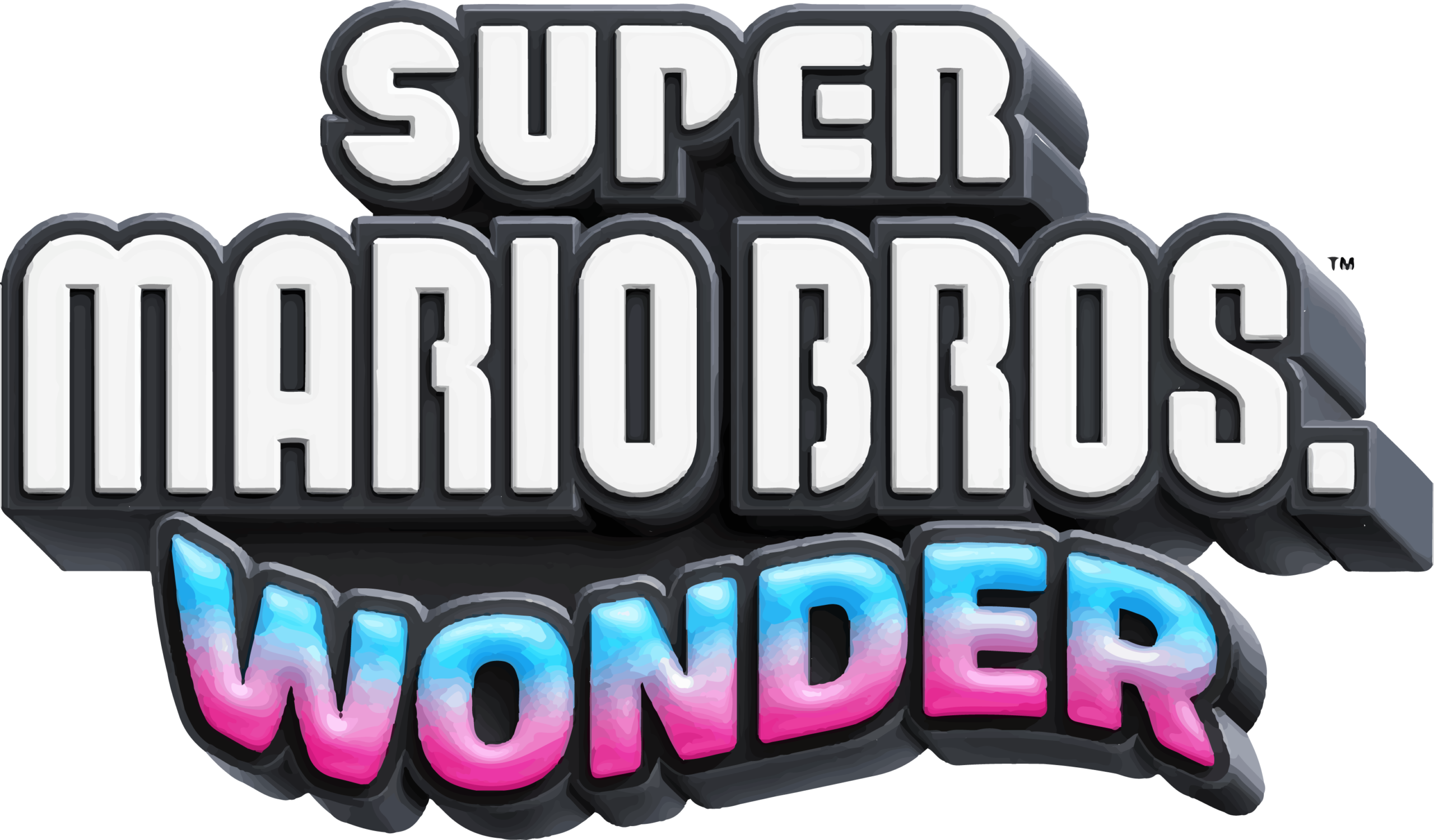
(Note: The logo you linked is the official branded title treatment created by Nintendo for this game.)
🏷️ Logo History
Unlike corporate logos that evolve slowly over decades, Super Mario Bros. Wonder’s logo is tied to a specific product — a game title — and was introduced as part of the marketing rollout in mid 2023 around the game’s Nintendo Direct announcement.
As part of the long‑running Super Mario Bros. franchise, the Wonder logo builds on decades of Mario branding tradition, particularly the iconic Super Mario wordmark that has been updated periodically since the original Super Mario Bros. in 1985.
Nintendo did not reveal an official symbolic meaning behind the logo beyond it being a distinct visual identity for this specific title — much like the naming and logo design approaches used for other Mario titles such as Super Mario Galaxy, Super Mario 3D World, and the New Super Mario Bros. series.
🔍 Logo Design Meaning
While Nintendo hasn’t published a formal interpretation of the Super Mario Bros. Wonder logo’s design, its elements reflect consistent Mario branding principles:
🍄 Classic Franchise Typography
- The Super Mario Bros. portion uses the familiar bold, rounded Mario typeface that evokes nostalgia, energy, and playfulness — traits long associated with the franchise.
- This typeface balances bold readability with whimsical personality, grounding the logo in decades of established Mario identity.
🌟 “Wonder” Emphasis
- The word “Wonder” is presented with more playful styling and often color or arrangement that suggests magic, surprises, and exploration, reinforcing the game’s central theme of transformative gameplay driven by the Wonder Flower mechanic.
- This part of the logo visually communicates curiosity and excitement, fitting a game that intentionally plays with unpredictable level effects.
🎨 Modern Yet Familiar
- The logo blends classic Mario visual language with new aesthetic touches to signal both continuity with past games and official identity for this new chapter in the franchise.
🎨 Color Philosophy
The Super Mario Bros. Wonder logo draws on the established Mario color palette — bright, high‑contrast hues that evoke fun, energy, and accessibility:
- Red: Often associated with Mario himself — energy, adventure, and heroism.
- Yellow / Gold: Happiness, optimism, and discovery — tied to power‑ups and positive experiences in gameplay.
- Blue & Green Accents: Balance and harmony — echoing the environments (sky, grasslands) common in Mario levels.
- Black Outlines: Boldness and clarity — ensures the logo stands out in print, video, and digital storefront contexts.
These colors reflect both Mario brand heritage and the vibrant, whimsical world players explore in Wonder.
📌 Brand Identity & Franchise Context
Super Mario Bros. Wonder serves as a flagship entry in a historic gaming franchise:
- It embraces classic side‑scrolling platforming while introducing new mechanics like the Wonder Flower, which can dramatically alter levels and create unpredictable challenges.
- The logo and game title represent both continuity with the Super Mario Bros. lineage and innovation within that lineage by highlighting “Wonder” as the unique hook of this title.
This approach aligns with Nintendo’s broader strategy of refreshing beloved properties for modern audiences without forsaking their iconic identities.
❓ Frequently Asked Questions (FAQs)
Q: What does the Super Mario Bros. Wonder logo stand for?
A: It is the official game title logo for Super Mario Bros. Wonder, symbolizing this specific entry in the Super Mario Bros. franchise with an emphasis on wonder‑themed gameplay.
Q: Why is “Wonder” styled differently?
A: The styling highlights the key theme of Wonder Flowers — unique powerups that dramatically change levels — and visually separates this game’s identity from earlier Mario titles.
Q: Is the logo part of larger Mario branding?
A: Yes. It builds on the iconic Super Mario Bros. branding while adding specific visual cues for this game’s narrative and thematic focus.
Q: Where is this logo used?
A: In promotional materials, game packaging, digital storefronts, trailers, merchandise, and other official Nintendo communications related to Super Mario Bros. Wonder.
🧠 Summary
The Super Mario Bros. Wonder logo is a modern embodiment of decades of Mario franchise identity. It marries the nostalgic typography and color palette familiar to long‑time fans with a distinct emphasis on the word “Wonder,” signaling the new gameplay themes and creativity at the heart of this 2023 title. Its design reinforces brand continuity, emotional appeal, and energetic character — all hallmarks of Nintendo’s enduring approach to game branding.