Spencer Gifts Logo – Brand Overview, History, Design Meaning & Color Philosophy
The Spencer Gifts logo represents one of the most recognizable specialty retail brands in North America. Known for its bold personality, edgy humor, and pop-culture merchandise, Spencer’s has built a strong identity that connects with generations of shoppers. From mall culture in the 1980s and 1990s to modern online retail, the brand has maintained a distinctive visual presence that reflects its playful and rebellious spirit.
If you are looking to download the Spencer Gifts logo in PNG or SVG format, understanding the story behind the brand and its visual identity makes the design even more meaningful.
Brand Overview
Spencer Gifts was founded in 1947 by entrepreneur Max Spencer Adler. The company originally started as a mail-order catalog business before transitioning into physical retail stores. Over time, Spencer’s became a staple of shopping malls across the United States and Canada.
The brand is widely known for selling:
- Novelty gifts
- Graphic T-shirts
- Pop culture merchandise
- Room décor and accessories
- Gag items and humorous products
- Party supplies and specialty items
Spencer’s has always targeted teens, young adults, and anyone who enjoys humor and bold self-expression. Unlike traditional gift stores, the brand embraces edgy themes, pop references, and counterculture aesthetics. This fearless positioning is clearly reflected in its logo design.
Today, Spencer’s operates hundreds of stores and continues to evolve with trends while maintaining its original fun-first identity.
Logo History
The Spencer Gifts logo has evolved over the decades, but its core personality has remained consistent: bold, playful, and instantly recognizable.
Early Years (1940s–1970s)
In its early catalog days, branding was relatively simple and text-based. Logos during this era focused more on clarity and readability rather than stylized design. As the business grew into physical retail, signage became more expressive to attract mall shoppers.
Mall Era Expansion (1980s–1990s)
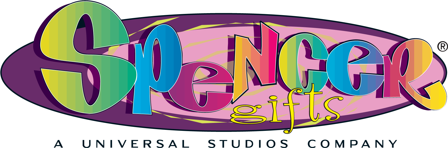
During the peak shopping mall era, Spencer’s branding became louder and more energetic. Storefront signage often featured thick, rounded typography with vibrant colors. The logo was designed to stand out in busy mall corridors filled with competing retail signs.
This period helped cement the brand in pop culture. Many customers still associate the classic Spencer’s sign with nostalgia and teenage memories.
Modern Era (2000s–Present)
In more recent years, the company streamlined its identity. The logo shifted toward a cleaner wordmark style, often simply reading “Spencer’s” instead of the longer “Spencer Gifts.” The typography became sharper and more adaptable for digital use.
The modern version works well across:
- Website headers
- Social media
- Packaging
- Promotional materials
- Digital downloads (PNG and SVG formats)
Despite updates, the brand has never moved toward minimal corporate blandness. Instead, it retains a bold and expressive look consistent with its store environment.
Design Meaning
The Spencer Gifts logo may appear simple at first glance, but its design communicates several strong brand messages.
1. Bold Typography
The use of thick, confident lettering symbolizes energy and personality. Spencer’s does not position itself as subtle or formal — the logo reflects that loud and proud identity.
2. Playful Attitude
Rounded edges or stylized letterforms in certain versions give the logo a fun, almost mischievous feeling. This mirrors the store’s novelty products and humorous merchandise.
3. Youthful Edge
The design appeals to teens and young adults. Its visual style suggests rebellion, humor, and individuality — values strongly associated with the brand’s customer base.
4. Name-Driven Recognition
Unlike brands that rely on symbols or icons, Spencer’s primarily uses a wordmark logo. This strategy builds recognition around the brand name itself. Over time, the lettering alone became iconic enough that no additional graphic element was necessary.
The simplicity also ensures flexibility across various backgrounds and promotional themes.
Color Philosophy
Color plays an important role in Spencer’s visual identity. Although logo versions may appear in different formats (black, white, or promotional variations), the underlying philosophy remains consistent.
High Contrast
Dark tones such as black are commonly used to create strong contrast. This makes the logo highly visible in busy retail environments.
Vibrant Energy
Spencer’s stores are known for bright neon lights, colorful merchandise, and attention-grabbing displays. The logo complements this atmosphere by using bold, energetic color treatments when needed.
Adaptability
The logo can easily shift between:
- Monochrome versions for digital use
- Full-color versions for store signage
- White overlays for dark backgrounds
This flexibility ensures consistency across both physical and online platforms.
Why the Logo Works So Well
The success of the Spencer Gifts logo comes down to clarity and personality. It does not rely on complicated symbolism. Instead, it lets the brand name carry the identity.
Key strengths include:
- Strong readability from a distance
- Memorable lettering style
- Emotional connection through nostalgia
- Alignment with brand tone (fun, edgy, bold)
Because Spencer’s sells personality-driven products, the logo must feel like an extension of that attitude — and it does exactly that.
FAQs
What does the Spencer Gifts logo represent?
It represents fun, humor, youth culture, and bold self-expression. The typography communicates confidence and playful energy.
Has the Spencer Gifts logo changed over time?
Yes. The logo evolved from simpler catalog branding to colorful mall signage and then to a modern, streamlined wordmark suitable for digital platforms.
Why does the logo sometimes say “Spencer’s” instead of “Spencer Gifts”?
The brand shortened its public identity to “Spencer’s” as part of modernization efforts, while still maintaining its heritage.
Is the Spencer Gifts logo trademarked?
Yes, the logo is a registered trademark. It is owned by the company and should not be used commercially without permission.
What file formats are best for downloading the logo?
- PNG – Best for web use and transparent backgrounds
- SVG – Ideal for scalable design and print projects
- Vector formats – Perfect for professional graphic design
Final Thoughts
The Spencer Gifts logo is a strong example of how typography alone can build a lasting brand identity. Since 1947, Spencer’s has grown from a small mail-order catalog into a cultural retail icon. Its logo reflects decades of boldness, humor, and connection with young audiences.
Whether you are a designer, student, or brand enthusiast, understanding the story behind the logo adds value beyond simply downloading the file. It represents not just a retail store — but an era of mall culture, pop references, and unapologetic fun.