Solo Cup Jazz Design Logo — Brand Overview
The Solo Cup Jazz Design logo isn’t just a brand mark — it’s a visual symbol that evokes nostalgia, cultural memory, and a specific aesthetic era. While Solo Cup Company itself is known for producing disposable cups and tableware, the “Jazz” pattern (often seen on cups, plates, and foodservice products) became a stand‑out graphic identity that transcended its original context to become a beloved cultural icon.
Unlike traditional corporate logos tied to names and slogans, the Jazz design is aesthetic branding at its purest — an abstract brushstroke of personality, motion, and vibrant energy that caught the collective imagination of an entire generation.
Logo History
Birth of a Pattern (1992)
The Jazz design first appeared in 1992 on disposable cups produced by the Sweetheart Cup Company. It emerged from a design contest held within the company — a deliberate attempt to create something attractive yet practical for printing.
A New Chapter with Solo Cup
When Solo Cup Company acquired Sweetheart Cup Company in 2004, it inherited this artwork and continued producing products with the Jazz design. Over time, people began calling the pattern the “Solo Jazz” design — even though it wasn’t originally Solo’s creation.
From Utility to Icon
Initially just another practical pattern to make disposable cups visually appealing, the Jazz design quickly took on a life of its own. By the early 2000s, it was one of Sweetheart’s top‑selling designs — and its afterlife under Solo helped cement its place in both commercial packaging and pop culture memory.
Design Meaning & Aesthetic Power
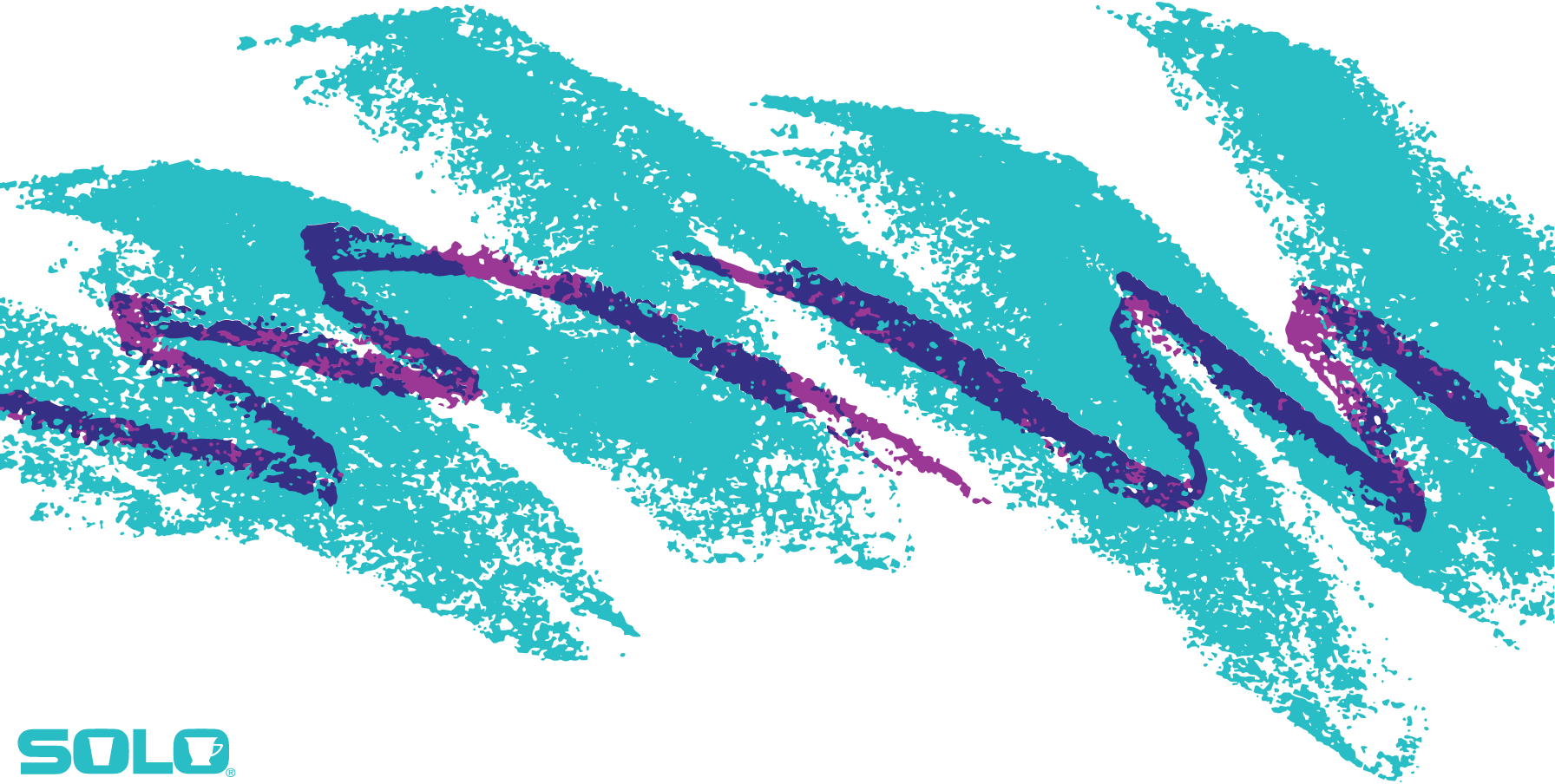
The Jazz pattern’s appeal lies in its effortless chaos and frenetic energy — as if abstract brushstrokes were captured in motion and frozen on surface. Here’s how its visual elements contribute to its identity:
- Teal and Purple Dynamic: The combination of bold teal and vibrant purple evokes contrast, movement, and a retro yet timeless energy — matching the wild creative vibes of the early 1990s.
- Abstract Forms: The jagged, free‑flowing strokes suggest spontaneity, breaking away from rigid geometric patterns typical of earlier packaging designs.
- Visual Texture & Nostalgia: Rather than a clean, corporate logo, Jazz feels lived‑in — as though it carries the memory of birthdays, school lunches, picnics, and family gatherings. That lived‑in vibe has helped it become a shared cultural experience.
What began as a practical design choice became a visual shorthand for a decade — a graphic pulse of an era.
Color Philosophy
Although not a logo in the traditional corporate sense, the Jazz design’s color philosophy is central to its charm:
- Teal: Energetic and slightly retro, teal evokes movement and visual boldness — a color that commands attention yet feels cool and balanced.
- Purple: The companion shade adds a playful pop — invoking creativity, personality, and a certain carefree attitude.
Together, these shades create a visual rhythm — like a jazz beat in graphic form — where color works just as much as pattern to shape emotional impact.
Cultural Significance & Legacy
What makes the Jazz design especially fascinating is how it outlived its original use and became a symbol of 1990s visual culture:
- 90s Iconography: Many people who grew up seeing Jazz‑patterned cups, plates, or bowls associate it with childhood memories, school cafeterias, camp events, and casual moments that quietly shaped visual culture.
- Memetic Popularity: Over time, the design became a meme and cult aesthetic — appearing on t‑shirts, stickers, skateboards, custom fashion, and even cars as a nostalgic callback to a beloved era.
- Revival in Fashion: Designers and artists have revived the pattern in apparel and accessories, cementing Jazz’s place in retro and vintage inspiration circles long after disposable cups were left behind.
In this sense, the Jazz design transcends branding — it’s now a cultural artifact as much as it is a commercial graphic.
FAQs
Q1: Is the Jazz design actually a logo?
Not in the traditional corporate logo sense — it’s a pattern associated with Solo Cup products that became iconic due to its widespread use and cultural resonance.
Q2: Who created the Jazz design?
The design emerged from an internal contest at the Sweetheart Cup Company in the late 1980s and was first used commercially in 1992. While definitive attribution has been debated, many sources credit a former employee named Gina Ekiss with the design.
Q3: Why is it called “Solo Jazz”?
When Solo Cup Company acquired Sweetheart’s assets in 2004, they continued producing products with the pattern — and consumers began referring to it as “Solo Jazz” because of that connection.
Q4: Why is it so memorable?
Its vibrant color contrast, loose abstract strokes, and ubiquitous presence on everyday disposable products during the 1990s created a shared cultural memory that many people find nostalgic and emotionally significant.
Q5: Does Solo still use the Jazz pattern?
Yes, Solo continues to produce items with the Jazz pattern, and it remains a registered design that represents a distinctive visual era.