1. Brand Overview
Safari is a web browser developed by Apple Inc. and is the default browser on Apple devices including macOS, iOS, iPadOS, and visionOS. First introduced on January 7, 2003, Safari was built to offer a fast, reliable browsing experience tightly integrated with Apple’s operating systems. It uses Apple’s own open‑source WebKit rendering engine—derived from the KDE project’s KHTML and JavaScriptCore—to display web pages efficiently and securely.
Today, Safari remains one of the most widely used browsers in the world, ranking as a major competitor to other browsers like Chrome and Firefox thanks to its speed, energy efficiency, privacy features, and seamless integration across Apple hardware.
The Safari logo has become synonymous with web exploration and navigation for Apple users worldwide. The emblem is used across software interfaces, promotional campaigns, digital icons, and app stores. It is recognized as a high‑quality tech brand mark alongside other Apple visual identities.
2. Logo History
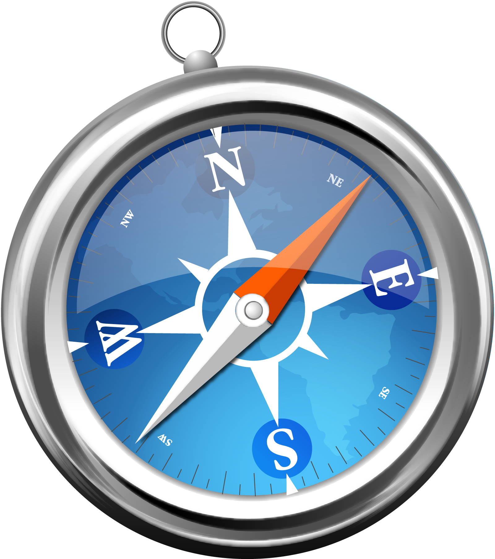
The Safari logo has evolved alongside the browser since its launch, but one central theme has remained constant: the compass.
2003 – 2014: Detailed Compass
When Safari first launched in 2003, the logo featured a highly detailed three‑dimensional compass design. The compass had a silver‑metal frame with realistic shading and reflections, giving it a polished, almost tangible appearance. These early versions reflected Apple’s focus on high‑quality visual design.
2013 – 2017: Flat Design Era
With the rise of flat user‑interface trends and the launch of iOS 7, the Safari logo was simplified. The three‑dimensional depth was reduced, and the design became flatter with more emphasis on the compass face and its red‑and‑white needle. Cardinal direction markers were removed, leaving only subtle notches and shapes to indicate direction.
2017 – Present: Modern Minimalism
From 2017 onward, Apple refined the logo again for modern interfaces. The design emphasizes simplicity and clarity: a blue circular compass face with a thin border and a sharp red and white needle pointing north‑east—a direction that has remained consistent throughout the logo’s history to symbolise forward movement and exploration.
The modern Safari logo mixes minimalism with recognizability, making it highly effective across both high‑resolution displays and small app icons.
3. Logo Design Meaning
The Safari logo is rich in symbolism tied to navigation and discovery.
Compass Core
The fundamental graphic of the Safari logo is a compass, a universally recognized tool for navigation. In the context of a web browser, the compass metaphor represents:
- Exploration of the web
- Direction and guidance
- Discovery of information
This aligns with Safari’s purpose: helping users navigate the vast world of the internet.
North‑East Needle Direction
Throughout its evolution, the compass needle has consistently pointed north‑east. Designers at Apple chose this orientation to symbolise forward motion and positive progress—which mirrors Safari’s positioning as a modern, forward‑thinking browser.
Clean, Rounded Form
The circular shape of the logo is inviting and balanced, while subtle gradients and colours provide depth without overwhelming complexity. This fits Apple’s broader design language that values simplicity, clarity, and ease of recognition.
4. Colour Philosophy
The Safari logo’s colour palette has also evolved, but it retains core elements that communicate key brand values.
Blue
Blue is the dominant colour of the modern Safari logo. Across many tech brands, blue is associated with:
- Trust
- Intelligence
- Calm, focused exploration
In the Safari context, it reflects both Apple’s platform reliability and the browser’s focus on secure, confident web navigation.
White
White is used for the compass face and needle background. It symbolises:
- Clarity
- Simplicity
- Fresh start
These align with Safari’s user‑friendly design.
Red Accent
The red portion of the compass needle draws the eye and provides contrast. Red represents:
- Energy
- Direction
- Focus
It reinforces the idea of purposeful browsing and visual dynamism.
Subtle Gradients
Modern versions of the logo use gentle gradients within the blue face to give subtle depth, creating a visual sense of dimension without losing the simplicity that Apple’s aesthetic prioritises.
5. Why the Safari Logo Works
A powerful brand logo must be simple, meaningful, and memorable—and the Safari emblem checks these boxes:
- Universal Symbolism: The compass immediately communicates exploration and navigation, directly tying to what a browser does.
- Clean Design: Minimal elements make the logo easily recognisable even at small sizes (like app icons).
- Timeless Identity: While refined over several design eras, the core concept has remained consistent, aiding brand recall.
- Colour Impact: The use of a bold blue with red accent creates visual energy balanced with trustworthiness.
6. FAQs
Q: What does the Safari logo represent?
A: The Safari logo depicts a stylised compass—a symbol of exploration and navigation—connecting to the browser’s purpose of helping users navigate the internet.
Q: When was Safari first released?
A: Safari was first introduced by Apple on January 7, 2003 and has evolved through multiple software updates since then.
Q: Why does the compass needle point north‑east?
A: The needle’s north‑east position symbolises forward direction and progress in digital exploration.
Q: What colours are used in the Safari logo?
A: The current Safari logo uses blue, white, and red to balance trust, clarity, and energy in its visual identity.
Q: Where can I download the Safari logo?
A: You can download the Safari browser logo in PNG and SVG formats from PNGLush, suitable for design, educational, and informational use.