1. Brand Overview
The Quaker Oats Company, commonly known simply as Quaker, is one of the most iconic breakfast food brands in the world. It was founded in 1877 when the Quaker trademark was registered in the U.S. Patent Office — making it the first trademark for a breakfast cereal. The company is now headquartered in Chicago, Illinois, USA and is owned by PepsiCo.
Quaker is best known for its oats and oatmeal products, but its portfolio spans cereals, snack bars, granola, and other wholesome grain‑based foods. For more than 140 years, the brand has positioned itself as a source of nourishing, reliable, and quality breakfast foods enjoyed worldwide.
Quaker’s marketing has historically emphasized health, trust, and wholesome nutrition, making it a staple in households across generations.
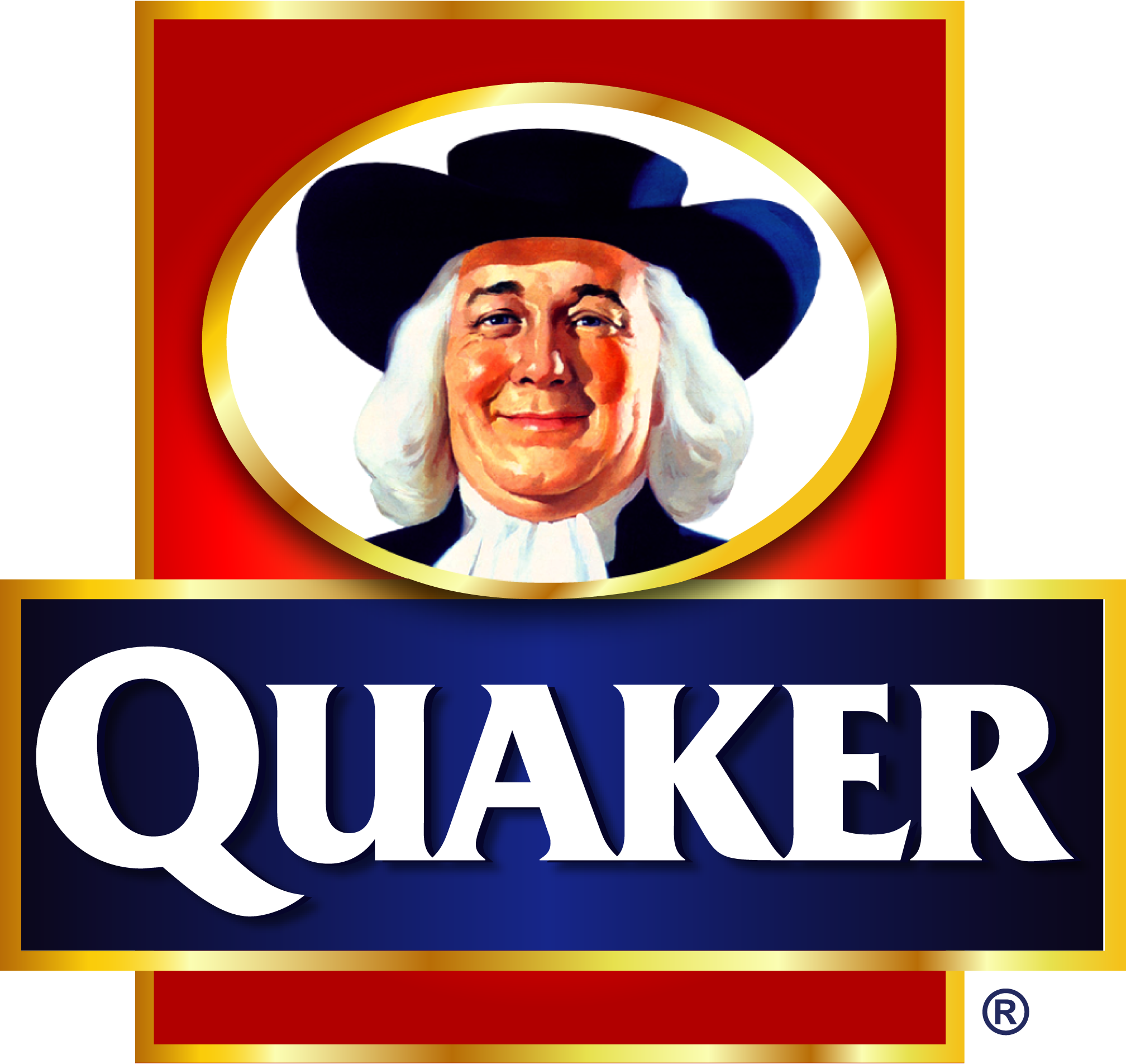
2. Logo History
The Quaker Oats logo has one of the most enduring brand mascots in American food history:
1877: First Trademark
The original logo featured a full‑length figure of a man in traditional Quaker garb, symbolizing honesty, integrity, and quality — traits the founders wanted associated with their oat products. This trademark registration marked the first ever for a breakfast cereal in the U.S. Patent Office.
1946 – Head Portrait Adopted
In the mid‑20th century, the brand shifted to a simpler head‑and‑shoulders portrait of the Quaker figure. Graphic designer Jim Nash created the black‑and‑white version in 1946, and in 1957 a full‑color rendition was produced by artist Haddon Sundblom, giving the Quaker man a warm, friendly presence on Quaker packaging and advertising.
1970 – Saul Bass Redesign
Well‑known designer Saul Bass designed a monochromatic version of the logo in 1970, modernizing the emblem while keeping the Quaker man recognizable.
2012 – Modern Refresh
In 2012, Quaker Oats updated its logo again with the design firm Hornall Anderson, giving the Quaker figure a slightly slimmer, younger appearance. This refresh retained the trusted imagery while aligning the brand with contemporary health and wellbeing values.
Today’s logo still features the Quaker man’s face — a symbol that connects over a century of brand heritage to modern markets.
3. Logo Design Meaning
The Quaker Oats logo revolves around a single, central character: the Quaker man. His image and attire convey specific brand meaning:
Symbol of Integrity
Quakers (members of the Religious Society of Friends) historically held reputations for honesty, simplicity, and fairness — qualities the brand wanted its products to embody. Quaker Oats adopted this imagery to signal trustworthiness and quality in an era when food regulation was minimal.
Approachability and Warmth
Over time, the logo evolved from a formal figure to a friendly, approachable face that instantly feels familiar to consumers. Later redesigns emphasized softer features and an inviting expression to strengthen emotional connection.
Tradition Meets Modernity
While the logo retains its classic character, each redesign refined the figure to look more contemporary. This allows the brand to honor its heritage while remaining visually appealing and relevant to today’s consumers.
4. Colour Philosophy
The current Quaker Oats logo typically relies on a simple and clean colour palette:
Blue
Blue is often used in the wordmark and branding elements. It conveys trust, stability, and reliability — traits deeply associated with the brand’s long history.
Neutral Tones
The Quaker figure itself is usually rendered with natural skin tones and neutral shades to reinforce warmth and approachability while keeping visuals grounded.
White Background
Using the logo on a white or light background enhances clarity and makes the emblem clean and easily recognizable at all sizes, whether on packaging or digital platforms.
5. Brand Identity and Cultural Significance
The Quaker Oats logo is not just an image — it’s a cultural icon that millions associate with breakfast, wholesome food, and family traditions.
- For over a century, the Quaker man has appeared on oatmeal cartons, cereal boxes, snack bars, and advertising materials.
- The logo has helped convey the idea that Quaker products are a healthy and nourishing start to the day.
- Its enduring presence on store shelves makes the brand instantly recognizable in many global markets.
Quaker’s brand values — quality, integrity, trust, and nourishment — are all reflected in the logo’s design and its evolution over time.
6. FAQs (Frequently Asked Questions)
Q: What does the Quaker Oats logo represent?
A: The logo features a man dressed in traditional Quaker attire, chosen to symbolize honesty, integrity, and quality — values the brand wants associated with its food products.
Q: Is the Quaker Oats brand connected to real Quakers?
A: No — the company has no formal ties with the Religious Society of Friends. The name and imagery were used for their positive connotations of trust and integrity.
Q: How old is the Quaker Oats logo?
A: The Quaker man was first registered as a trademark in 1877, making it one of the oldest food brand trademarks in the U.S.
Q: Why has the logo changed over time?
A: Updates have modernized the design to remain visually relevant while preserving the iconic and trustworthy character of the Quaker figure.
Q: What products use the Quaker Oats logo?
A: The logo appears on oatmeal products, cereals, granola bars, and other Quaker‑branded food items worldwide.