Brand Overview
The Port Adelaide Football Club is one of the most historic and successful teams in Australian rules football. Founded in 1870, the club is based in Port Adelaide, a suburb of Adelaide in South Australia. Over more than 150 years, the club has built a powerful sporting legacy and a passionate fan base.
Port Adelaide competes in the Australian Football League, the highest level of professional Australian rules football. The team is often referred to by its modern nickname “Power,” while historically it was known as the “Magpies.”
The club has won numerous premierships in state competitions and continues to be one of the most recognizable teams in Australian football. Its home games are played at the famous Adelaide Oval, which is one of the most iconic sporting venues in Australia.
The Port Adelaide logo represents the club’s long history, strong identity, and competitive spirit. Over time, the logo has evolved to reflect both the club’s heritage and its modern identity in the AFL.
Port Adelaide Football Club Logo History
The logo of the Port Adelaide Football Club has changed several times throughout its long history, reflecting different eras of the club.
Early Emblems (1900–1927)
The earliest official crest used by the club in the early 1900s featured a detailed design with two magpies perched on a gum branch, along with a football and flags. This imagery reflected the club’s nickname “Magpies” and its connection to the Port Adelaide community.
These early logos were traditional sports crests, filled with symbolic elements that celebrated the club’s identity and Australian heritage.
Magpies Era Logos (1930–2019)
Between 1930 and 2019, the club used several versions of a logo featuring a single magpie bird, which became the central symbol of the team. The bird was typically shown perched on a branch or wire and facing left.
In 1975, the club introduced a circular emblem with the magpie and the word “Magpies,” which remained in use for decades and became the longest-running logo in the club’s history.
AFL Era Logo (1997)
When Port Adelaide joined the AFL in 1997, it was required to adopt a new identity that distinguished it from other clubs using similar colors and nicknames. As a result, the club created a new logo representing its AFL team, the Power.
This design included a silver fist holding a lightning bolt, symbolizing energy and strength. The logo also introduced teal as part of the club’s modern color scheme.
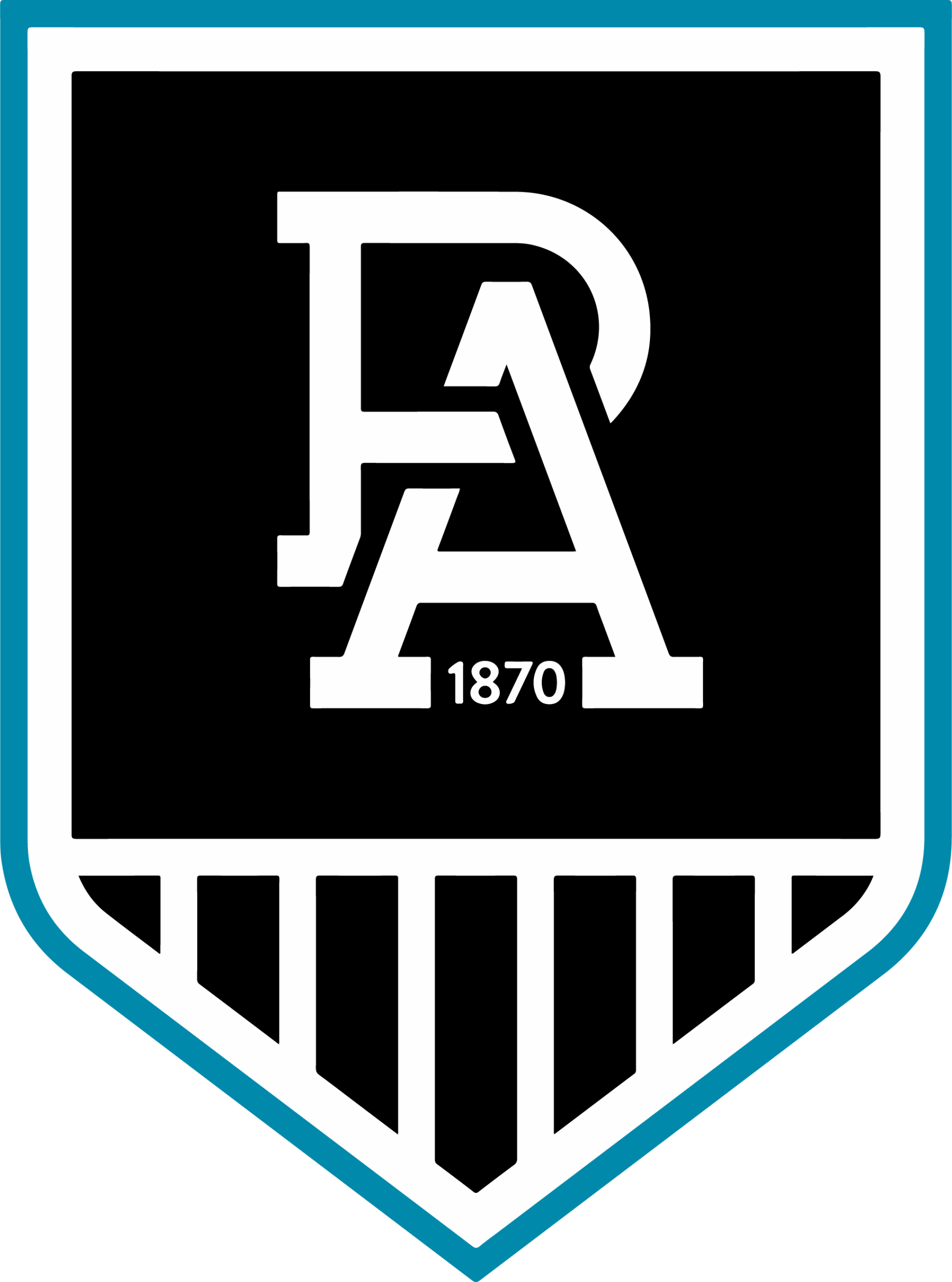
Modern Logo (2020–Present)
In 2020, the club celebrated its 150th anniversary by unveiling a unified logo that combined elements from its historic Magpies identity and its modern Power branding.
The logo features:
- The “PA” monogram representing Port Adelaide
- The year 1870, highlighting the club’s founding
- Black and white prison bars, a nod to the historic jersey
- A teal outline representing the modern AFL era
This modern emblem symbolizes the unity of the club’s past, present, and future.
Design Meaning
The Port Adelaide Football Club logo is filled with symbolic meaning that reflects the team’s heritage and identity.
Strength and Power
In the AFL-era logo, the lightning bolt and clenched fist represent strength, energy, and determination. These elements reinforce the team’s nickname, the Power.
Heritage and Tradition
The black-and-white prison bar pattern is one of the most iconic symbols associated with the club. It reflects the historic jerseys worn by Port Adelaide teams for over a century.
Club Identity
The “PA” monogram stands for Port Adelaide and serves as a simple yet powerful representation of the club.
Unity of Past and Present
The modern crest was designed to bring together the club’s Magpies heritage and its AFL Power identity into one unified symbol.
Color Philosophy
The Port Adelaide Football Club logo uses a distinctive color palette that represents both tradition and modern sporting identity.
Black
Black symbolizes strength, authority, and determination. It has been a key color in the club’s jerseys and branding since the early days.
White
White represents integrity, clarity, and tradition. Together with black, it forms the classic Magpies color scheme.
Teal
Teal was introduced when the club entered the AFL in 1997. It symbolizes modernization and distinguishes the team from other clubs using similar colors.
Silver
Silver appears in some versions of the AFL-era logo and represents power, speed, and innovation.
Why the Port Adelaide Logo Works
The Port Adelaide Football Club logo is effective because it blends historical tradition with modern sports branding.
Key strengths of the logo include:
- Strong symbolism connected to the club’s history
- A bold and recognizable color palette
- Simple but powerful typography
- Elements representing both heritage and modern identity
This combination makes the logo easily recognizable among AFL teams and helps maintain the club’s strong brand presence.
FAQs
What is the Port Adelaide Football Club logo?
The Port Adelaide Football Club logo is the official emblem of the Australian rules football team Port Adelaide. It appears on team uniforms, merchandise, marketing materials, and digital media.
When was Port Adelaide Football Club founded?
The club was founded in 1870, making it one of the oldest football clubs in Australia.
What do the “PA” letters in the logo mean?
The “PA” monogram stands for Port Adelaide, representing the club’s name and identity.
What colors are used in the Port Adelaide logo?
The logo typically features:
- Black
- White
- Teal
- Silver
These colors reflect both the club’s historic Magpies identity and its modern AFL branding.
What file formats are available for the Port Adelaide logo?
The Port Adelaide logo can usually be downloaded in several formats, including:
- PNG (transparent background)
- SVG (vector format)
- JPG
- EPS or AI for design projects
These formats allow designers and developers to use the logo in web design, branding projects, and printed materials.