🌍 Brand Overview: Planet Fitness
Planet Fitness is a major American gym franchise known for making fitness accessible and non‑intimidating for everyday people. Founded in 1992 in Dover, New Hampshire, it was created by Michael and Marc Grondahl, and later joined by Rick Berks — the latter helped name the brand “Planet Fitness.”
From its early days, Planet Fitness has pursued a simple mission: open gym doors to those who might otherwise feel uncomfortable in a traditional fitness environment. Unlike conventional gyms aimed at serious bodybuilders or advanced athletes, Planet Fitness reframed the gym experience for casual users, beginners, and everyday exercisers.
It’s grown dramatically since its launch — with over 2,700 clubs worldwide as of 2025 — spanning locations in the United States, Canada, Panama, Mexico, Spain, and Australia.
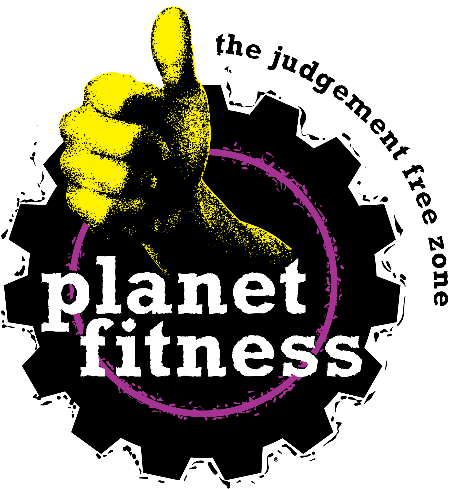
One of the defining slogans of the brand is the “Judgement Free Zone®”, which emphasizes a welcoming, supportive atmosphere where fitness is approachable for everyone.
🕰️ Logo History: Evolution and Significance
The visual identity of Planet Fitness has its roots in the early 1990s when the brand first emerged. While various visual elements have evolved, the core emblematic logo — combining a circular gear and a thumb‑up symbol — has remained central to the brand’s identity for many years.
Here’s a simplified rundown of how the logo developed:
- 1992–Early Days: As Planet Fitness emerged from a rebranded gym concept, visual identity began modestly with simple branding aimed at being approachable and friendly.
- Mid–2000s: As the “Judgement Free Zone®” philosophy took hold (officially introduced around 2005), the logo was increasingly used to reinforce that message visually.
- 2015 Redesign: The brand adopted yellow and purple more prominently as primary colors to strengthen the visual identity.
- 2020–Present: The current emblem — with its emblematic gear and thumbs‑up motif in purple and yellow — remains instantly recognizable and closely tied to the brand’s welcoming, inclusive ethos.
Despite occasional discussions in design communities about modernization, the core elements have stuck, largely due to strong brand recall and consistent emotional messaging.
🎨 Design Meaning: What the Logo Elements Signify
The Planet Fitness logo isn’t just a random graphic — each element is tied to the brand’s identity and mission:
🛠️ The Gear Symbol
The logo’s circular gear shape conveys movement, progress, and mechanical effort, echoing exercise machinery components and the idea of fitness as an ongoing process. It speaks to effort, motion, and personal discipline — but in a supportive, non‑intimidating way.
👍 The Thumbs‑Up Icon
This is perhaps the heart of the design:
- In Western culture, a thumbs‑up is widely understood as a sign of approval, encouragement, and positivity.
- In the Planet Fitness context, it projects support for every person’s fitness journey, no matter their level.
✍️ Lowercase Wordmark
The words “planet fitness” appear in a bold, lowercase serif typeface, which gives the logo a friendly and approachable feel rather than an aggressive, high‑intensity tone. Lowercase helps soften the brand image, aligning with its non‑judgmental philosophy.
🎨 Color Philosophy: What the Colors Represent
Planet Fitness uses a distinctive palette of black, yellow, purple, and white. Each color plays a role in communicating different brand qualities:
| Color | Symbolism |
|---|---|
| 🟣 Purple | Creativity, ambition, and uniqueness in the fitness space. |
| 🟡 Yellow | Energy, optimism, and positivity — enhances the welcoming vibe. |
| ⚫ Black | Strength, stability, and bold contrast to enhance visibility. |
| ⬜ White | Cleanliness, openness, and balance within the design. |
These colors work together to communicate that Planet Fitness is energetic yet inclusive, strong yet non‑intimidating.
❓ FAQs About Planet Fitness and Its Logo
1. Why does the logo feature a gear instead of a traditional “planet”?
The gear was chosen to symbolize movement, progress, and the mechanics of fitness, rather than literal planetary imagery. It underscores the idea of continuous improvement and effort within a supportive environment.
2. What does the thumbs‑up in the logo signify?
The thumbs‑up gesture is a universal sign of positivity and support, reflecting Planet Fitness’s commitment to encouragement and a non‑judgmental atmosphere.
3. Why lowercase letters in the wordmark?
Lowercase type gives the brand a friendly, approachable presence, avoiding the intimidating feel common to many high‑intensity gym brands.
4. Has the logo changed a lot over time?
While the color emphasis and some stylistic touches have evolved (especially around 2015 and 2020), the core design — gear plus thumbs‑up plus distinct wordmark — has stayed consistent, helping maintain brand recognition.
5. What do the colors specifically communicate?
- Black conveys confidence
- Purple evokes creativity and uniqueness
- Yellow adds cheer and accessibility
- White balances the palette and represents openness.
🏁 Conclusion
The Planet Fitness logo is more than a visual mark — it’s a reflection of the brand’s core philosophy of inclusivity, encouragement, and accessibility in fitness. Through its use of bold colors, friendly typography, and positive imagery like the thumbs‑up, the logo communicates an inviting environment where anyone — from beginners to casual gym‑goers — can feel welcome.
If you’d like, I can also break down how the logo is used in various marketing materials and signage, or provide download options for all official assets. Just let me know!