Penfolds is widely recognised as one of Australia’s oldest and most prestigious wineries, celebrated around the world for its premium wines and deep winemaking heritage. Founded in 1844 in Adelaide, South Australia, Penfolds has grown from humble beginnings into a globally respected brand, producing both everyday wines and some of the most collectible bottles in the wine world — most notably the legendary Penfolds Grange.
Today, the Penfolds brand and its classic logo are associated with craftsmanship, tradition, innovation, and luxury, bridging nearly two centuries of winemaking evolution.
1. Brand Overview
Penfolds was established in 1844 by Dr. Christopher Rawson Penfold and his wife Mary Penfold, English immigrants who planted vines around their Magill Estate near Adelaide shortly after arriving in Australia. Originally created partly as a medicinal wine tonic, the winery quickly expanded into commercial winemaking, driven by growing demand and pioneering spirit.
Over the decades, Penfolds became one of Australia’s most prominent wine producers, known for a multi‑vineyard, multi‑regional approach that sources fruit from key South Australian regions including Barossa Valley, Coonawarra, and the Adelaide Hills. This strategy supports consistency, complexity, and character in wines at all price points, from approachable Bins to rare, cellar‑worthy icons.
The brand is currently part of Treasury Wine Estates, one of the world’s largest wine companies, but retains a strong identity tied to its heritage and independent legacy within the global portfolio.
2. Logo History & Development
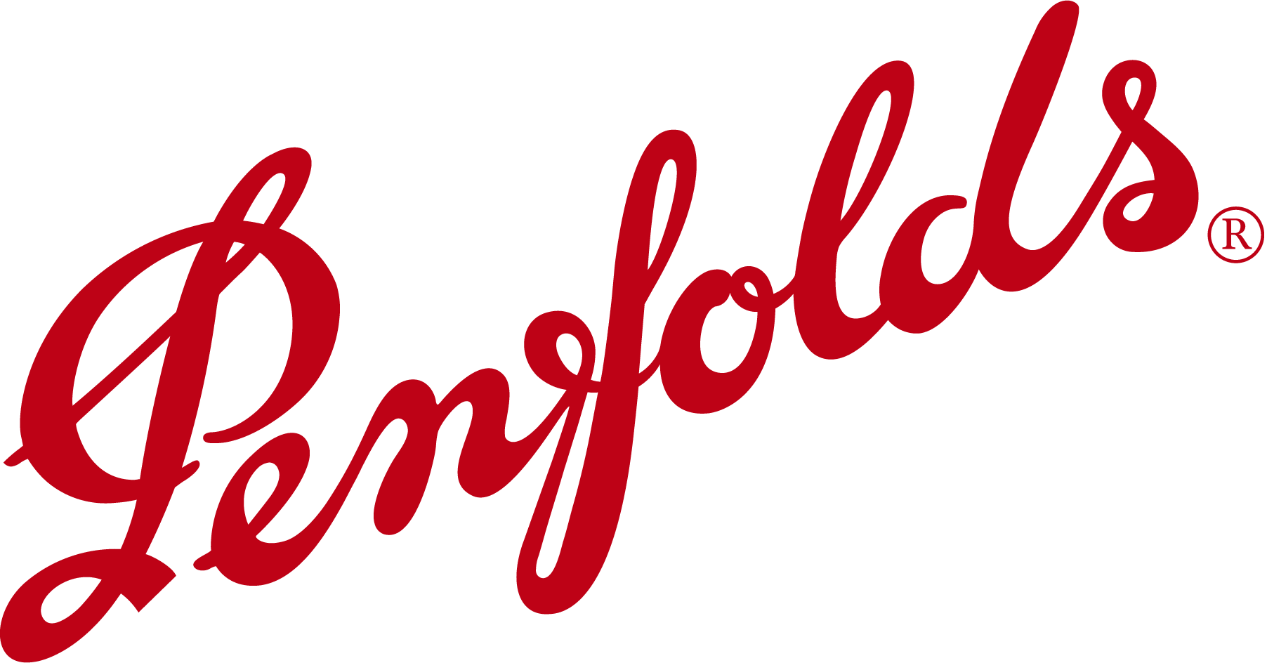
The Penfolds logo is one of Australia’s most recognised wine trademarks, first used in 1923 and deeply embedded in both national and international wine culture.
Early Wordmark Origins (1923 – mid‑20th century)
Penfolds’ classic script logo first appeared in the early 20th century and was designed to convey elegance, tradition, and a handcrafted ethos appropriate to premium wine labels.
This distinctive script‑style wordmark, often in deep red (a colour long associated with wine and luxury), became synonymous with quality and heritage over decades of use.
Modern Refinements
While the overall form of the Penfolds script has endured, designers have refined and tweaked curves and spacing over time to ensure clarity and balance — particularly as the logo was adapted for different bottle labels, digital formats, and luxury packaging.
Contemporary branding also sees the Penfolds wordmark used alongside complementary visual motifs in retail and packaging design, but the script signature remains central to the identity — a visual anchor that conveys heritage and premium quality.
3. Design Meaning
Signature Script
The Penfolds logo’s classic handwritten “Penfolds” script evokes a sense of personal craftsmanship and artisanal tradition — characteristics that align with high‑end wine production where subtlety, balance, and human touch are essential qualities.
In the wine world, script logos often signal heritage, authenticity, and personality, distinguishing the brand from modern geometric marks. Penfolds’ flowing script captures this nuance, presenting the winery as both historic and enduringly relevant.
Colour & Visual Language
- Deep Red / Burgundy: The script is commonly rendered in red or dark wine tones, reinforcing both the colour of many of Penfolds’ flagship wines and the sense of luxury.
- Elegant Curves: The custom letterforms suggest refinement and tradition, qualities often associated with collectible and aged wines.
Unlike symbols or icons, the simple wordmark leans on typography and colour to convey brand meaning — a strategy particularly effective in the premium wine category, where the name itself carries strong recognition and reputation.
4. Color Philosophy
The Penfolds logo is most commonly presented in a rich red or burgundy tone, reflecting not only the colour of red wine — the category for which Penfolds is most celebrated — but also the feelings of luxury, richness, and warmth associated with fine wine.
This colour choice aligns with luxury branding conventions, where deeper hues often signify maturity, depth, and sophistication — all traits that match Penfolds’ brand personality and product positioning.
5. Cultural & Market Significance
Penfolds holds a legendary position in Australian wine and among global wine communities. Its wines — from approachable Bin series wines to the world‑famous Penfolds Grange — are prized by collectors and connoisseurs alike.
Penfolds Grange in particular has achieved legendary status, winning multiple perfect scores from leading critics and often fetching high prices at auction — evidence of both its quality and collectibility.
The brand’s presence at high‑profile global events — such as being named the official wine partner of the 2026 Formula 1 Australian Grand Prix — underscores its continued relevance and luxury positioning in a competitive global market.
Penfolds is also regularly ranked among the most admired wine brands in the world, reflecting both historical stature and contemporary recognition for consistency and excellence.
6. FAQs
Q: What does the Penfolds logo represent?
A: The graceful script wordmark represents the winery’s long heritage, craftsmanship, and premium identity in the world of fine wine — a hallmark first used in 1923 and refined over decades.
Q: When was Penfolds founded?
A: Penfolds was founded in 1844 in Adelaide, South Australia by Dr Christopher and Mary Penfold.
Q: Why is the Penfolds script associated with luxury?
A: Script typography in wine branding often signals craftsmanship and heritage, qualities especially valued in premium wines and collectible vintages.
Q: What is Penfolds’ most famous wine?
A: Penfolds Grange is widely regarded as Australia’s most legendary red wine, acclaimed for quality, complexity, and ageing potential.
Q: Who owns Penfolds today?
A: Penfolds is part of Treasury Wine Estates, a major global wine company.