1. Brand Overview
North Melbourne Football Club is one of the oldest and most iconic sporting clubs in Australia, founded in 1869 and based in North Melbourne, Victoria. It competes in the Australian Football League (AFL) for men and the AFL Women’s (AFLW) competition, alongside fielding teams in the Victorian Football League and VFLW.
Nicknamed the Kangaroos (often shortened to “Roos” or “Kangas”) — and also affectionately known as the Shinboners — the club has a deep cultural identity rooted in its working‑class beginnings and strong community connections. Its official motto is “Victoria amat curam” (Latin for “Victory Demands Dedication”).
The club’s teams play home matches at Marvel Stadium and have a long tradition of passionate supporter culture. On-field success includes four AFL/VFL premierships (1975, 1977, 1996, 1999) among other notable achievements.
2. Logo History
The club’s logo has evolved several times in its long history — reflecting shifts in era, style, and how North Melbourne wanted to represent itself to fans and the wider football community:
Early Eras (pre‑1976)
In the club’s earlier years, official AUS football club logos were rare, with some monogram or heraldic symbols used informally.
1976–1982: Initial Shield Logo
The first major logo featured a kangaroo within a shield — with the animal facing left, combining team identity and visual strength.
1983–1984: Kangaroo Repositioned
The kangaroo was redrawn facing right, symbolizing a new forward direction for the club.
1985–2006: Evolutions of Stripes & Shield
From the mid‑1980s through to the early 2000s, the logo kept the shield motif and blue‑and‑white stripes consistent with the club’s jumper colours, with subtle stylistic shifts.
2007–2016: Rounded Shield & Modernisation
A more contemporary, rounded shield was introduced with a fuller kangaroo image and clearer typography.
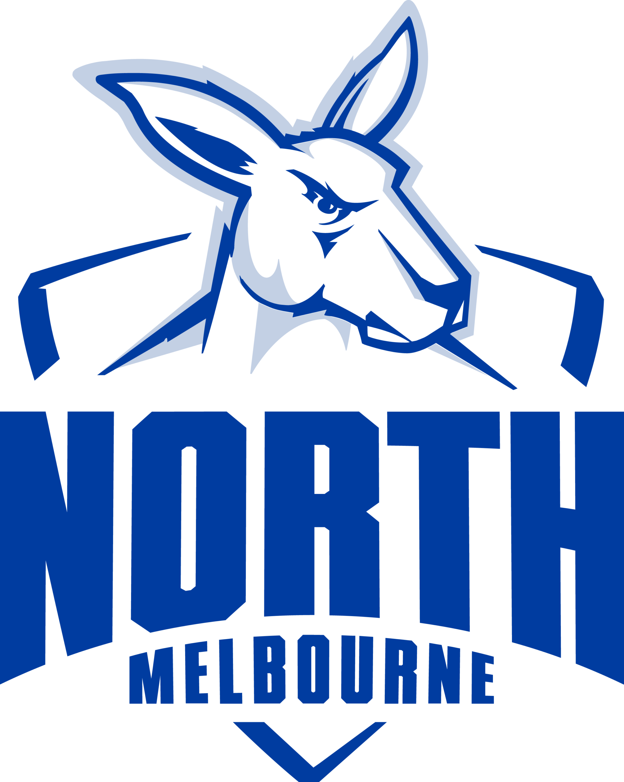
2017–Present: Fierce Kangaroo & Emphasis on Name
In the latest redesign — the seventh logo in the club’s 147‑year history — the kangaroo is rendered more dynamic, purposeful and aggressive. The words North Melbourne are also made more prominent, marking a return to community identity after a period when the team was simply called “The Kangaroos.”
According to club leadership, this logo embodies the values of strength, pride, resilience and future ambition — core to what the organisation calls the Shinboner Spirit.
3. Design Meaning
The North Melbourne Football Club logo blends traditional symbolism with sporting identity:
Kangaroo Symbol
- The kangaroo represents the team’s nickname and Australian heritage. It’s a powerful, agile animal — apt for a football club known for grit and athleticism.
Shield Shape
- The classic shield conveys protection, unity, defence, and strength — traits essential in Aussie rules football.
Typography
- Bold, clear lettering in the club’s name reinforces visibility and pride in place — significant after years when the club sought to strengthen its North Melbourne identity.
Legacy and Continuity
- The design bridges the club’s rich heritage with a modern competitive mindset — symbolising respect for tradition alongside evolution.
4. Color Philosophy
The North Melbourne logo uses a simple yet bold palette tied directly to the club’s historic guernsey colours:
Royal Blue (#13388F)
- Blue signifies loyalty, trust, pride, and unity — core values for supporters and players alike.
White (#FFFFFF)
- White represents clarity, integrity, and fairness, highlighting sporting spirit and visual contrast.
Light Blue Accents (#C6D2E6)
- Often used as a secondary tone, light blue adds depth and subtle variation while maintaining connection to the core palette.
These colours mirror the club’s famous royal blue and white striped guernsey, instantly recognisable among AFL fans.
5. FAQs
Q: What does the North Melbourne logo represent?
A: It showcases the club’s identity — a fierce kangaroo within a shield, symbolising strength, pride, tradition and forward momentum in Australian rules football.
Q: Why is the kangaroo used?
A: The kangaroo is an iconic Australian animal and perfectly reflects the club’s nickname and national sporting heritage.
Q: How many times has the logo changed?
A: There have been seven distinct logo designs in the club’s history, with the newest introduced in 2023/24.
Q: What are the club’s official colours?
A: Royal blue and white are the signature colours, often complemented by lighter blue tones.
Q: Does the logo tie into the club’s motto?
A: Yes — the emblem’s design underlines “Victoria amat curam” (“Victory Demands Dedication”) through its bold, determined look.