Brand Overview
NEOM is an ambitious futuristic mega‑city and urban development project in northwestern Saudi Arabia announced in 2017. It is part of Saudi Vision 2030, an economic diversification plan backed by the Saudi Arabian government and primarily funded by the Public Investment Fund (PIF).
The name NEOM is a constructed brand name derived from two components:
- Neo — a Greek prefix meaning “new”
- M — the first letter of the Arabic word mustaqbal meaning “future” and also representing Mohammed bin Salman, the Crown Prince who initiated the project.
NEOM is designed as a high‑tech, ultra‑modern region focused on sustainability, innovation, quality of life, and economic diversification beyond oil. It spans a massive area along the Red Sea coastline and includes multiple zones such as The Line, Oxagon, Trojena, and Magna.
The NEOM brand and its logo represent a vision for the future of sustainable urban living, combining cutting‑edge technology, environmental responsiveness, and human‑centered design.
Logo History
The NEOM logo is tied to the branding of the entire megacity project and was introduced as part of its launch in the late 2010s.
Early Visual Identity
From its inception in 2017, NEOM’s visual identity was designed to reflect its futuristic mission. Early promotional materials and official announcements featured the name “NEOM” in bold, modern typography consistent with contemporary tech branding.
Evolving Visual Branding
As NEOM’s public awareness grew with expansions like The Line and other zones, the logo began incorporating distinctive symbolic elements. While most versions focus mainly on the clean text logotype, some visual interpretations pair it with an abstract emblem composed of geometric shapes and patterns representing key pillars of the project — such as technology, nature, sustainability, community, and innovation.
Despite such variations, the core identity — a minimal, bold typographical mark — has remained consistent to emphasize clarity, modernity, and global appeal.
Design Meaning
The NEOM logo (as seen on downloads and promotional use) is more than just a wordmark — it symbolizes NEOM’s core values and futuristic aspirations.
Modern Typography
Most official and downloadable versions of the logo use simple, bold, sans‑serif letterforms. This design choice conveys:
- Innovation and technology
- Modern urbanism
- Simplicity and forward momentum
The clean typography underscores NEOM’s positioning as a project rooted in future‑oriented design and progress.
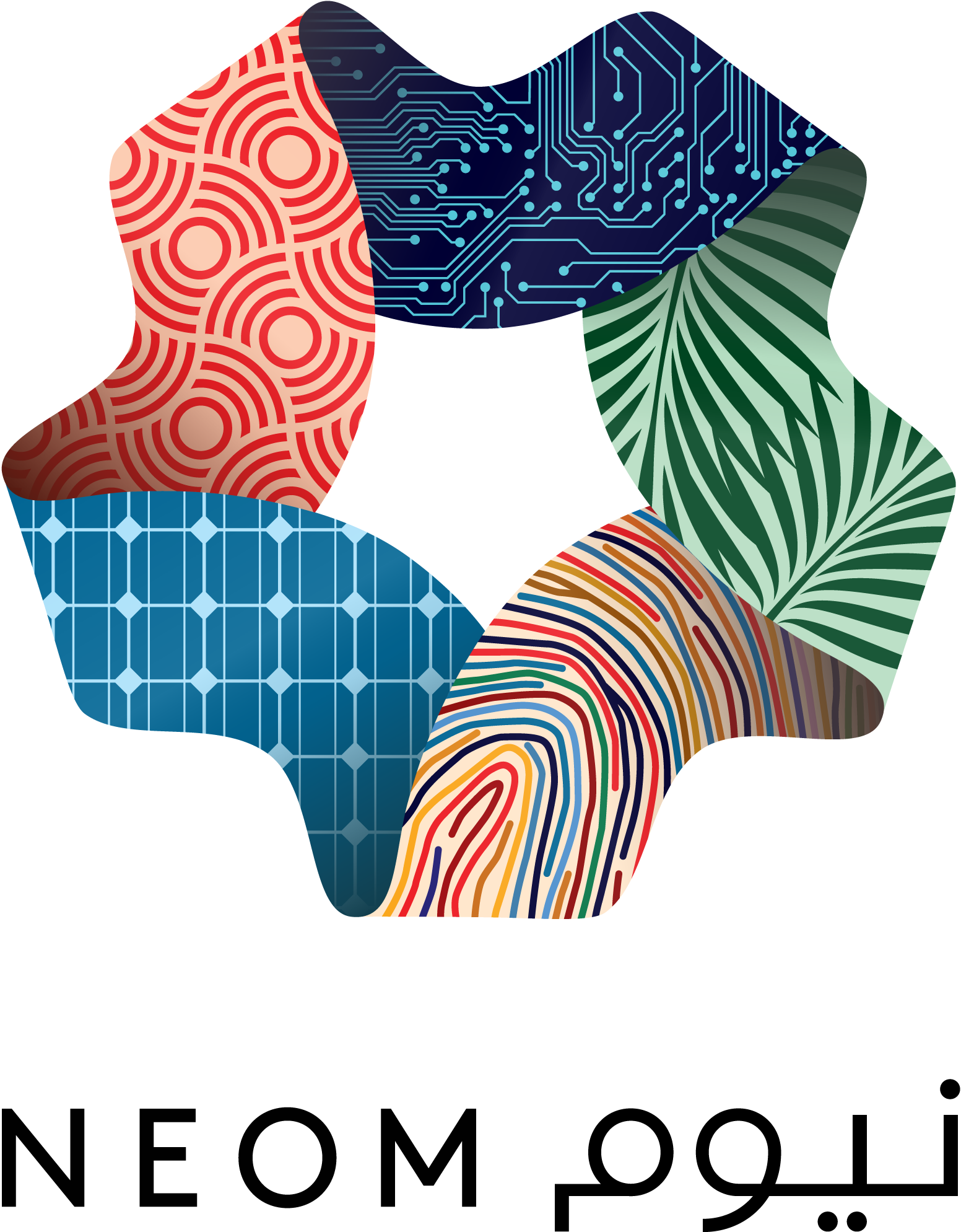
Emblematic Symbol (where used)
Some visual representations include a multicolored star‑like symbol paired with the NEOM wordmark. According to analyses of the design:
- Each point or segment represents a fundamental aspect of NEOM’s vision — such as technology, nature, community, sustainability, and livability.
- The geometric, almost tessellated arrangement of shapes conveys interconnected systems — reflecting NEOM’s integrated approach to smart infrastructure and urban networks.
This emblematic design visually encapsulates the idea of diverse elements coming together to create a holistic future community.
Color Philosophy
The NEOM logo and its variations use color thoughtfully to express different aspects of the megacity’s identity.
Green
Green often signifies:
- Sustainability and environment
- Renewable energy commitments
- Harmony with natural landscapes
Because NEOM emphasizes environmental sustainability, green is a natural color choice for parts of its visual identity.
Blue
Blue in the logo represents:
- Technology and innovation
- Connectivity
- Water and coastal identity
The coastal geography of NEOM along the Red Sea gives this color additional contextual meaning.
Red / Orange Hues
Some versions or symbolic elements introduce warmer colors to symbolize:
- Energy
- Progress
- Human activity and creativity
These tones bring visual contrast and underscore NEOM’s ambitions for vibrant human communities.
Neutral Black (Logotype)
The clean black logotype used in many official renderings:
- Provides clarity and professionalism
- Helps the logo stay legible across media
- Creates visual anchor against colorful emblem elements
Altogether, the palette communicates innovation balanced with nature and sustainability — reinforcing NEOM’s dual emphasis on technology and livability.
FAQs
What is NEOM?
NEOM is a futuristic planned city project in Saudi Arabia designed as a hub for innovation, sustainability, and future industries, part of the country’s Vision 2030 economic strategy.
What does the name NEOM mean?
The name is derived from “neo” meaning new (Greek) and “M” from mustaqbal meaning future (Arabic), conveying the idea of a new future.
What does the NEOM logo represent?
The logo’s design — whether as a wordmark or paired with abstract geometric elements — represents innovation, sustainability, technology, and the interconnected nature of the megacity’s ambitions.
Are there colors associated with the NEOM logo?
Yes. Colors like green, blue, and warm accent tones are used to reflect sustainability, technological progress, and human dynamism, while neutral black anchors the typography.
Is the NEOM logo trademarked?
Yes. The NEOM logo and graphic identity are owned by the NEOM Company and protected under intellectual property laws.