1. Brand Overview
The Manly Warringah Sea Eagles were admitted into top‑grade competition in 1947 and have been known by that name ever since. From the beginning, the club adopted maroon and white as its official colours — colours associated with the local community’s heritage teams and surf life saving clubs.
The Sea Eagles’ brand has always been centred around themes of strength, resilience, community connection, and heritage. These reflect both the natural strength of the sea eagle — a powerful bird of prey native to the Sydney coastline — and the sport’s competitive spirit. The club has won multiple premiership titles and has remained one of the most recognisable rugby league teams in Australia.
2. Logo History
Origins & Early Symbols
When the club joined the NSWRL in 1947, it adopted maroon and white as its colours and chose the sea eagle as its emblem — a nod to the powerful native bird that soars above its Northern Beaches heartland. Early jerseys featured a simple maroon design with a white “V”, with symbols evolving over time.
In the early 1950s, the club’s first emblem appeared as an “MW” monogram, and by the mid‑1950s the sea eagle figure was shown more distinctly on uniforms and badges.
Evolving Emblems Across Decades
Over subsequent decades, the Sea Eagles logo evolved in both style and detail:
- 1960s–1970s: The sea eagle motif matured into a more dynamic figure in flight, becoming a key visual identity on club materials.
- 1980s–1997: A more classic circular logo with a boldly depicted sea eagle became widely recognised during a period of strong on‑field success.
- 1998–1999: A more colourful and stylised version featuring additional accent colours (including blue and yellow linked to major sponsorship) appeared when the club participated in the early years of the modern NRL era.
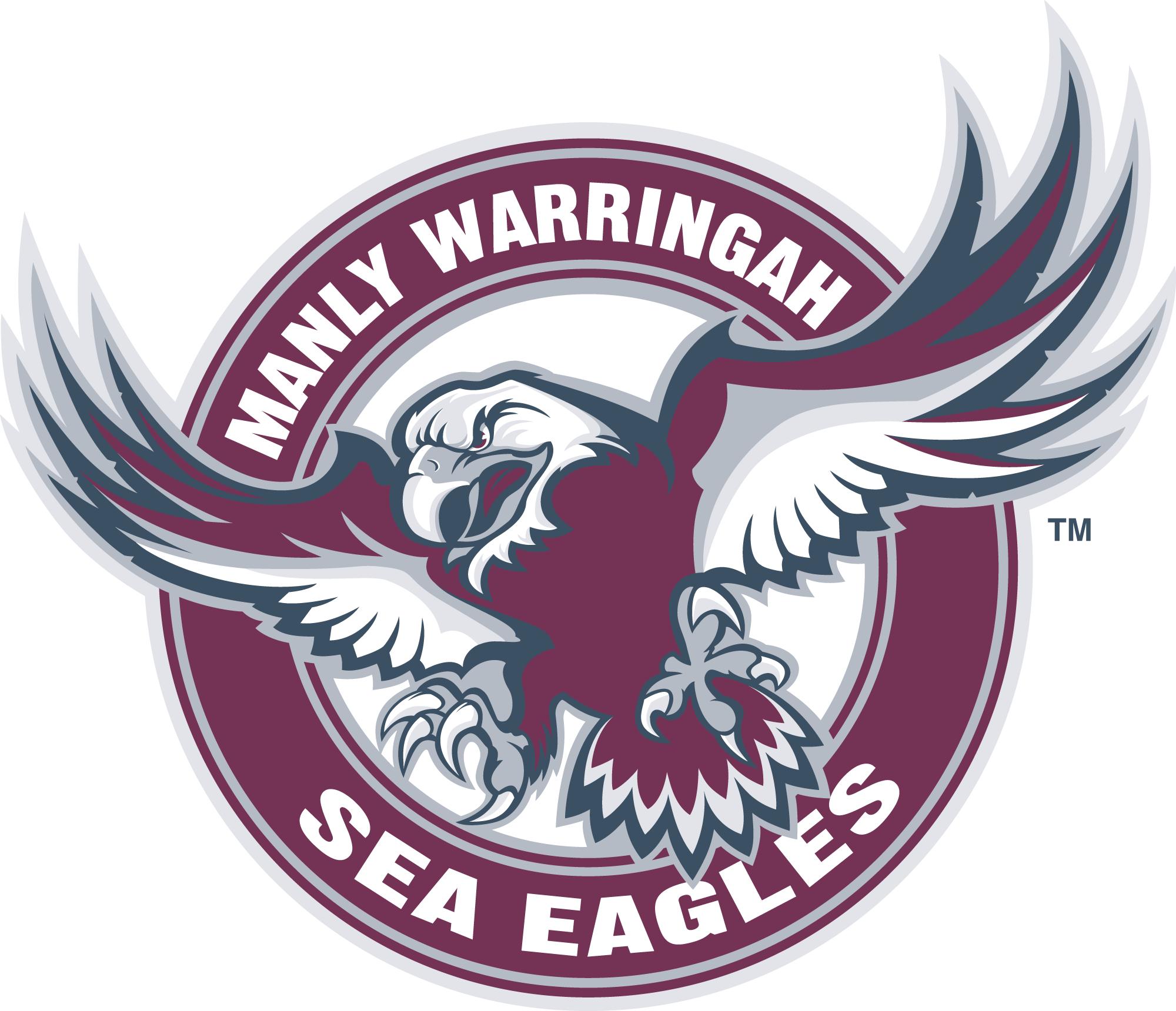
- 2003–2023: After a temporary merger and re‑formation, the Sea Eagles returned to a refined version of their classic eagle logo, focusing on a fierce, detailed depiction of the bird and maroon and white text around a circular badge.
2023 – Present: New Identity
In October 2023, the Sea Eagles unveiled a refreshed brand identity and logo ahead of the 2024 NRL season. This modern emblem is designed to honour the club’s deep heritage while giving it a contemporary look.
Key aspects of the new logo include:
- Retention of the traditional maroon and white colour scheme.
- A circular motif, a design feature the club has used since the late 1970s.
- A stylised sea eagle head that blends bold, streamlined lines with a sense of forward motion.
- A slanted typeface that suggests progress and dynamism, with “Manly Warringah” prominently showcased to reaffirm the club’s full heritage name.
This logo bridges the past and the future — keeping iconic visual references while ensuring adaptability for digital and merchandise platforms.
3. Design Meaning
The visual elements of the Sea Eagles logo are rich in symbolism:
- The sea eagle represents power, agility, and dominance — traits valued both in nature and on the rugby league field.
- Maroon and white embody unity and tradition, colours that have been central to the club’s identity since its inception.
- The circular motif symbolises continuity and unity — visually grounding the logo in history while supporting modern graphic versatility.
- The combination of bold lines and forward‑slanted type in the modern logo suggests momentum and progress — an evolution, not abandonment, of the club’s storied past.
Together, these design choices reflect a brand that is confident, rooted in tradition, and ready for future growth within the sport.
4. Color Philosophy
The Sea Eagles’ primary colours — maroon and white — carry both visual and emotional weight:
- Maroon: Often associated with strength, intensity, and commitment — qualities reflected in the team’s on‑field ethos and history of competitive success.
- White: Symbolises clarity, heritage, and a clean, bold contrast that has helped the club’s branding stand out in rival uniforms and promotional materials.
These colours not only reflect decades of tradition but also provide high‑contrast visibility — ideal for merchandise, broadcast graphics, and stadium presence.
5. FAQs
Q: What does the Sea Eagles logo represent?
A: The logo symbolises the power and heritage of the club through the native Australian sea eagle — a strong bird of prey connected to the team’s Northern Beaches origins.
Q: Why are the team colours maroon and white?
A: They were adopted from local district teams and representative sides and have been used since the club’s entry into top‑grade competition in 1947.
Q: Has the Sea Eagles logo changed much over time?
A: Yes — it has evolved from early simple emblems to more dynamic and modern designs, culminating in a refreshed identity unveiled in late 2023 that balances heritage and contemporary aesthetics.
Q: What does the sea eagle symbol signify for fans?
A: It stands for resilience, pride, and unity — both on the field and within the club’s broader community of supporters.