Brand Overview
Hi‑5 is a popular children’s entertainment brand best known for its musical group and associated television series that first launched in 1999.
Hi‑5 began in Australia as a children’s musical group and television program that combined fun, music, dance, and educational play to engage young audiences. The show was created to support preschool learning with songs, stories, movement, and interactive segments tailored to early childhood development.
Over the years, Hi‑5 grew from a local Australian series into a global franchise, spawning international adaptations in countries including the United States, the United Kingdom, Philippines, and Indonesia. The franchise also included touring musical performances and merchandise, making it a recognizable brand in children’s edutainment.
The Hi‑5 logo became an important part of the brand’s identity, appearing on television title screens, DVDs, merchandise, stage costumes, and promotional materials.
Logo History
The Hi‑5 logo has evolved over time but retained its core design elements centered on a hand‑shaped graphic with playful text.
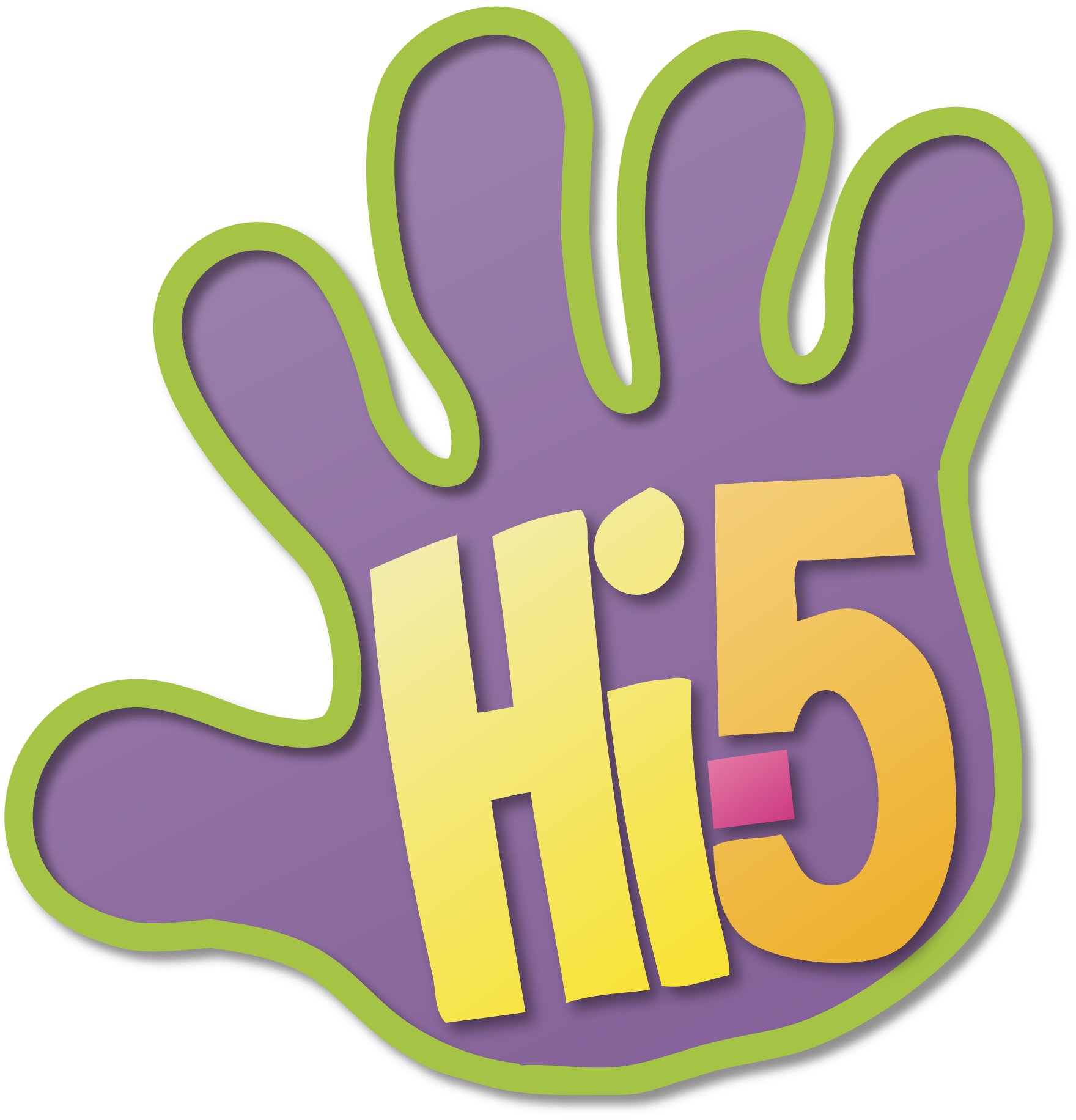
1999–2009: Original Logo
When the Hi‑5 brand launched in 1999, the logo featured:
- A purple hand shape
- A green outline around the hand
- The letters “Hi” in yellow, the hyphen in pink, and the number “5” in orange
This bright and playful design echoed the energetic, child‑friendly nature of the show.
This logo was used throughout much of the early years of the show and became closely associated with the original Australian series as well as early international versions.
2009–Present: Updated Logo
Around 2009, the Hi‑5 logo was redesigned with:
- A slightly different shade of purple for the hand
- A red hyphen replacing the pink one
- A cleaner, more modern appearance
This updated version has been used for many later seasons of the show and across global productions. Some versions also include 3D effects or animated transitions in television openings.
Beyond the main TV logo, Hi‑5 House and international editions sometimes used alternate graphic variants, but the core hand shape and the “Hi‑5” text remained central.
Design Meaning
The Hi‑5 logo is designed to visually reflect the brand’s emphasis on fun, learning, and engagement for children.
Hand Symbol
The logo’s most prominent element is the hand shape, which symbolizes:
- A high five gesture — a universal signal of positivity, encouragement, and fun
- Interaction and engagement with the audience
- The idea of hands‑on learning and creative play
This makes the logo immediately memorable and tied directly to the interactive nature of the show.
Playful Typography
The text “Hi‑5” inside the hand uses bright, bold colors and child‑friendly shapes that convey:
- Energy and excitement
- Approachability for young viewers
- A sense of movement and rhythm
The combination of vibrant colors conveys a joyful and dynamic brand identity that matches the show’s content.
Color Philosophy
The colors in the Hi‑5 logo are intentional and contribute to the joyful visual tone of the brand:
Purple / Violet
Purple serves as the primary color of the hand shape and is associated with:
- Creativity and imagination
- A playful, child‑friendly aesthetic
- Strong contrast with other colors for visibility
Green Outline
The green outline around the hand symbolizes:
- Growth and learning
- The energy of nature and development
- A supportive, nurturing environment
Yellow (“Hi”)
Yellow in the lettering represents:
- Happiness and brightness
- Warmth and friendliness
- Intellectual curiosity
Red or Pink (Hyphen)
The hyphen — originally pink, later red — implies:
- Excitement and attention
- A visual bridge between the words and number
- Visual contrast to balance the palette
Orange (“5”)
The orange number five adds:
- Playful warmth
- Energetic emphasis
- A visually strong accent that anchors the text palette
Together, these bright, complementary colors make the logo appealing and stimulating for its young target audience, reinforcing the brand’s fun and educational mission.
FAQs
Q: What is Hi‑5?
A: Hi‑5 is a children’s musical group and television entertainment brand that blends songs, dance, and learning. It started in Australia in 1999 and expanded globally through TV series, tours, and merchandise.
Q: What does the Hi‑5 logo represent?
A: The Hi‑5 logo uses a colorful hand shape with the words “Hi‑5” to reflect friendly interaction (like a high five), energy, and play — symbolizing the brand’s focus on fun and learning.
Q: Has the Hi‑5 logo changed over time?
A: Yes. The original 1999 logo was updated around 2009 with new color tones and a refreshed design while keeping the core hand and text concept.
Q: Why are there bright colors in the logo?
A: Bright colors like purple, green, yellow, red, and orange help make the logo visually appealing to children and align with the energetic and cheerful nature of the Hi‑5 brand.
Q: Is the Hi‑5 logo trademarked?
A: Yes. The logo has been registered for entertainment and multimedia services related to television programming, music, and children’s content.