Five Nights at Freddy’s Brand Overview
Five Nights at Freddy’s (FNaF) is a popular horror game franchise created by Scott Cawthon in 2014. The series is set in a fictional universe centered around haunted animatronic characters and eerie night-shift mechanics, blending jump scares with survival strategy. After its debut, the franchise expanded into sequels, books, merchandise, and a major film adaptation, gaining a massive global fanbase known for lore theories and creative fan content.
The brand represents mystery, suspense, and nostalgic thrills, tapping into both horror gaming culture and community-driven storytelling.
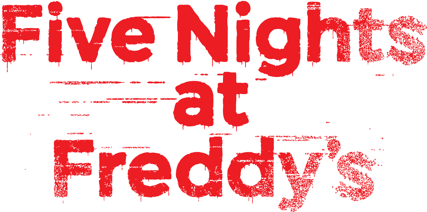
Logo History
The Five Nights at Freddy’s logo has become iconic for its gritty, distressed design that perfectly matches the franchise’s eerie tone. Across its multiple games, the logo retains core elements while adjusting for context:
- Original Game (2014): The original logo featured blocky, metallic letters with a worn effect, evoking rust and decay — fitting the abandoned pizzeria setting.
- Subsequent Titles: Later entries often adapted the wordmark with slightly different textures, colors, or graphic additions to reflect the specific theme of each game (e.g., darker tones for more intense sequels).
- Logo Consistency: Despite variations, the FNaF wordmark remains instantly recognisable, keeping the gritty type treatment at its core.
The consistent use of these visual cues has helped the logo become one of the most identifiable marks in horror gaming.
Design Meaning
The Five Nights at Freddy’s logo encapsulates the franchise’s atmosphere:
- Distressed Typography: The rough, worn appearance suggests decay, tension, and unease — key themes in the games.
- Block Letters: Bold and slightly industrial letterforms give a sense of structure and presence, while the texture adds an unsettling quality.
- Broken/Uneven Effects: Subtle imperfections in the letters mirror the chaotic nature of the haunted animatronics and deteriorating environments within the story.
Overall, the design visually conveys fear, suspense, and mystery, immediately signaling the horror genre to fans.
Color Philosophy
The FNaF brand logo typically uses a limited, atmospheric palette to match the horror theme:
- Dark Greys & Blacks: Create a moody, ominous aesthetic that aligns with dimly lit game environments.
- Reds or Rusty Tones: Often used to evoke danger, blood-like associations, or aged metal surfaces, reinforcing tension and unease.
- Subtle Highlights: Light touches on textured surfaces add depth without diminishing the dark, suspenseful mood.
These color choices support the franchise’s identity as a psychologically tense and eerie horror experience.
Usage Guide
To preserve the identity and impact of the Five Nights at Freddy’s logo:
Logo Placement
- Ensure sufficient clear space around the logo to avoid visual clutter.
- Avoid placing it over busy or bright backgrounds that reduce its eerie effect and readability.
Scaling & Format
- Scale proportionally; never stretch, skew, or distort the logo.
- Use vector files (SVG/EPS) for print and high-resolution PNG for digital applications.
Color & Backgrounds
- Use approved color versions that maintain the intended mood (dark, ominous tones).
- Avoid unapproved recolors or bright effects that contradict the franchise’s horror atmosphere.
Thematic Use
- Pair the logo with dark, atmospheric visuals in promotional materials to uphold the franchise’s tone.
- Do not use the logo in contexts that are inconsistent with the brand’s image (e.g., cheerful, child-friendly themes).
FAQs
1. What genre is Five Nights at Freddy’s?
It’s a survival horror video game series known for jump scares and tense gameplay.
2. Who created FNaF?
The franchise was created by Scott Cawthon and launched in 2014.
3. What does the logo style represent?
The distressed, gritty design reflects haunted environments, suspense, and decay — core elements of the game’s atmosphere.
4. Can I use the FNaF logo for my project?
The logo is a registered trademark. Commercial or public use typically requires permission from the IP holder. Editorial or personal use requires careful consideration of copyright and fan content rules.
5. What file formats should I use?
Use SVG/EPS for print and scalable designs, and PNG for digital platforms.