1. Brand Overview
Formally established in 1963 as a junior rugby league club, Cronulla‑Sutherland’s top‑grade team was admitted to the New South Wales Rugby League (NSWRL) premiership in 1967, four years later. From then on, the club grew into a respected NRL franchise with a strong local fanbase deeply rooted along Sydney’s coastline.
The club’s nickname — the Sharks — emerged in its inaugural season when several influences, including the then‑club captain and local rugby culture, converged around the idea of a shark mascot. Early reports indicate that while other nicknames like “Lions” were considered, “Sharks” quickly took hold and was already being used in league publications before the first season began.
After years of striving for their first top‑grade success, the Sharks clinched their maiden NRL premiership in 2016, a milestone achievement that secured their place among rugby league’s elite.
2. Logo History
Like many long‑serving sports clubs, the Cronulla‑Sutherland Sharks logo has evolved significantly since the club’s early days — reflecting changes in identity, design trends, and sporting branding.
1967 – 1968: Captain Cook’s Endeavour
In their very first first‑grade season, the Sharks’ crest did not feature a shark at all. Instead, it depicted an outline drawing of Captain Cook’s ship, HMS Endeavour, referencing Cronulla’s proximity to Botany Bay — where Cook first landed in Australia. The shield‑style emblem also incorporated teal — a nod to local surf life saving club colours — and the club’s full district name.
1968 – Late 1970s: Early Shark Symbols
By 1968, the club introduced its first shark imagery, beginning with a circular crest featuring a simple black shark. Over the subsequent decade, that representation became more refined, and typically featured a blue shark icon against a black circular background.
Late 1970s – 1997: Black Circular Crest
From the late 1970s through to the late 1990s, the Sharks adopted a mostly black roundel logo with a bright blue shark silhouette at its centre. This version emphasised bold contrast and became widely recognised among supporters during a key phase of club growth.
1998 – 2003: Star‑Shaped Era
Following the disruption caused by the Super League split in the mid‑1990s, the club introduced a new logo from 1998 to 2003 — a blue and white star‑shaped design reflecting a modernised look. During this period, the club even shortened its official name to simply “Sharks” in branding and marketing, an effort to broaden appeal beyond its district identity.
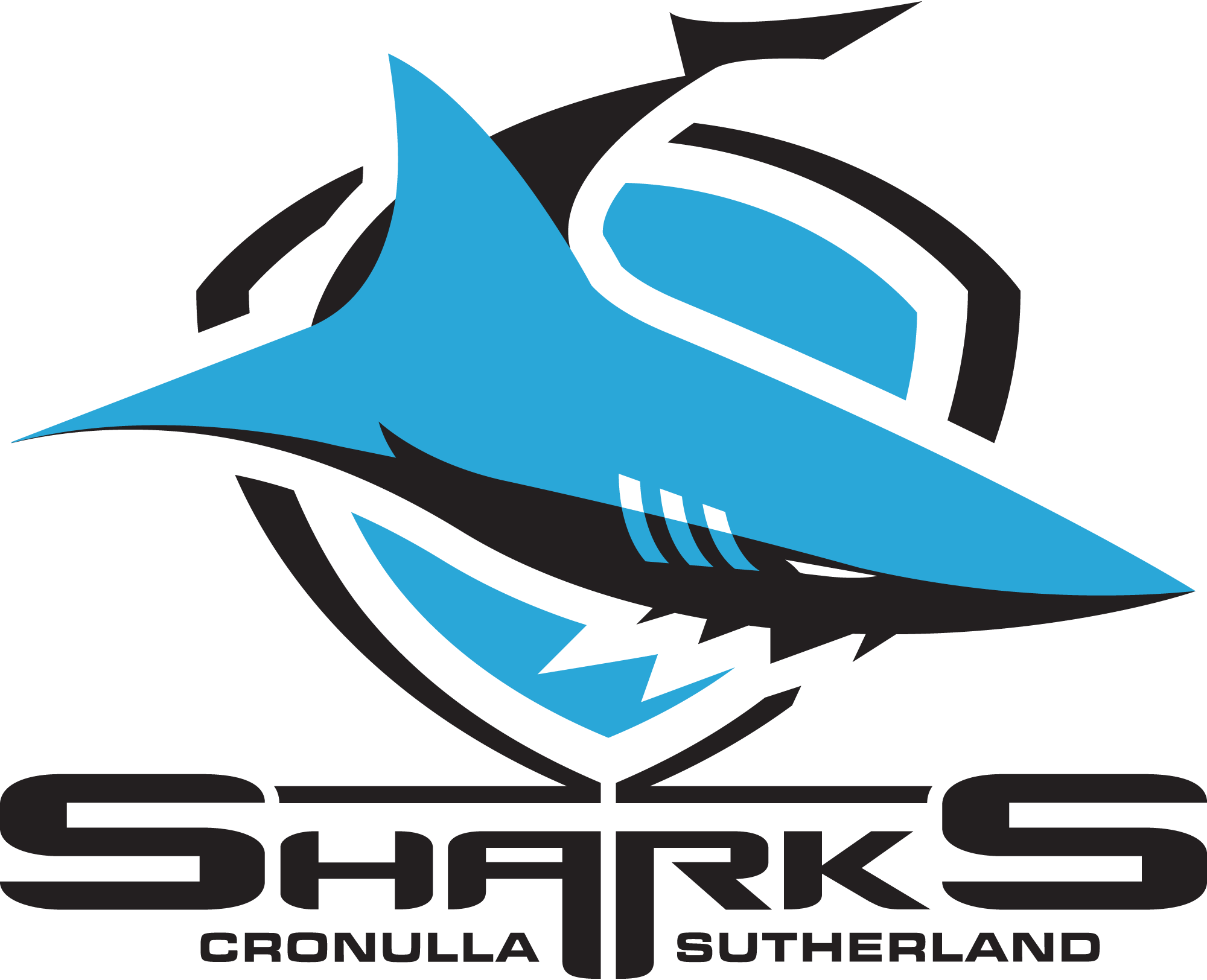
2004 – Present: The Modern Shield & Shark
When the club restored its full Cronulla‑Sutherland Sharks name in 2003, a new logo was adopted the following year. The current emblem — in use since 2004 — features a dynamic sky‑blue shark poised on a black‑outlined shield, evoking both power and motion. This logo prioritises visual impact, recognisability, and alignment with contemporary sports branding aesthetics.
3. Design Meaning
The Sharks’ logo carries symbolic meaning tied to both local identity and sporting characteristics:
- Shark Motif: The shark itself embodies strength, unpredictability, and aggression — traits celebrated in the physical nature of rugby league. The design evolution has maintained a focus on an active, forward‑leaning shark figure, signifying a relentless pursuit and competitive drive.
- Shield Shape: The shield around the shark reinforces ideas of defence, unity, and tradition, giving the emblem a sense of structure and gravitas.
- Early Endeavour Symbol: The original ship emblem linked the club to local maritime history and Cronulla’s coastal setting, tying club origin to place and local heritage.
Across all iterations, the central theme has remained consistent: representing a fierce, coastal club rooted in the Sutherland Shire while striving for competitive success and community identity.
4. Color Philosophy
The Cronulla‑Sutherland Sharks’ colour palette has also been a defining brand element throughout its history:
- Sky Blue: Symbolises the ocean and sky of the club’s coastal home, conveying openness, energy, and local pride.
- Black: Introduces intensity, power, and visual contrast — making the shark icon stand out boldly.
- White: Offers clarity and brightness, balancing the darker tones and enhancing logo legibility across uniforms and digital media.
This combination of sky blue, black, and white has become synonymous with Sharks’ branding across jerseys, merchandise, and club communications.
5. Cultural Significance
The Sharks’ identity extends beyond rugby league into the local community and cultural sphere. The Sutherland Shire — often simply called “The Shire” — is known for its coastal lifestyle, strong local culture, and community support for the team. The Sharks brand reflects that connection, both in its colours and in the enduring use of the shark motif.
In recent years, the club has also embraced cultural identity initiatives, including Indigenous Round jerseys that feature Honour First Nations art and storytelling tied to the broader landscape and community of Kurranulla (the traditional name for the Cronulla area). These designs incorporate local totems and oceanic elements, bringing modern cultural significance into the club’s visual expression.
6. FAQs
Q: What does the Cronulla‑Sutherland Sharks logo represent?
A: The logo symbolises the club’s coastal roots and competitive nature, using a shark figure to embody strength, agility, and a relentless sporting spirit.
Q: Has the club always been called the Sharks?
A: No — although the “Sharks” nickname was adopted from the start of their first‑grade competition, the club originally used various emblems like Captain Cook’s ship in its earliest year.
Q: When did the current logo first appear?
A: The modern shield‑style shark logo was introduced in 2004, shortly after the club restored its full name, Cronulla‑Sutherland Sharks.
Q: What are the club’s official colours?
A: The Sharks’ traditional colours are sky blue, black, and white, reflecting coastal identity and bold visual contrast.