Carlton Football Club – In‑Depth Brand & Logo Overview
The Carlton Football Club, affectionately known as the Blues, is one of the oldest, most successful, and culturally significant clubs in Australian rules football. Founded in 1864 in the Melbourne suburb of Carlton, Victoria, the club has played a pivotal role in shaping the game’s history and the Australian sporting landscape.
As a founding member of the Victorian Football League (VFL) in 1897 — now the Australian Football League (AFL) — Carlton boasts a legacy of sporting excellence, with 16 senior premierships, numerous finals appearances, and a deep, passionate supporter base spanning generations. Beyond on-field success, Carlton is known for its strong community ties, member ownership structure, and iconic visual identity, which has evolved while remaining rooted in tradition.
1. Brand Overview
Carlton Football Club represents more than a sports team; it is a heritage institution that embodies Victorian sporting culture and Australian football history. Over its 150+ year history, the club has cultivated a brand identity associated with:
- Tradition: Maintaining classic navy blue colours and iconic symbols across generations.
- Excellence: A track record of premierships, finals appearances, and legendary players.
- Community: Member-driven governance and strong local connections, including youth programs and grassroots support.
- Professionalism: Balancing historical prestige with modern sports marketing, fan engagement, and digital presence.
The club plays its home matches at iconic venues such as the Melbourne Cricket Ground (MCG) and Marvel Stadium, while training and community activities are centred at Ikon Park (Princes Park). Carlton has become synonymous with the “Blues” brand, instantly recognisable to AFL fans across Australia and internationally.
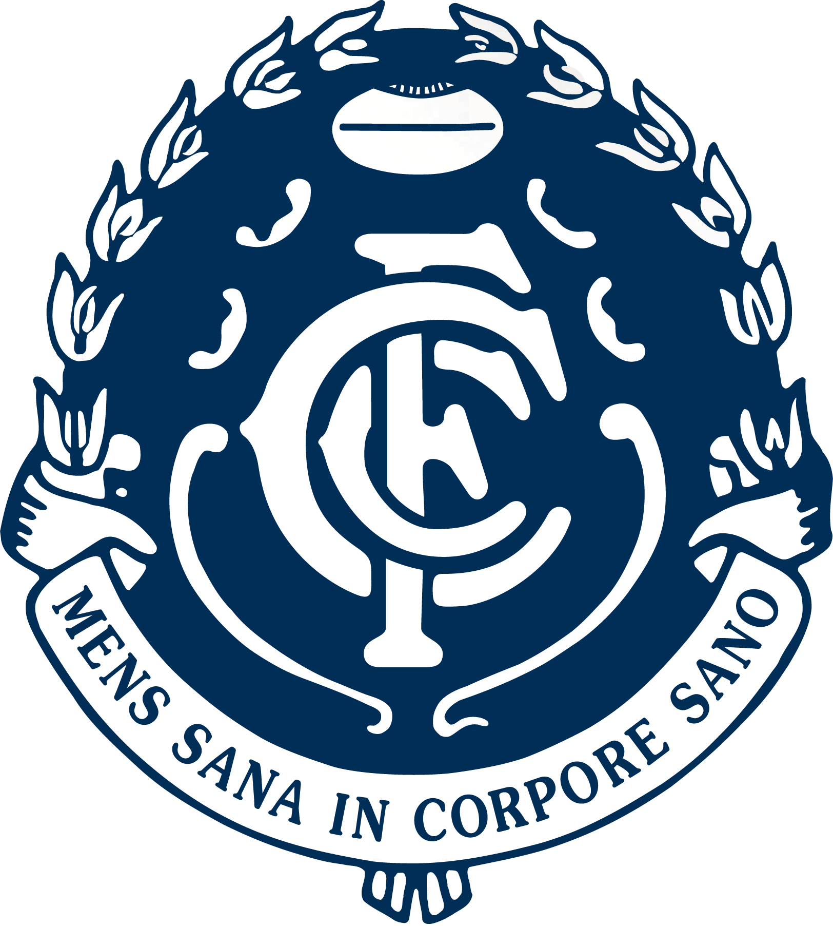
2. Logo History
Carlton’s visual identity has evolved gradually over more than a century, yet it has always maintained a consistent core: the CFC monogram. Unlike many modern sports teams that rely on mascots or pictorial logos, Carlton’s strength has been its timeless typographic emblem, which symbolizes heritage, unity, and prestige.
Early Origins (Late 19th – Early 20th Century)
When Carlton first adopted its navy blue guernseys in 1871, the club used simple designs featuring plain colours. By the early 1900s, the CFC monogram began appearing on uniforms and merchandise. The letters — intertwined elegantly — represented Carlton Football Club and provided a distinctive, recognisable mark that fans could rally behind.
Mid-20th Century – Wreath and Crest Additions
Through the mid-20th century, Carlton experimented with placing the monogram within decorative wreaths or circular crests, often accompanied by the club’s Latin motto:
“Mens sana in corpore sano” — translating to “A healthy mind in a healthy body.”
These elements were meant to signify:
- Excellence and sportsmanship, linking athletic performance to personal development.
- Prestige and history, aligning the club with broader Victorian sporting traditions.
- Recognition and visual impact, ensuring the emblem stood out on merchandise, pennants, and promotional materials.
150th Anniversary Logo (2014)
In 2014, Carlton celebrated 150 years of existence, marking the occasion with a special commemorative logo:
- The CFC monogram remained central, retaining its classic intertwined style.
- A silver laurel wreath surrounded the monogram, symbolising victory, achievement, and prestige.
- The year “1864” was included, emphasizing the club’s longevity.
- A football motif was subtly incorporated, connecting the emblem to its sporting roots.
This logo was designed to celebrate heritage while remaining functional across modern media, merchandise, and digital platforms.
Modern Simplified Logo (2019 – Present)
In 2019, Carlton streamlined its visual identity to focus on the monogram itself, removing additional embellishments such as wreaths or footballs. This minimalist approach reflects contemporary branding trends while remaining faithful to tradition:
- The CFC monogram is bold, elegant, and highly legible across uniforms, digital media, and merchandise.
- The navy blue colour palette ensures visual consistency with the team’s historical guernseys.
- Simplification supports versatility, allowing the logo to scale effectively across social media, apparel, signage, and broadcast graphics.
The result is a timeless emblem that balances heritage with modern branding requirements, making it instantly recognisable to both long-time supporters and new fans.
3. Design Meaning
Every element of Carlton’s logo carries symbolic significance:
- CFC Monogram: The intertwined letters represent the club’s name while conveying unity, identity, and heritage. Its geometric balance evokes stability and longevity.
- Navy Blue Colour: Symbolizes strength, loyalty, and tradition, creating an emotional connection with fans. Navy blue has been a defining feature of Carlton’s playing strip since the 19th century.
- White Letters: Provide contrast and clarity, enhancing visibility and reinforcing the monogram’s prominence.
- Crest/Wreath Elements (historical): These reflected achievement, tradition, and sporting excellence, while connecting the club to broader Victorian and international sporting aesthetics.
The Carlton logo succeeds because it is both symbolic and functional: it communicates the club’s identity clearly while remaining elegant, versatile, and steeped in history.
4. Color Philosophy
Carlton’s visual identity relies on a classic navy blue and white palette:
- Navy Blue (#000080): Represents stability, heritage, and professionalism. It reflects both the historic colours of the club and a sense of pride and gravitas in sporting achievement.
- White (#FFFFFF): Provides strong contrast for the monogram, ensuring the emblem is instantly recognisable across uniforms, merchandise, and digital media.
The simplicity of this two-colour scheme enhances versatility and ensures consistency across generations, making the Carlton brand timeless, elegant, and authoritative.
5. Cultural and Branding Significance
Carlton Football Club’s logo is more than just a visual identifier — it is a symbol of identity, pride, and tradition:
- Historical Legacy: The monogram has represented over 150 years of elite Australian rules football.
- Fan Recognition: The logo fosters instant recognition and loyalty among supporters, both in Melbourne and nationwide.
- Merchandising: Its simplicity allows seamless application on jerseys, hats, scarves, and digital content.
- Digital Presence: The modern logo adapts well to social media, apps, and broadcast graphics, helping the club remain relevant in a digital era.
Carlton’s visual identity embodies the Blues’ ethos: a deep respect for tradition paired with forward-looking adaptability.
6. FAQs
Q: What does the Carlton Football Club logo represent?
A: The CFC monogram represents the club’s full name — Carlton Football Club — symbolising heritage, unity, and identity in Australian rules football.
Q: Why is the club nicknamed the “Blues”?
A: The nickname comes from the navy blue playing colours, which have been worn consistently since 1871 and are central to the club’s identity.
Q: Has the Carlton logo changed much over time?
A: Yes — while the monogram remains central, earlier versions included wreaths, crests, footballs, and anniversary elements. Today, a simplified monogram dominates.
Q: What was the 150th anniversary logo?
A: It featured the classic monogram surrounded by a silver laurel wreath, the founding year 1864, and subtle football motifs to celebrate the club’s rich history.
Q: What makes Carlton’s logo iconic?
A: Its combination of simplicity, heritage, and adaptability makes it instantly recognisable across generations, media, and merchandise — a visual representation of the Blues’ longstanding success and cultural significance.