Brand Overview
The Canberra Raiders are a professional rugby league club based in Canberra, Australia. The team competes in the National Rugby League (NRL), which is the highest level of rugby league competition in Australia and New Zealand.
The club was officially established in 1981 and entered the top-level competition in 1982. Since then, the Raiders have become one of the most recognizable teams in Australian rugby league.
Nicknamed the “Green Machine,” the team is famous for its bright lime-green uniforms and passionate fan base. Over the decades, the Raiders have built a strong reputation in the sport and have won multiple premiership titles while producing many legendary players.
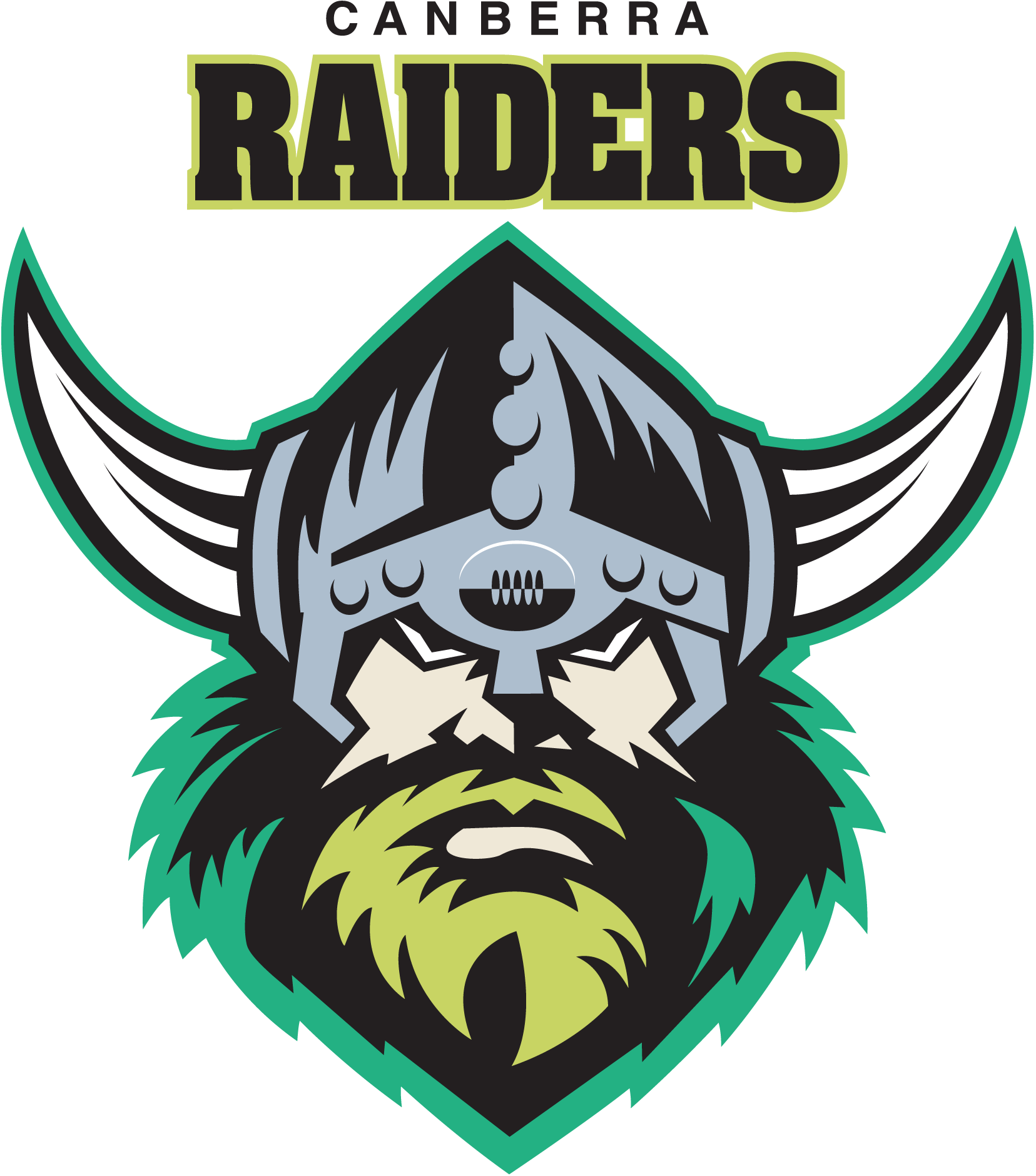
The Canberra Raiders logo represents the club’s identity, strength, and competitive spirit. Featuring a Viking warrior symbol, the logo reflects the aggressive and fearless playing style associated with the team.
Canberra Raiders Logo History
The Canberra Raiders logo has evolved several times since the club’s formation, reflecting changes in design trends and branding strategies.
1981–1999: Original Raider Logo
The first official Raiders logo was introduced when the team joined the competition in the early 1980s. This version featured a Viking warrior portrait inside a circular badge, representing the meaning of the word “raider.”
The design included bold typography and strong colors, giving the team a distinctive identity among rugby league clubs.
2000–2019: Modernized Raider Emblem
In 2000, the club introduced a redesigned logo featuring a larger Viking head with a helmet and beard. This version was cleaner and more modern than the original crest and quickly became a well-known symbol among rugby league fans.
The new design emphasized:
- Strong outlines
- Bold facial features
- A more modern wordmark
This version remained the primary club logo for nearly two decades.
2019–Present: Contemporary Viking Logo
In 2019, the Raiders updated their brand identity to modernize the logo for digital platforms and merchandise. The redesign simplified the Viking head and refined the typography.
The updated emblem improved visibility across:
- Social media
- Team uniforms
- Digital marketing
- Mobile apps and merchandise
More recent updates have continued to refine the design by simplifying lines and strengthening the color palette.
Design Meaning
The Canberra Raiders logo contains several symbolic elements that represent the club’s values and identity.
The Viking Warrior
The Viking head is the central element of the logo. Vikings historically represent strength, bravery, and exploration. For the Raiders, this imagery symbolizes:
- Fearlessness on the field
- Aggressive competition
- Determination and resilience
The Viking mascot used by the team is also known as Victor the Viking, reinforcing the identity of the club.
Bold Typography
The heavy lettering used for the word “Raiders” reflects power and strength. The bold typeface also improves readability on team jerseys, stadium signage, and digital media.
Helmet and Beard Details
The Viking helmet and beard provide a distinctive visual identity. The design has become an iconic symbol of the club and is instantly recognizable among NRL fans.
Color Philosophy
The Canberra Raiders logo uses a unique and vibrant color palette that helps the team stand out in the league.
Lime Green
Lime green is the most recognizable color associated with the Raiders. It was chosen because it was uncommon among rugby league teams, helping the club develop a distinctive brand identity.
This bright green color is also responsible for the club’s nickname, the Green Machine.
White
White provides contrast and clarity in the logo design. It helps highlight the Viking figure and improves visibility across different backgrounds.
Blue and Gold
Blue and gold appear as secondary colors in the Raiders’ branding. These colors represent the traditional sporting colors of the Australian Capital Territory, linking the club to its regional identity.
Together, these colors create a bold and energetic visual identity.
Why the Canberra Raiders Logo Works
The Raiders logo is successful because it combines strong symbolism with a clear and memorable design.
Key strengths of the logo include:
- A powerful Viking mascot that reflects the team name
- Unique lime-green branding that stands out in sports
- Bold typography for easy recognition
- A design that works across jerseys, merchandise, and digital media
These elements make the logo one of the most recognizable symbols in rugby league.
FAQs
What is the Canberra Raiders logo?
The Canberra Raiders logo is the official emblem of the rugby league team Canberra Raiders. It features a Viking warrior symbol and the team name.
When were the Canberra Raiders founded?
The Canberra Raiders were founded in 1981 and joined the top rugby league competition in 1982.
What does the Viking in the Raiders logo represent?
The Viking represents strength, courage, and the attacking spirit of the team.
Why are the Raiders called the Green Machine?
The nickname comes from the team’s distinctive lime-green uniforms, which have become a signature part of their identity.
What file formats are available for the Canberra Raiders logo?
The logo is typically available in several formats:
- PNG (transparent background)
- SVG (vector format)
- JPG
- AI / EPS for designers
These formats allow the logo to be used for websites, graphic design, and printing.