1. Brand Overview
Buick is one of the world’s oldest automobile brands and a premium division of General Motors (GM). Founded by automotive pioneer David Dunbar Buick in 1899, Buick predates many other major carmakers and helped lay the foundation for the formation of General Motors in 1908. Today Buick serves markets primarily in North America and China, and is positioned as a premium yet attainable luxury brand with a focus on refined comfort, technology, and design.
Over its long history, Buick has built a reputation for smooth‑riding sedans and SUVs, a loyal customer base, and distinctive design cues — including the famous “Trishield” emblem that has served as its visual signature for decades.
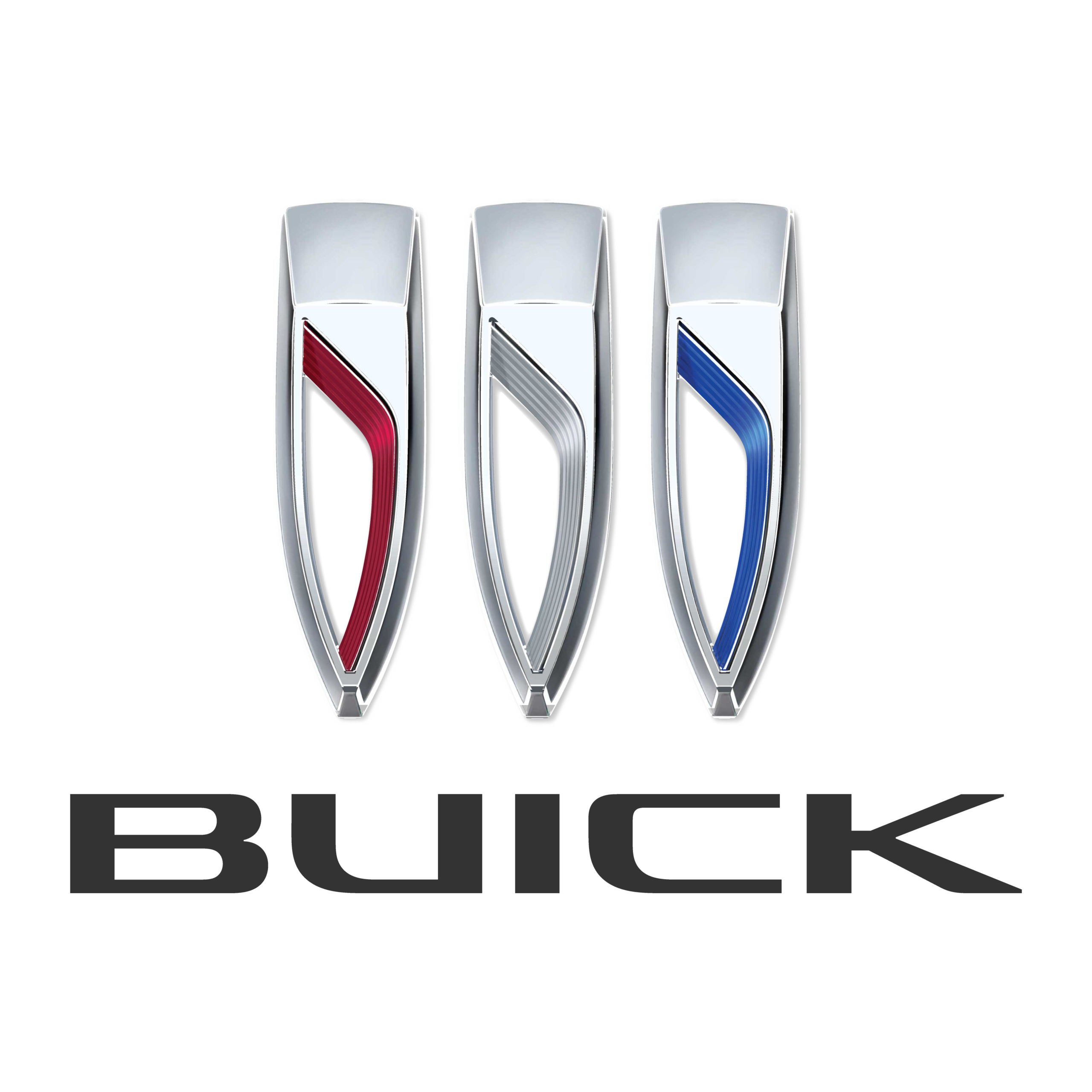
2. Logo History
Buick’s logo has evolved significantly over many eras, but the 2022 version represents the most substantial redesign in decades.
Tri‑Shield Origins (1960s)
The familiar three shields logo debuted in 1960, replacing a single shield that referenced the Buick family coat of arms. The three individual shields originally symbolized Buick’s then‑lineup of three models — the LeSabre, Invicta, and Electra.
This tri‑shield motif became Buick’s enduring emblem and was refined multiple times throughout the late 20th century, including a sleek chrome‑dominated version in the early 2000s and a tricolor shield variant around 2015.
2022 Redesign – Modern Tri‑Shield
In 2022, Buick unveiled a bold new interpretation of its classic tri‑shield logo as part of a comprehensive brand refresh. This was the first major emblem redesign since around 1990.
Key changes in this version include:
- The three shields aligned horizontally rather than diagonally.
- The removal of the circular surround that previously framed the shields.
- A more minimalist and flat design suitable for digital and physical applications.
- Retention of the iconic red, white, and blue color accents inside each shield in many applications, though a monochrome or chrome version is also used.
This modern iteration still honors Buick’s heritage while signaling a new chapter in design and technology for the brand.
3. Logo Design Meaning
Three Shields
The shield motif first rose to prominence in 1960 and has become Buick’s defining symbol:
- Heritage & Legacy: The shields trace back to the ancestral coat of arms of founder David Dunbar Buick.
- Product Line Symbolism: Originally, each shield represented a model in Buick’s lineup. Over time, they came to represent the brand’s engineering excellence and aspirational identity.
- Unity & Balance: In the 2022 design, arranging the shields in a straight line signals simplicity, balance, and forward‑looking clarity — very much in step with modern design sensibilities.
Minimalist & Modern Execution
Compared with earlier, more complex designs, the 2022 logo’s flat, unframed layout reflects key trends in branding:
- Adaptability across digital platforms (websites, apps, dashboards).
- A clean look that pairs well with contemporary vehicle front fascias.
- A symbolic shift toward a more technology‑oriented and electrified brand future, considering Buick’s plans for electrification and new EV models.
4. Color Philosophy
Traditional Accent Colors
Early tri‑shield designs used red, white, and blue inside the shields — a nod to both Buick’s historical crest and classic automotive heritage.
- Red: Represents energy and passion.
- Blue: Conveys trust, engineering precision, and sophistication.
- White/Silver: Suggests purity, elegance, and premium quality.
Modern Treatments
In many modern brand applications, Buick also uses monochrome or chrome versions of the logo, especially on vehicle grilles, badging, and premium materials, reinforcing a sense of luxury and timelessness.
The flatter, cleaner color palette pairs well with contemporary design both in print and in digital environments.
5. Cultural and Brand Significance
The Buick 2022 logo isn’t just a badge — it reflects a broader brand transformation:
- Electrification & Future‑Focus: The redesign was introduced alongside concept vehicles like the Wildcat EV, aligning the brand with innovation and its planned electric future.
- Modern Identity: Simplified visual language makes the logo easier to recognise across screens, apps, and interactive platforms — crucial in today’s digital‑first automotive world.
- Heritage Connection: While modernised, the shield elements still tie back to Buick’s long history, reinforcing continuity even as the brand evolves.
6. FAQs (Frequently Asked Questions)
Q: What does the Buick tri‑shield logo represent?
A: The three shields originate from founder David Dunbar Buick’s family coat of arms and later symbolised the trio of original Buick models; over time they became a core emblem of Buick identity.
Q: Why did Buick change its logo in 2022?
A: Buick updated its logo to reflect a modern, cleaner design that better suits digital applications and signals the brand’s transition toward future technologies, including electric vehicles.
Q: Are the colors in the new logo meaningful?
A: The red, white, and blue accents in the shields tie back to historic emblem colors, while monochrome/chrome treatments are used for a premium, contemporary look.
Q: When will the new logo appear on Buick vehicles?
A: The redesigned emblem began appearing on production Buick models starting in 2023, including next‑generation SUVs like the GL8 Century.
Q: Is Buick moving to electric vehicles?
A: Yes — as part of its broader transformation, Buick has committed to an all‑electric future by around 2030.