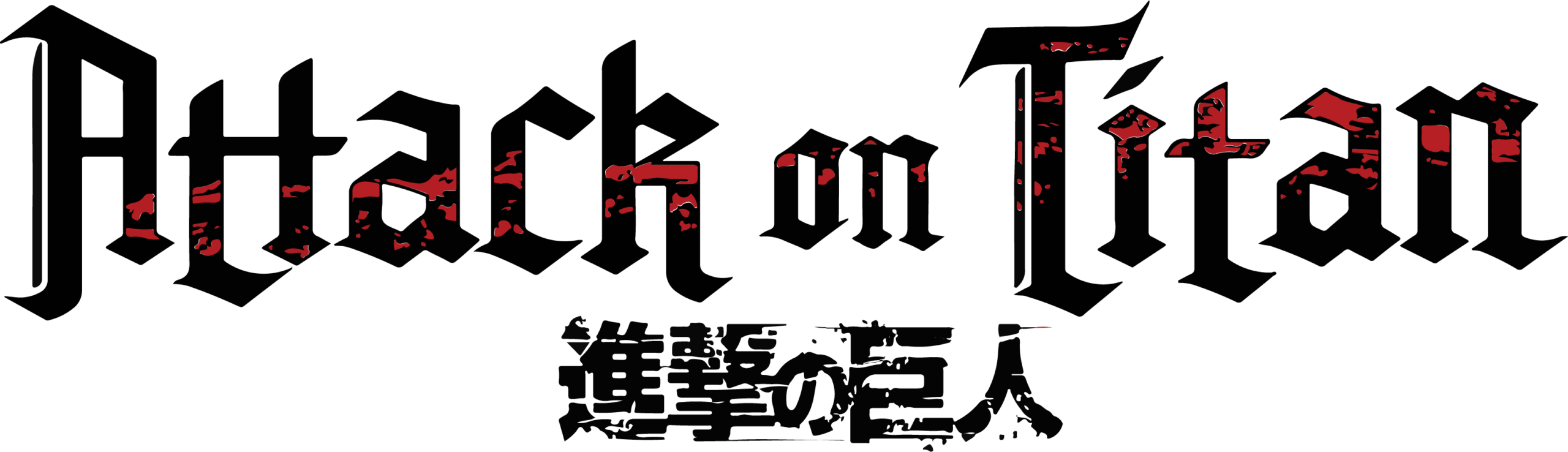
Attack on Titan Logo Brand Overview
Attack on Titan is a widely popular Japanese anime and manga franchise known for its dramatic storytelling, complex characters, and intense action. Set in a world where humanity fights for survival against towering humanoid creatures called Titans, the series has gained global recognition and a dedicated international fanbase.
The Attack on Titan brand identity reflects epic conflict, survival against overwhelming odds, and deep emotional stakes. Its logo visually conveys strength, tension, and the narrative’s dark, dramatic tone.
Logo History
The Attack on Titan logo is the primary visual identifier used across anime episodes, manga volumes, merchandise, promotional materials, and digital platforms. The logo has remained consistent in style since the franchise’s inception, contributing to strong brand recognition among fans worldwide.
Designed to complement the series’ dramatic themes, the logo appears on official covers, toys, apparel, collectibles, and media packaging. Its constant presence across formats reinforces the franchise’s iconic status in the global anime community.
Design Meaning
The Attack on Titan logo communicates several core brand and thematic concepts:
Epic Storytelling & Conflict
Bold, stylised letterforms convey intensity and drama, reflecting the series’ central themes of war, survival, and human resilience.
Recognition & Identity
The distinct design ensures immediate recognisability among fans and viewers, serving as a visual anchor for the franchise’s narrative world.
Dramatic Tone
Sharp edges and dramatic contrast in the logo’s presentation mirror the emotional weight and high‑stakes tension characteristic of the story.
Together, these elements encapsulate the series’ identity as a powerful and compelling narrative experience.
Color Philosophy
The Attack on Titan logo uses colour and contrast to reinforce its thematic tone:
High Contrast Tones
Dark, bold colours create a strong visual presence that echoes the franchise’s intense, dramatic atmosphere.
Neutral Accents
Neutral or muted tones are used to maintain readability and support the logo’s integration into varied merchandise, posters, and media packaging.
This palette ensures maximum impact and recognisability across print, digital, apparel, and promotional materials.
Usage Guide
To use the Attack on Titan logo consistently and appropriately:
Logo Placement
- Allow clear space around the logo so it remains distinct.
- Avoid placing it on backgrounds that reduce contrast or legibility.
Size & Scaling
- Resize proportionally without stretching, skewing, or distortion.
- Use high‑resolution files for digital displays and scalable formats for print applications.
Colour Integrity
- Maintain approved colours and contrast — do not recolour the logo.
- Ensure strong contrast between the logo and its background to preserve visibility.
Restricted Uses
- Do not alter the logo’s design structure, typography, or proportions.
- Do not combine it with other marks or graphics without authorised permission.
FAQs
1. What is Attack on Titan?
Attack on Titan is a Japanese anime and manga series focused on humanity’s struggle for survival against giant creatures known as Titans.
2. What does the Attack on Titan logo represent?
The logo represents epic conflict, dramatic storytelling, and recognisability within the global fan community.
3. Can I use the logo for my project?
Official use typically requires permission, especially for public or commercial purposes.
4. Are modifications allowed?
No — the logo should remain in its original form, design, and colour.
5. Which formats should I use?