🍃 Animal Crossing — Brand & Logo Deep Dive
Animal Crossing is a beloved social simulation video game series developed and published by Nintendo. The franchise started with Dōbutsu no Mori in Japan and debuted internationally as Animal Crossing on the GameCube in 2002. Since then it has become a cultural phenomenon with multiple mainline games, spin‑offs, and a massive fan community worldwide.
🎯 Brand Overview
- Name: Animal Crossing
- Developer & Publisher: Nintendo
- First Release: April 14, 2001 (Japan; as Dōbutsu no Mori)
- Genre: Social & life simulation
- Platforms: Nintendo consoles & devices (GameCube → Switch → mobile)
The series centers on a player character living in a town inhabited by anthropomorphic animals. Gameplay emphasizes creativity, community, gentle pacing, customization, and real‑time progression — all contributing to its “cozy gaming” appeal.
🖋️ Logo History
The Animal Crossing logo has evolved over more than two decades but has maintained core visual themes throughout its lifecycle.
🕰️ Early Years (2001–2005)
When the series first launched (as Dōbutsu no Mori), the logo was intentionally simple and organic in aesthetic, reflecting both its Japanese origins and the calm, welcoming atmosphere of the gameplay world. A leaf motif — or in some early versions a clover — was used as a cheerful symbol of nature and friendly community life.
🛠️ Refinement & Recognition (2005–2019)
As new titles like Wild World, City Folk, and New Leaf were released, the logo became more stylized and polished. While text and presentation refined over time, the leaf or nature‑inspired element consistently remained at the heart of the design, anchoring the franchise’s identity.
🌅 Modern Era — New Horizons (2020–Present)
The current iteration, popularized with Animal Crossing: New Horizons on Nintendo Switch, uses a clean, vibrant leaf graphic with bold, welcoming typography. This version helped solidify the logo as a global symbol of comfort, community, and serene escapism — especially amplified during the global lockdowns of the early 2020s.
🍃 Design Meaning
The Animal Crossing logo isn’t just a title treatment — it’s a thoughtful reflection of the series’ core themes and experience.
🌿 Leaf Symbol
- The most iconic element of the logo is the leaf, which represents nature, growth, simplicity, and community — all central to gameplay.
- In‑game, leaf icons often represent furniture and items, tying the logo directly to mechanics like crafting and collecting.
- The leaf’s universal, organic shape resonates globally, making it instantly recognizable across cultures without needing text.
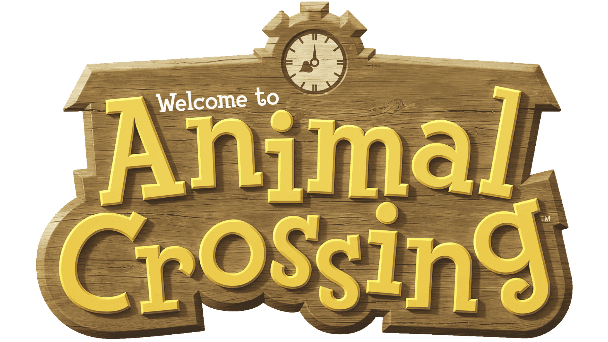
🪵 Wooden Sign Aesthetic
Many versions of the logo incorporate a wooden sign or plaque background, which evokes the feel of a village board or outdoor notice, reinforcing the game’s homely, community‑based setting.
🪻 Friendly Typeface
- The typography is playful and approachable, often resembling hand‑crafted or rounded text, matching the welcoming and relaxed tone of the franchise.
- Fonts like Fink Heavy or variations of friendly, serif‑inspired styles further enhance this charm.
🎨 Color Philosophy
The Animal Crossing logo uses a warm, earthy palette that reinforces comfort and nature:
- Olive & Leaf Green: Growth, tranquility, life — emblematic of the environments players explore and shape.
- Warm Beige & Brown: Earthy tones recall wood, soil, and the rustic village aesthetics that define the series world.
- Yellow Accents: A cheerful, uplifting touch that conveys happiness and sunshine — fitting for an escapist, feel‑good game.
The color scheme celebrates nature, comfort, and a gentle pace of life, distinguishing it from more aggressive or intense gaming logos.
📌 Logo Evolution & Consistency
Although the logo has seen stylistic updates across console generations, certain principles have remained consistent:
- Nature‑centric Imagery: The leaf motif persists as a core brand identifier.
- Approachable Design: Friendly typography and natural textures reinforce accessibility and comfort.
- Cultural Adaptability: The logo transcends language barriers, helping Animal Crossing become a globally recognized gaming brand.
These factors have made the logo more than just a title treatment — it’s a symbol of a genre, often associated with “cozy games” and positive emotional experiences.
❓ Frequently Asked Questions (FAQs)
Q1: What does the leaf in the logo symbolize?
A: The leaf represents nature, growth, and community, core elements of Animal Crossing’s gameplay and philosophy.
Q2: Has the logo changed much over time?
A: Yes — it has evolved in style and polish, but always remained true to its nature‑inspired roots.
Q3: Why does the logo feel so calming compared to other games?
A: Its rounded type, earthy colors, and organic shapes are intentionally gentle and welcoming, aligning with the series’ relaxing gameplay.
Q4: What role does the logo play in branding?
A: It anchors the franchise identity across games, merchandising, and marketing, making it instantly recognizable.
Q5: Is the logo directly inspired by in‑game items?
A: Yes — leaf icons in Animal Crossing games often represent items and inventory, making the logo feel deeply connected to the gameplay experience.
🧠 Cultural Impact
The Animal Crossing logo has become more than a game title — it’s a cultural icon:
- It symbolizes slow gaming and comfort, especially noted during the popularity of Animal Crossing: New Horizons amid global lockdowns.
- The leaf motif appears widely in merchandise, fan art, and even outside gaming contexts, illustrating its broad appeal and emotional resonance.