Brand Overview
The 2014 FIFA World Cup was the 20th edition of the FIFA World Cup, the most prestigious international tournament in men’s football organized by FIFA. The tournament took place in Brazil from 12 June to 13 July 2014, featuring national teams from across the globe competing for the world championship.
Brazil hosted the World Cup for the second time (the first was in 1950), and the event attracted billions of viewers worldwide. The tournament concluded with Germany defeating Argentina in the final at the Maracanã Stadium.
To represent the event visually, FIFA introduced a unique official emblem that captured Brazil’s culture, football passion, and welcoming spirit.
Logo History
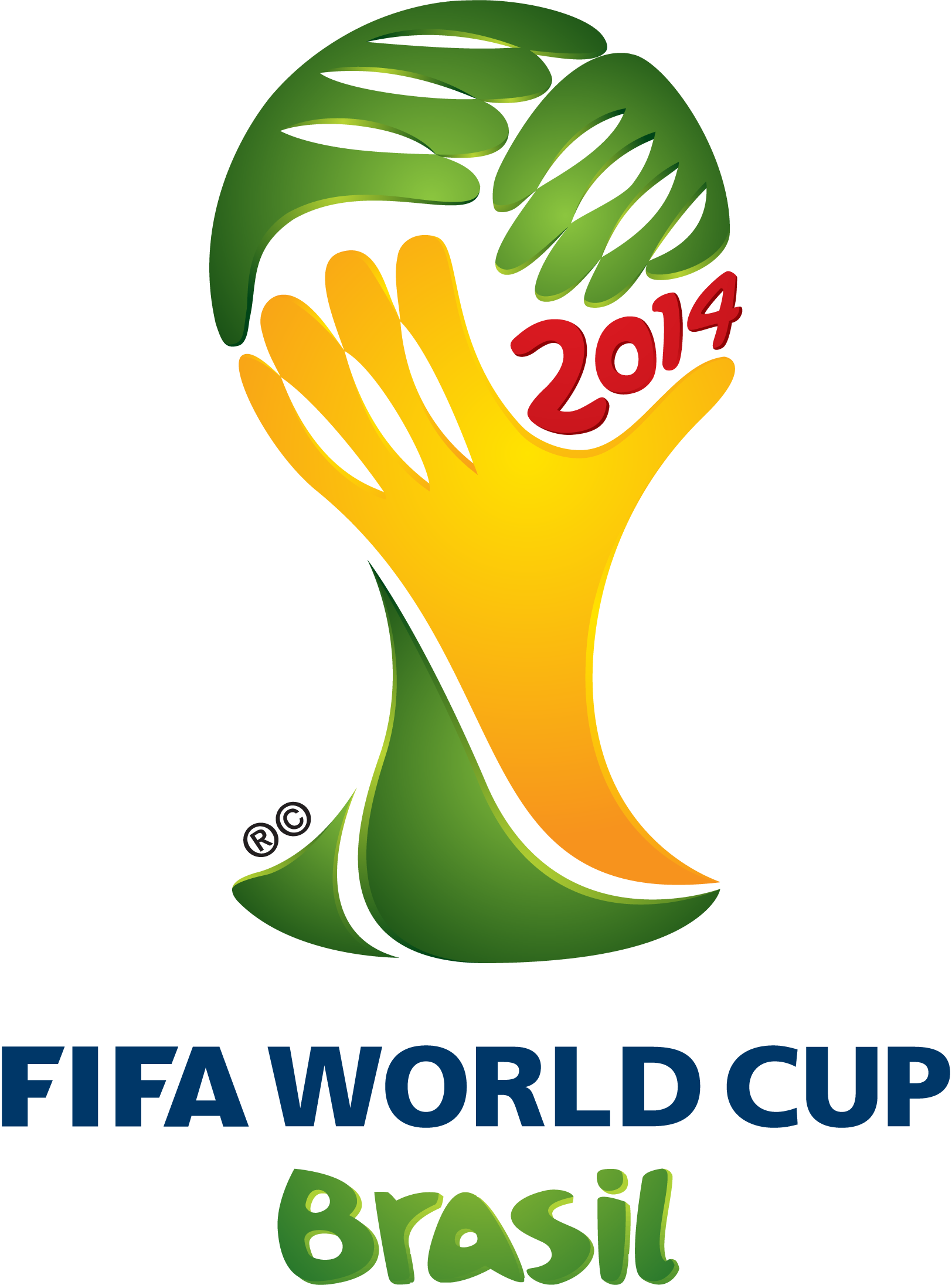
Official Launch (2010)
The official emblem of the 2014 World Cup was unveiled on 8 July 2010 in Johannesburg during the 2010 FIFA World Cup celebrations.
The logo was titled “Inspiration.” It was created by the Brazilian design agency Africa and selected from proposals submitted by 25 Brazilian agencies invited by FIFA.
A jury consisting of prominent Brazilian figures—including cultural icons, designers, and public personalities—chose the final design because it best reflected the spirit of Brazil and the global celebration of football.
Once chosen, the emblem became the primary visual identity used across the tournament’s branding, marketing campaigns, merchandise, stadium signage, and broadcast graphics.
Design Meaning
The 2014 World Cup emblem contains several symbolic elements.
Three Hands Holding the Trophy
The central design shows three stylized hands coming together to lift the FIFA World Cup trophy.
This imagery represents:
- celebration and victory
- unity among nations
- the shared passion for football worldwide
The design was inspired by photographs of players lifting the trophy after winning the tournament.
The hands visually form the shape of the World Cup trophy through negative space, creating a dynamic and recognizable silhouette.
Unity and Celebration
The joined hands symbolize the coming together of cultures and countries during the tournament. The World Cup is not just a sporting event—it is a global celebration of diversity, sportsmanship, and unity.
Brazilian Identity
The overall artistic style resembles brushstrokes or hand-painted shapes, reflecting the expressive and vibrant culture associated with Brazilian football and art.
This style was intended to feel human, energetic, and emotional, capturing the spirit of Brazil’s famous football philosophy known as “jogo bonito” (the beautiful game).
Color Philosophy
The color palette of the 2014 World Cup logo draws directly from Brazil’s national identity.
Yellow and Green
The dominant colors are yellow and green, which are the primary colors of the Brazilian national flag.
These colors symbolize:
- Brazil’s tropical environment
- sunshine and natural landscapes
- the country’s vibrant culture
They also visually communicate Brazil’s role as the host nation welcoming the world.
Red Accents
Subtle red tones appear in the typography, highlighting the year “2014” and adding contrast and energy to the design.
Typography
The typography used in the logo reads:
“2014 FIFA WORLD CUP BRASIL”
Key characteristics include:
- clean sans-serif lettering
- modern and legible style
- strong hierarchy emphasizing the tournament year
The typography balances the organic shapes of the hands with a clear, professional appearance suitable for global branding.
Cultural Significance
The 2014 emblem represented more than just a tournament logo. It symbolized:
- Brazil’s passion for football
- the unity of international competition
- celebration and human connection
The design was also used across numerous World Cup materials including:
- official posters
- broadcast graphics
- stadium branding
- merchandise and souvenirs
It became one of the most recognizable visual identities of the decade in global sports marketing.
FAQs
Why does the 2014 World Cup logo show hands?
The hands represent victory and celebration, symbolizing players lifting the World Cup trophy and nations coming together during the tournament.
What is the official name of the logo?
The emblem is called “Inspiration.”
Who designed the logo?
It was designed by the Brazilian agency Africa and selected from submissions by 25 agencies.
Why are the colors green and yellow?
They reflect the national colors of Brazil and symbolize the country welcoming the world.
When was the logo revealed?
It was unveiled in July 2010 during the 2010 World Cup in Johannesburg.