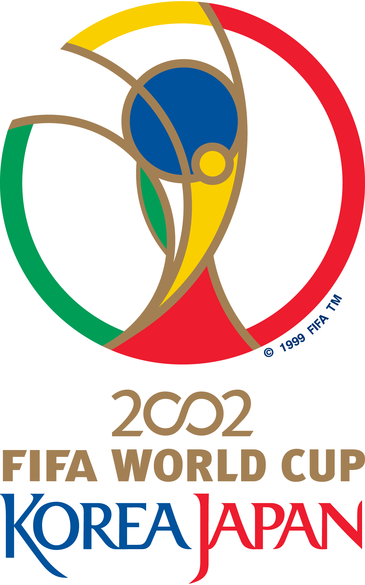
2002 FIFA World Cup Brand Overview
The 2002 FIFA World Cup was the 17th edition of the men’s international football (soccer) championship and the first World Cup ever to be co‑hosted by two countries: South Korea and Japan. This landmark tournament expanded football’s global reach and brought together nations from every continent in a celebration of sport, culture, and international unity. Brazil won the championship, earning its fifth World Cup title and cementing its status as the most successful team in the tournament’s history.
The 2002 World Cup is remembered for its passionate fans, memorable matches, and historic moments — all of which helped deepen football’s popularity across Asia and the world.
Logo History
The 2002 FIFA World Cup logo was developed as the official visual identity for the tournament co‑hosted by South Korea and Japan. Designed to reflect the unique partnership of the host nations and the spirit of global competition, the logo was used extensively throughout the event’s promotional campaign, broadcast graphics, tickets, signage, and official merchandise.
This emblem has become one of the most recognisable tournament marks in World Cup history, associated with another chapter in football’s expanding global influence.
Design Meaning
The 2002 FIFA World Cup logo conveys cultural, athletic, and symbolic elements:
- Unity & Collaboration: The design represents the joint hosting effort by South Korea and Japan, symbolising cooperation, harmony, and shared passion for football.
- Movement & Energy: Curved lines and vibrant shapes suggest motion and dynamic play — reflecting the excitement and fast pace of the world’s most watched sporting event.
- Global Celebration: As the official mark of the World Cup, the emblem communicates international connection, bringing together diverse nations through sport.
Together, these aspects communicate both the competitive nature of football and its ability to unite people across borders.
Color Philosophy
The color choices in the 2002 World Cup logo were selected for visibility, cultural resonance, and symbolic meaning:
- Bold Primary Tones: Bright colours — including reds, blues, and greens — create strong visual impact and represent passion, vitality, and international diversity.
- Contrast & Clarity: Ensuring the emblem stands out across broadcast, print, and merchandise environments was key to maintaining recognition and unity in design.
These colours were not only vibrant and distinctive but also helped the logo perform well in a wide range of visual contexts around the world.
Usage Guide
To use the 2002 FIFA World Cup logo properly and consistently:
Logo Placement
- Give the logo enough clear space around it so it remains prominent and uncluttered by other design elements.
- Avoid placing it on overly busy or low‑contrast backgrounds.
Size & Scaling
- Resize proportionally — avoid stretching, skewing, or distorting the design.
- Use high‑resolution formats for digital applications and vector formats for print or large displays to preserve clarity.
Colour Integrity
- Keep the original colours — do not use unapproved variations, gradients, or effects that change the intended look.
- Maintain strong contrast with the background for maximum readability.
Restricted Uses
- Do not alter the logo’s structure, typography, or proportions.
- Do not combine the logo with other marks without proper permission.
FAQs
1. What was the 2002 FIFA World Cup?
The 2002 FIFA World Cup was the 17th men’s international football tournament, co‑hosted by South Korea and Japan — the first tournament ever jointly hosted by two nations.
2. What does the 2002 World Cup logo represent?
The logo represents global unity, collaborative national pride from the host countries, and the excitement and energy of world championship football.
3. Can I use the 2002 FIFA World Cup logo for my project?
Use of the official logo generally requires permission from the rights holders, especially for commercial and public uses.
4. Are modifications allowed?
No. The logo should remain in its original form without alterations to its structure, colours, or relationships between design elements.
5. Which formats should I use?
For digital materials, use high‑resolution raster formats. For printed or scalable applications, use vector formats that maintain crispness and detail regardless of size.