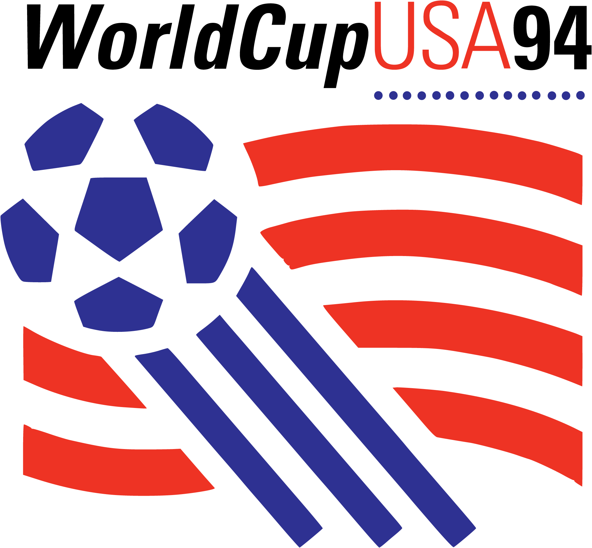
1994 FIFA World Cup Brand Overview
The 1994 FIFA World Cup was the 15th edition of the men’s football (soccer) World Cup tournament and one of the most memorable events in the history of international sports. Hosted by the United States, it took place from June to July 1994 across multiple cities and stadiums. The tournament drew unprecedented attendance numbers, setting records for overall spectators and helping expand the global popularity of football. Brazil emerged as champions by winning the final on penalties, becoming the first country to win four World Cup titles.
Logo History
The 1994 FIFA World Cup logo was created as the official visual identity for the tournament held in the United States. Unveiled well ahead of the event, the design was intended to capture both the excitement of the competition and the character of the host nation. It was used across official tournament materials including posters, tickets, merchandise, broadcasts, signage, and promotional campaigns.
The logo became a recognizable symbol of the World Cup and remained associated with one of the most successful editions of the tournament in terms of global engagement and attendance.
Design Meaning
The 1994 FIFA World Cup logo is rich in symbolism and communicates several key messages:
- National Identity: The design incorporates elements that reflect the United States as the host nation, often using colours and shapes reminiscent of national motifs and dynamic movement to convey sporting spirit.
- Movement & Energy: The shapes and forms used in the logo evoke momentum and fluidity, symbolising the pace and passion associated with football on the world stage.
- Global Celebration: As the visual mark of football’s premier international tournament, the logo represents a gathering of nations and cultures united by sport.
The overall concept blends athleticism and national pride, helping the event stand out among global sporting competitions.
Color Philosophy
The colour choices in the 1994 World Cup logo were made to reflect both the tournament’s energetic character and its American setting:
- Bold Primary Tones: Often featuring shades associated with the host country — such as strong reds, blues, and whites — the colours helped make the logo distinct and memorable.
- Contrast and Visibility: The palette ensured the logo performed well across diverse media formats, from television screens and print posters to merchandise and outdoor signage.
These color decisions were designed to enhance visibility, reinforce identity, and convey excitement and celebration.
Usage Guide
To use the 1994 FIFA World Cup logo correctly and consistently:
Logo Placement
- Keep clear space around the logo to maintain its prominence and visual impact.
- Avoid placing the logo on overly busy or low‑contrast backgrounds.
Size & Scaling
- Resize the logo proportionally; avoid stretching, warping, or distortion.
- For digital applications, use high‑resolution image formats.
- For large‑format print or merchandise, use version files suitable for scalability to preserve detail.
Color Integrity
- Maintain the logo’s original colours; do not use unapproved palette variations.
- Ensure strong contrast with background elements to preserve readability.
Restricted Uses
- Do not alter the typography, structure, or chords of the logo.
- Do not combine the logo with other marks without proper permission.
FAQs
1. What was the 1994 FIFA World Cup?
The 1994 FIFA World Cup was the 15th edition of the global football championship tournament, held in the United States and famous for its record‑breaking attendance and widespread international interest.
2. What does the 1994 FIFA World Cup logo represent?
The logo symbolises the tournament’s energy, global unity, and connection to its host nation, combining dynamic shapes with bold colours to reflect both athleticism and national pride.
3. Can I use the 1994 FIFA World Cup logo for my project?
Use of the official tournament logo typically requires permission from FIFA or the appropriate rights holders, especially for commercial or public uses.
4. Are modifications allowed?
No — the logo must be used in its original form, without changes to its structure, colours, or proportions.
5. Which formats should I use?
For digital platforms, use high‑resolution PNG formats. For print or promotional materials, use scalable vector formats to maintain clarity.